

Over the past two weeks, we’ve been searching for colors rarely seen in my previous color palettes, namely white, grey, blue, and purple. Last week, we attempted some white palettes and settled for white with a pop of color. This week, I’m sharing a couple of palettes addressing the purples and blues. We tried something a bit new for the second palette, but I don’t think it will be the last time we try it! Color palettes were created using Play Crafts’ Palette Builder 2.1 and my photographs, with conveniently matched cotton solids and Aurifil threads in case a palette so inspires you to sew!
 Corresponding solids from left to right:
Kona Black, Kona Shadow, Bella Baby Blue, Bella Aubergine, Kona Storm, Bella Betty’s Blue
Corresponding Aurifil thread from left to right:
2692 – Black
2615 – Aluminum
2562 – Lilac
2566 – Wisteria
2745 – Midnight
4140 – Wedgewood
Purple, lovely purple! Literally one, maybe two days after deciding to seek less frequent colors in nature, one of my kids spotted this pinecone refuse left by some critter alongside a hiking path. I went to investigate in response to, “What’s this, mama?” and viola! Purple! and a bit of blue! I love when my kids find little treasures out in the natural world, since that spark of wonder is what makes the world go ’round! I certainly will do all I can to keep it going as long as I have a speck of influence, and will cherish the treasures found.
 Corresponding solids from left to right:
Bella Stone, Kona Surf, Kona Ocean, Kona Copen, Kona Periwinkle, Kona Blueberry
Corresponding Aurifil thread from left to right:
2605 – Grey
2525 – Dusty Blue Violet
2780 – Dk Delft Blue
2725 – Lt Wedgewood
2720 – Lt Delft Blue
2770 – V Lt Delft
For this palette, we tried something a bit different. There are bits of blue appearing around our gardens–blueberries are beginning to ripen, the blue bachelor button buds are ready to pop any day, and the borage is flowering its fuzzy blue blooms. But no where is there a strongly dominant blue; it is mixed in with the rest of the colorful bits of beauty but alone would not hold its own in a color palette.
To combat that, I decided to try a reverse color scavenger hunt. I picked a couple of borage flowers and gave my oldest the challenge of finding things in the house that matched the color perfectly. Borage is a tricky color–a blueish violet that’s very soft and subtle, but she managed to find one book that was an absolute perfect match: a little book called the Dali Lama’s Book of Love & Compassion, a sweet little collection of positive reflections that was a gift from my husband way back before we were even engaged. Everything else we tried was either too blue or too purple, so I headed up and grabbed some blue-violet Aurifil spools to see if we could get lucky. Sure enough, 2525-Dusty Blue Violet is the perfect match! If you look at the matching Aurifil threads pulled from the palette, the second coordinating color is exactly that! Once again, Aurifil has the perfect match.
It has been fun to seek the rarer colors, and I still have yet to find a convincingly grey palette, nor have I fully succeeded with a white one, so I will keep looking! I challenge you to spot some odd colors in the world around you this week–where do you see blue? purple? or any other unusual colors that stand out to you? Let me know in the comments, or link to a photo!
Enjoy the search!

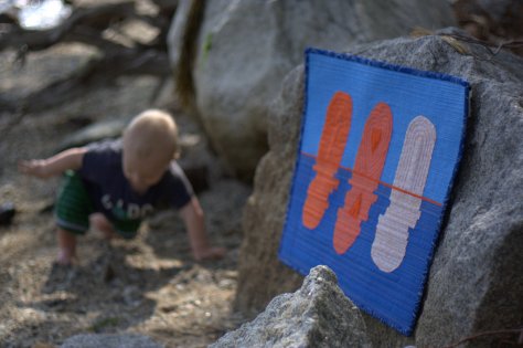
 I recently finished and gifted this mini quilt to a fellow quilting friend as part of a small private swap, and now that it has been received, I can tell you all about it! I entitled it, “Let Your Heart Shine True”, and it’s meant to be a visual representation of the fact that the goodness in your heart shines through, despite any missteps, mistakes, wrong words, or other things we personally may feel will tarnish or cloud our good intentions. It was made for Yvonne of
  This is my first attempt at a “statement quilt”, per se. My thought was that the quilt would show the large pieces on top as representing “people”, and the rippled reflection below being the public perception of the person. When mistakes are made, things are said in a not so clear way, or even just general awkward social interactions happen, those are the ripples that cause the reflection to be jarred and shaken. Yet despite the ripples and the jolted reflection, the heart remains intact and unbroken. If you lead with the heart, your good intentions ultimately must become known, no matter how many times you need to back pedal or rephrase things to clarify your meaning. I thought creating a statement quilt for Yvonne was fitting, since she has created a number of quilts as part of her
  The construction of this mini quilt was a fun multi-step process. I began by needle-turn appliquéing the rounded pieces onto panels of background fabric. I cut the bottom pieces with an identical free-style rounded top, but with much longer length since I planned to cut and resew it many times. Once they were appliquéd onto the background fabric, I cut random, varied width strips from the bottom ones, off-set it enough to wobble but not extend beyond the width of the finished panel, and resewed it. Each one was cut and re-sewn six or seven times to create the rippled effect. Let me tell you–that first cut into the needle-turned mound was a bit nerve-wracking! It was another one of those times I just had to trust that the vision in my head would translate well to reality.
 After rippling all three reflections, I squared each panel and sewed them together creating a horizon with a very narrow, approximately 1/8″ strip of solid orange fabric (Kona Persimmon, I think!). Yvonne’s favorite colors are blue and orange, which clearly influenced my fabric selection. I used some of our mutual favorite oranges from Carolyn Friedlander, and added some sketch by Timeless Treasures and an unknown solid from my early quilting days stash. I bound it in blue Mercury by Alison Glass, including a bit of framing while adding a bit from another mutually adored fabric designer.
 After that, the quilt begged for some more quilting, so I added random rows in yellow, gold, and orange for interest (40 wt 1135-Pale Yellow, 50 wt 5022-Mustard, and 50 wt 1154-Dusty Orange respectively). Both the top and bottom ended up pretty thoroughly matchstick quilted, but I really like the addition of the yellow, gold, and orange thread in the bottom, as well as the added interest of using a slightly heavier weight thread as the yellow. It reminds me of light reflecting off the ripples in a pond, which is perfect given the intention of the quilt.

 Corresponding solids from left to right:
 Inside near a bright window = dancing shadows
 Outside in direct bright sunlight = garishly bright with dark shadows
 Outside in a shady spot without direct sun = gentle and flat, and with a little bit of lightening in a photo editor, it creates the bright photo with soft shadows that was used to create the color palette above.
 Corresponding solids from left to right:
 Corresponding solids from left to right:

 As an extra special incentive, if you buy the bundle from me, you will also be entered to win a Quilter’s Planner 2017 Starter Kit, which includes a 2017 Quilter’s Planner as well as pens, stickers, and highlighters to help you stay organized, productive, and inspired! (Note: The winner will receive the starter kit as soon as it’s available, expected to be shipping in October). Congratulations to Sharon, the winner of the Quilter’s Planner Starter Kit!
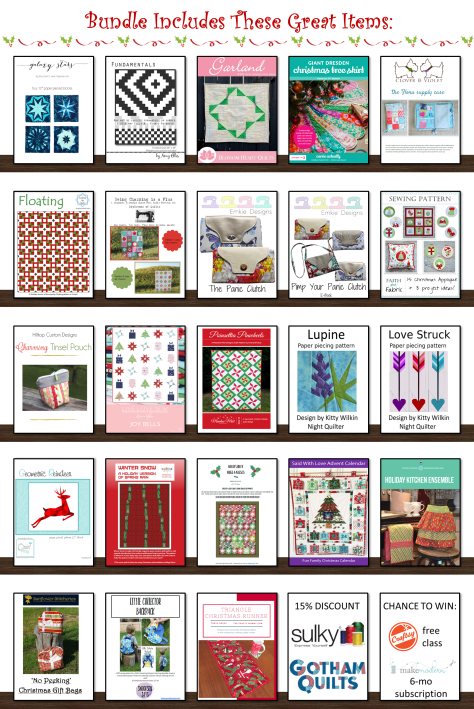
 You will get immediate digital download of all of the patterns shown above, plus:

 Thanks to the
  To enter the giveaway today, tell me what you like to do on rainy days. Leave a comment and make sure I’m able to get ahold of you if you win. For an additional entry,
 Corresponding solids from left to right:
 Corresponding solids from left to right:

 I’m also joining in with a talented group of pattern designers to bring you a great Christmas in July pattern bundle in a couple of weeks. Mark your calendars for July 11th, since the sale will kick off at 3pm EST and will run for only 72 hours! I can assure you won’t want to miss this bundle, since it includes a great variety of both holiday themed and general purpose patterns of all sorts. I’ll be including my two best selling foundation paper pieced patterns, Lupine & Love Struck in the bundle. There will be prizes to be won, AND every person who buys the bundle from me will be entered into the running for a Quilter’s Planner 2017 Starter Kit, which includes a 2017 planner as well as pens, clips, & highlighters to help you stay organized.
 This mini quilt finishes at 24″ square, and its creation coincided with the fabulous bloom of peonies in our garden. It features a new die called
 The colors of the peonies and the colors in the quilt meld so beautifully together! I really could not help but take a million photos of this quilt with the gorgeous color gradient of peonies from my garden, but since it’s Thursday, I figured a combination of Color Inspiration Thursday and a heads-up about my Sizzix tutorial would be perfectly acceptable.
 Ahhh peonies! Such an inspiration!
 Corresponding solids from left to right:
 I love the natural ombres and vibrant colors found in nature and thoroughly enjoy combining natural inspiration with quilty projects. It is so fun to try to stitch the beauty around me into the quilts in my hands!
 I’m nearing the finish line with this little one. It features some of my favorite Carolyn Friedlander fabrics, with a goal of playing with transparency in a cyclic way. I created a mini 2″ square foundation paper pieced pattern for each quarter of this mini mini, resulting in about a 4″ square. I used the template I designed for accurate piecing of the center spokes, and then have used different methods for sewing the outer curves.
 One of the fun perks of dragging projects out over obscene lengths of time (chuckle with me for a minute, here) is that it becomes a documentation of skill development. Two of the four curves were pieced using traditional curved sewing, and the wobbly, puckery wonk is indicative of my amateur curve abilities a few months ago. In fact, my original plan includes a needle-turn appliqué element over the curve, since I knew that it would most likely be something I would need to mask a bit (possibly a lot bit).
 You can see on the green quadrant that there is another dark curved piece added on top of the curve. That is needle-turned and does a fabulous job of covering the little inconsistencies of my tiny curved stitching. Use the method that works best for you, right!?
 However, since completing the first two quadrants of this mini mini, I have learned and conquered the
  I am currently contemplating the quilting for this mini mini, and am leaning toward some simple, large, hand stitching to secure the layers and add just a bit of interest. I also have some travel plans coming up, so as long as I can get the top prepared and layered, hand stitching might be just the thing to take with me on my trip. I’m really happy with how this is progressing, though, and I’m grateful as always for the patience of my quilty friends as I slowly process, evolve and execute my plans for their personalized mini minis. I’ll be sure to share the finished mini mini once I finally complete it.
 If you still want to support my making and blogging in a tangible way, you can purchase my patterns on