Category Archives: Design

Embrace the Rainbow

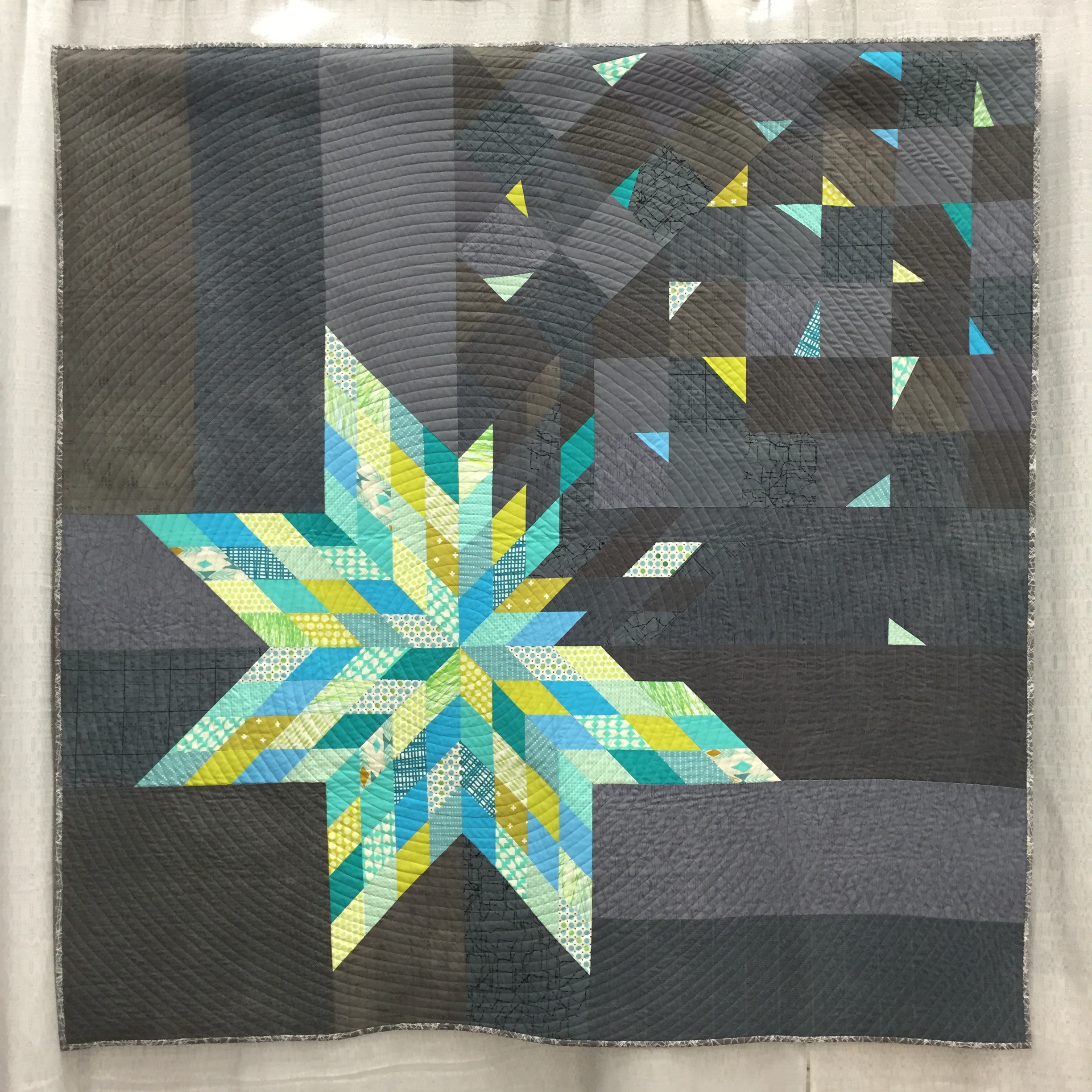
Rainbows make me happy. As early as I can remember, I’ve enjoyed arranging things in rainbow order. In high school and college, I would always eat M&Ms in rainbow order. No exceptions. As a mom, putting colored pencils or crayons away in rainbow order fills me with a weird feeling of bliss. It’s no surprise, then, that rainbow order finds itself into so many of my quilts. For a while, I thought I would “grow out of” my penchant for rainbows. For some reason, in my mind, rainbow order isn’t as mature as, say… marsala, or gold. Then I had a little blog comment conversation via email with Jenn from A Quarter Inch from the Edge, where she pointed out, “Why does one need to get over a penchant for rainbows? We see them so rarely in real life… we’ve got to make a few of our own!” True that! And so, I have embraced my love of rainbows and I’m letting it shine! Here are two of my current works in progress as proof.

Twirling Star by Leanne at Devoted Quilter pattern testing
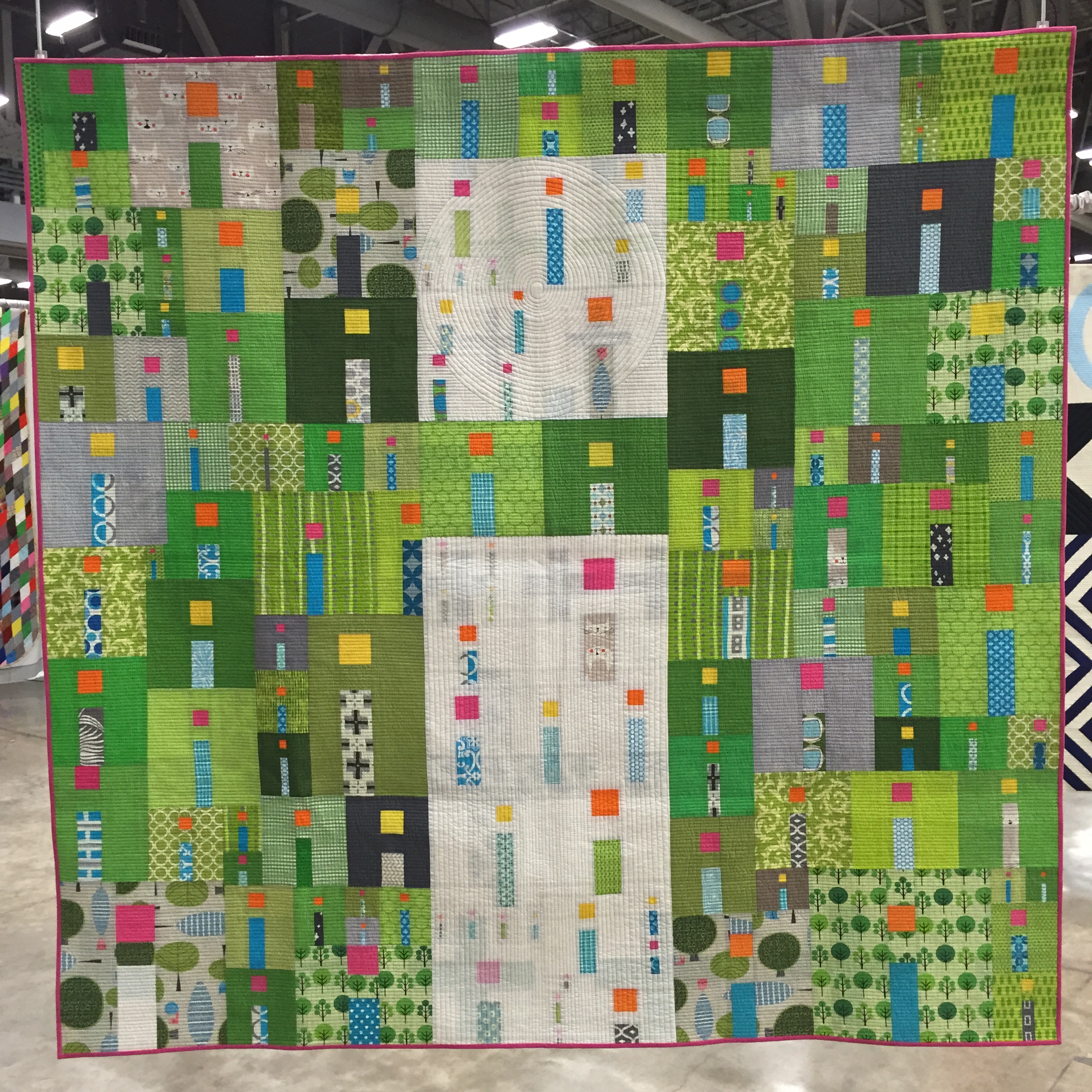
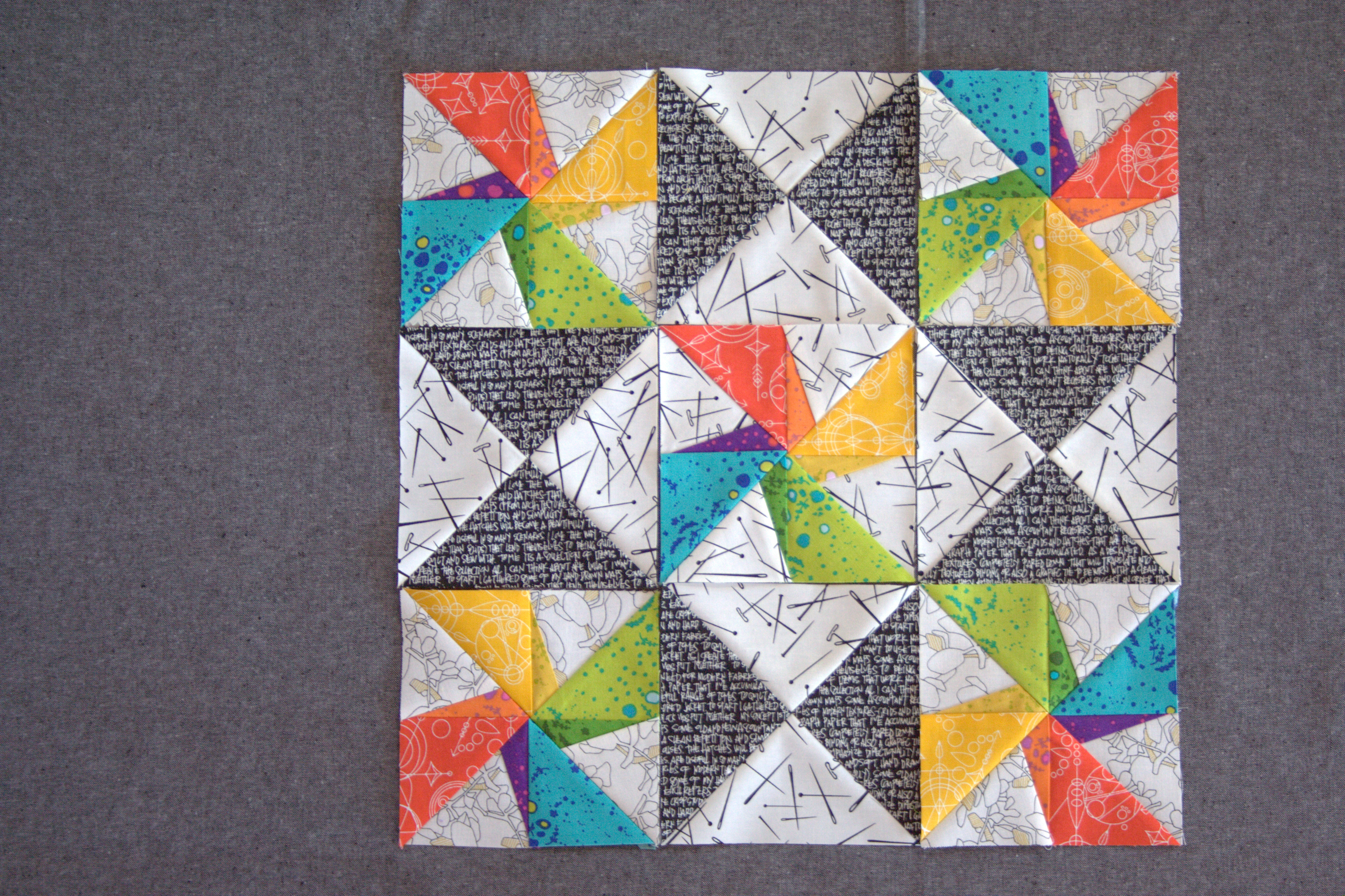
I’m testing a pattern called Twirling Star by Leanne at Devoted Quilter. It has been fun getting feedback on Instagram about fabric choices along the way. I opted for an entirely low volume background, just switching up the background fabric for the outer pinwheels to help the center star stand out a bit more. Opinions were pretty evenly split between using this Botanics Foliage in Charcoal fabric versus using Ledger from Carolyn Friedlander’s Architextures line. As much as I LOVE Ledger (can you tell I love pretty much all things Carolyn Friedlander?), I was toying with the idea of spinning the outer rainbow pinwheels, but wanted the flexibility to make the decision after seeing the blocks. With Ledger, the directionality issue would have required that I make the decision before assembling the blocks. Foliage, it was!

twirling star rainbow pattern testing for leanne at devoted quilter
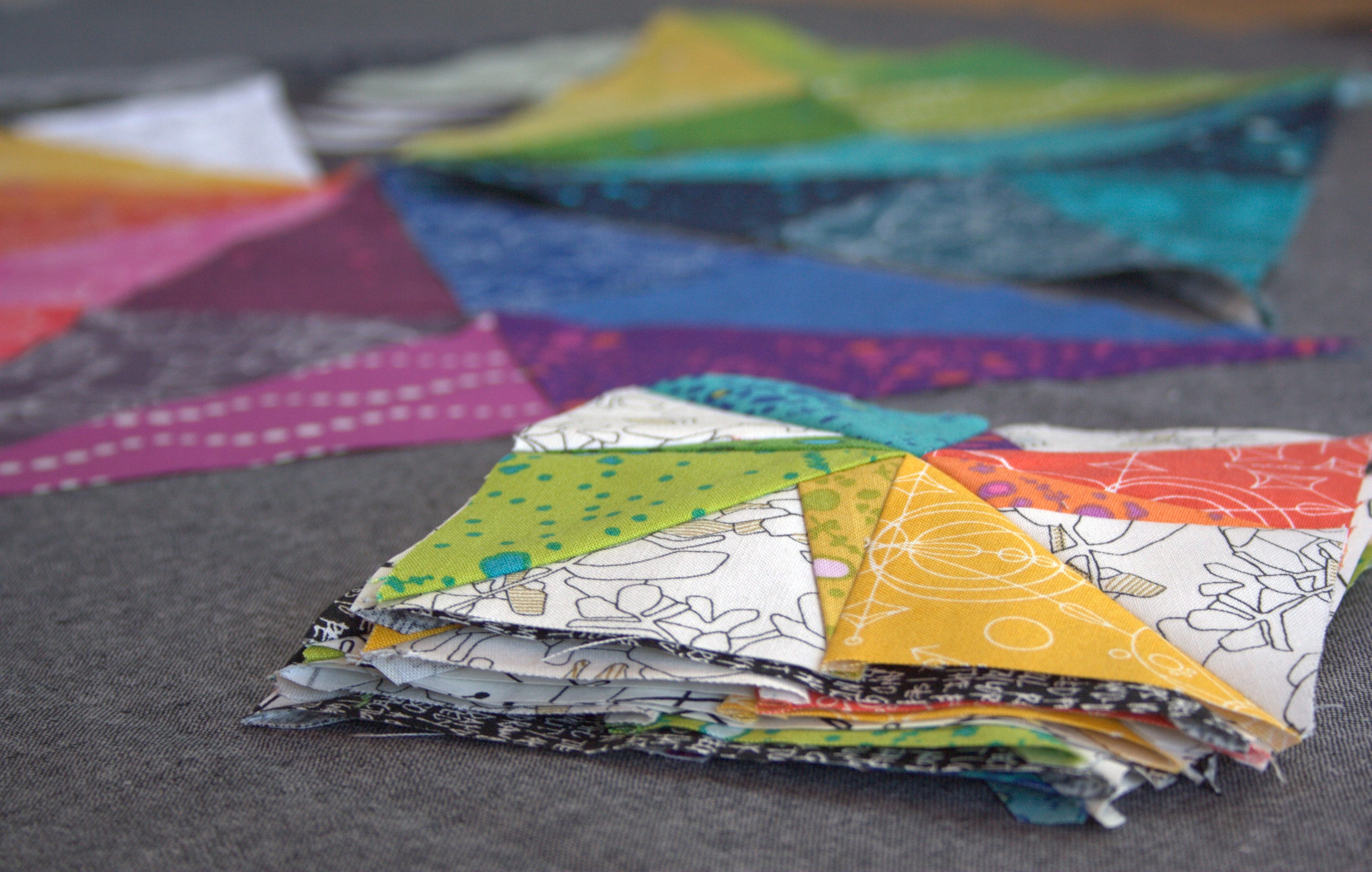
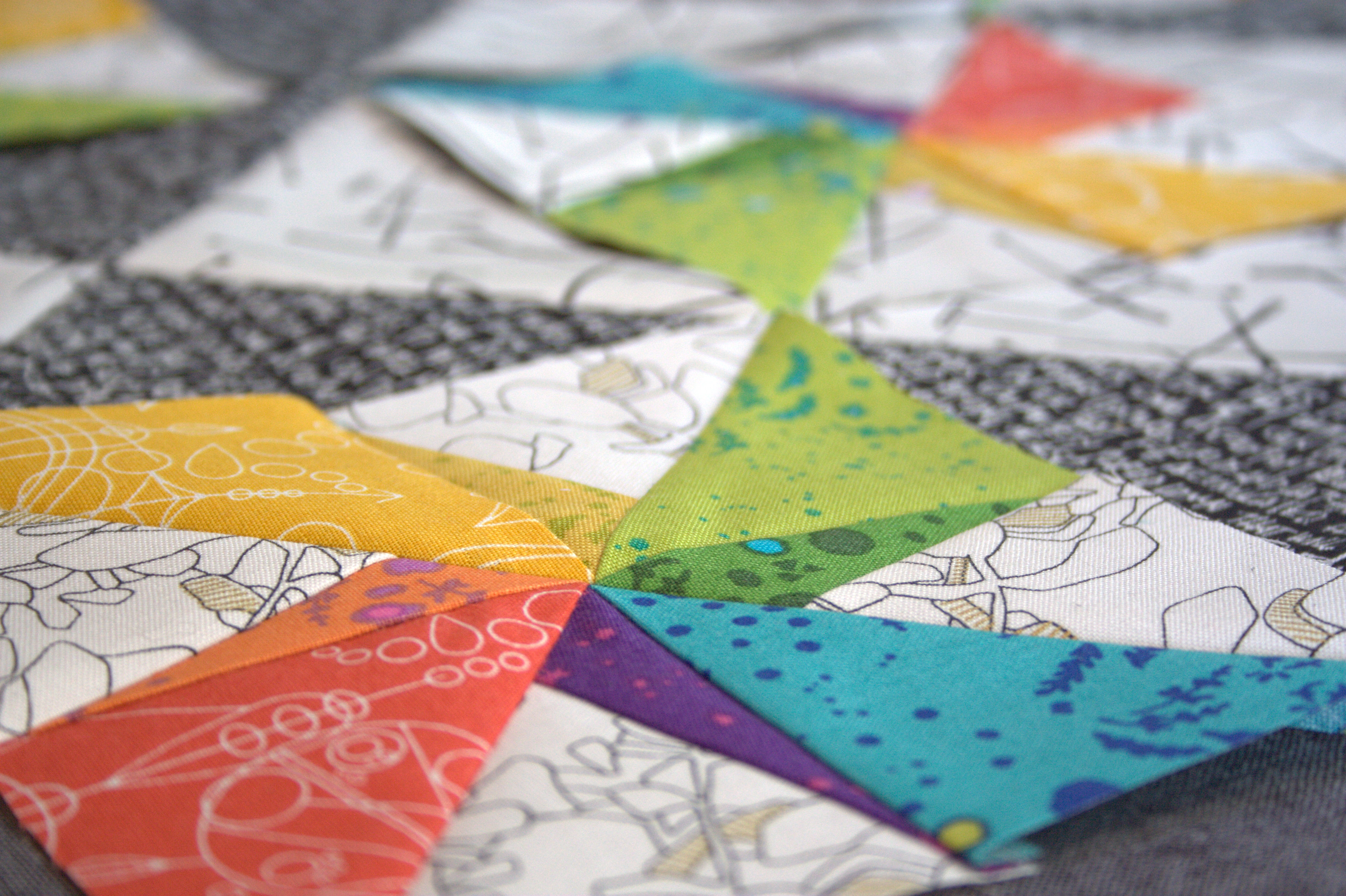
Now I just need to sew these blocks together and add the borders and this mini quilt top will be finished!

prismatic medallion rainbow alison glass version
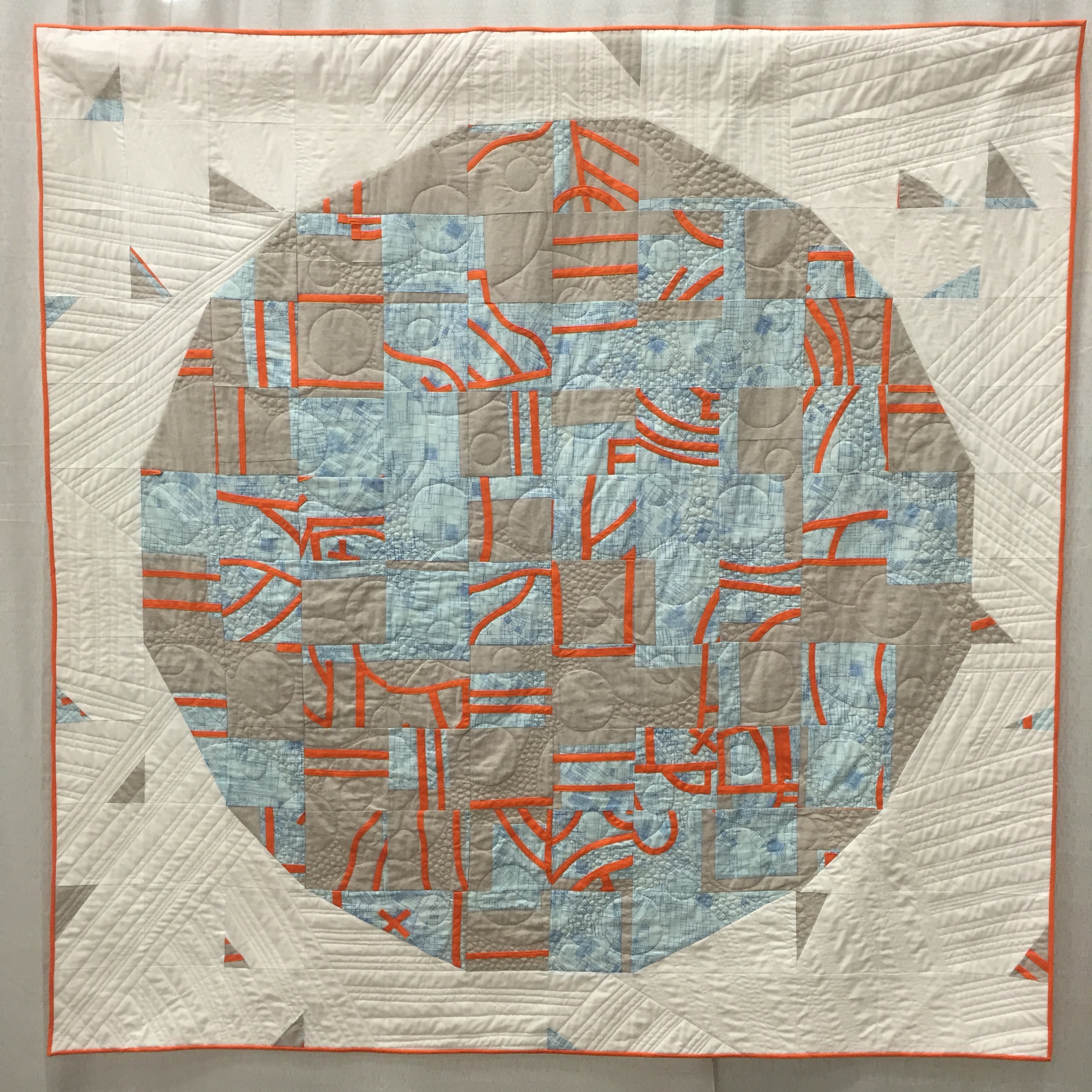
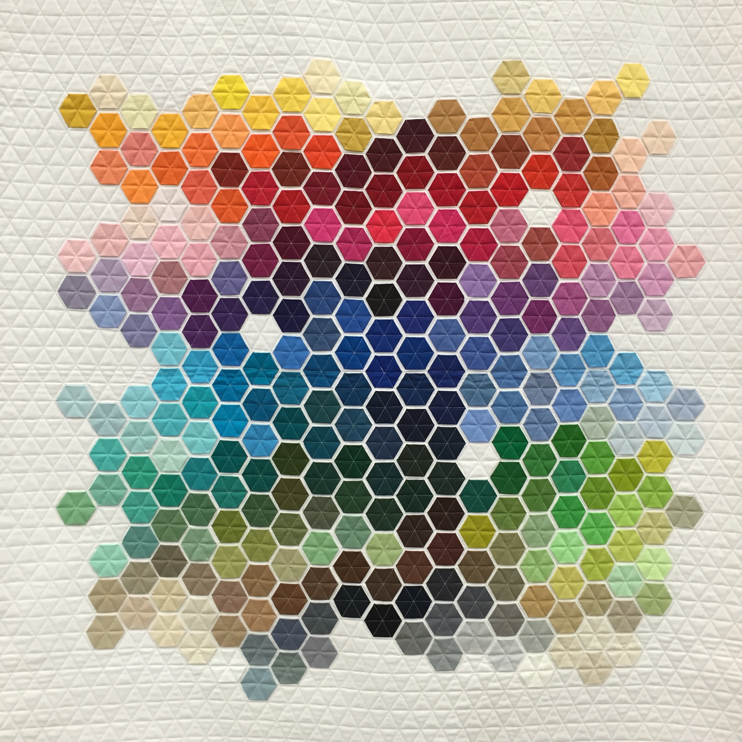
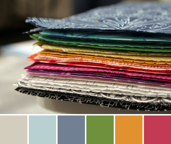
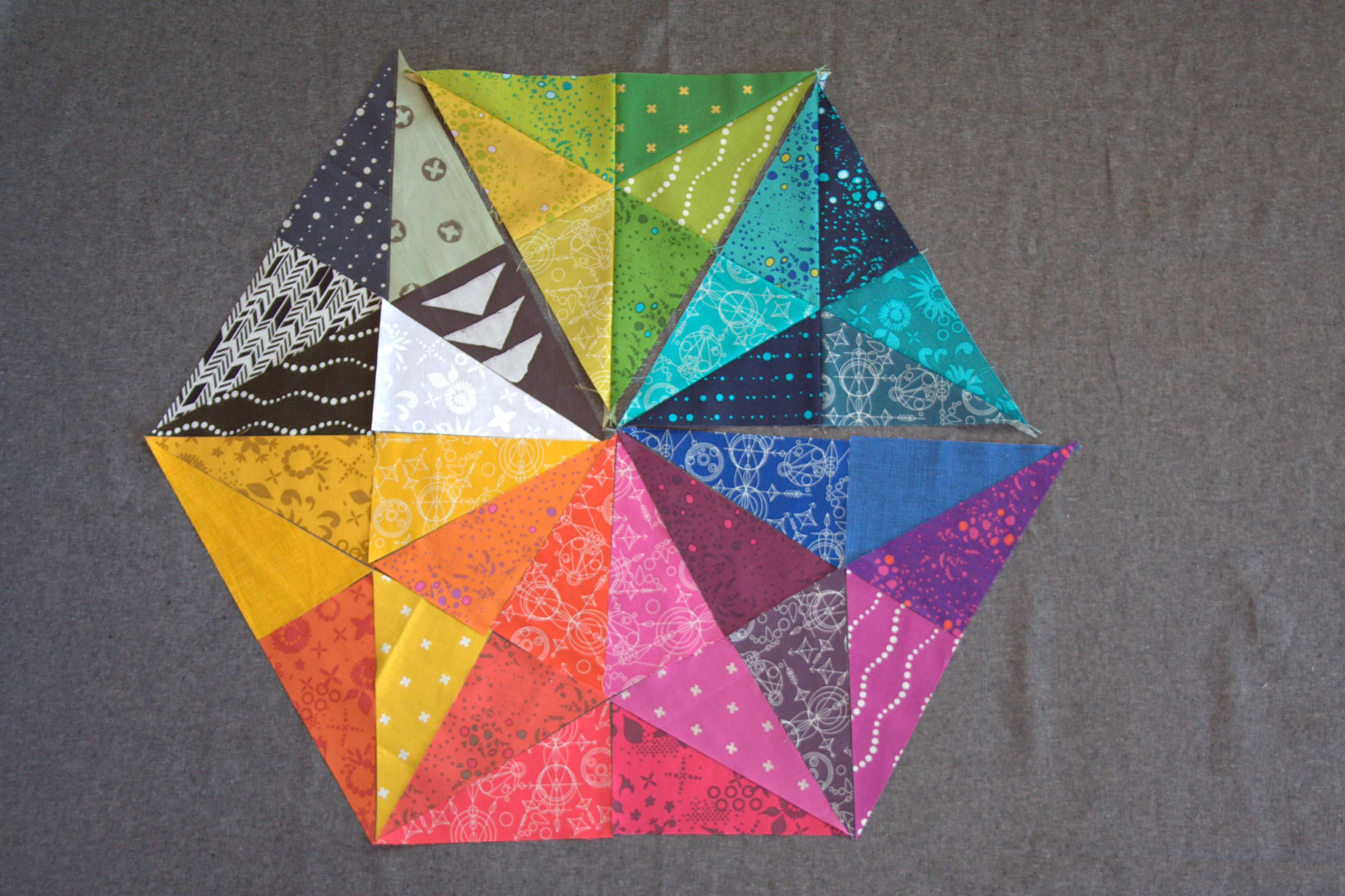
Next up is my progress on the Prismatic Medallion mini quilt I’m making for my partner in the Alison Glass Mini Quilt Swap. I definitely attribute my recent burst of rainbow to my purchase of the newest Alison Glass Sunprints. How could you resist making EVERYTHING with these fabulously bright and saturated fabrics!?

I’ve finally received all of the supplemental fabrics needed to fill out the black and white section, and all of the pieces are cut. Only the green and blue/turquoise triangles are sewn together so far. I’m really happy with the black and white triangle, and have come to accept the blue/purple triangle. I’m still debating the yellow/orange and the red/orange/magenta sections.

prismatic medallion alison glass version
Alison Glass handcrafted added in. I think it’s too brown for this palette.

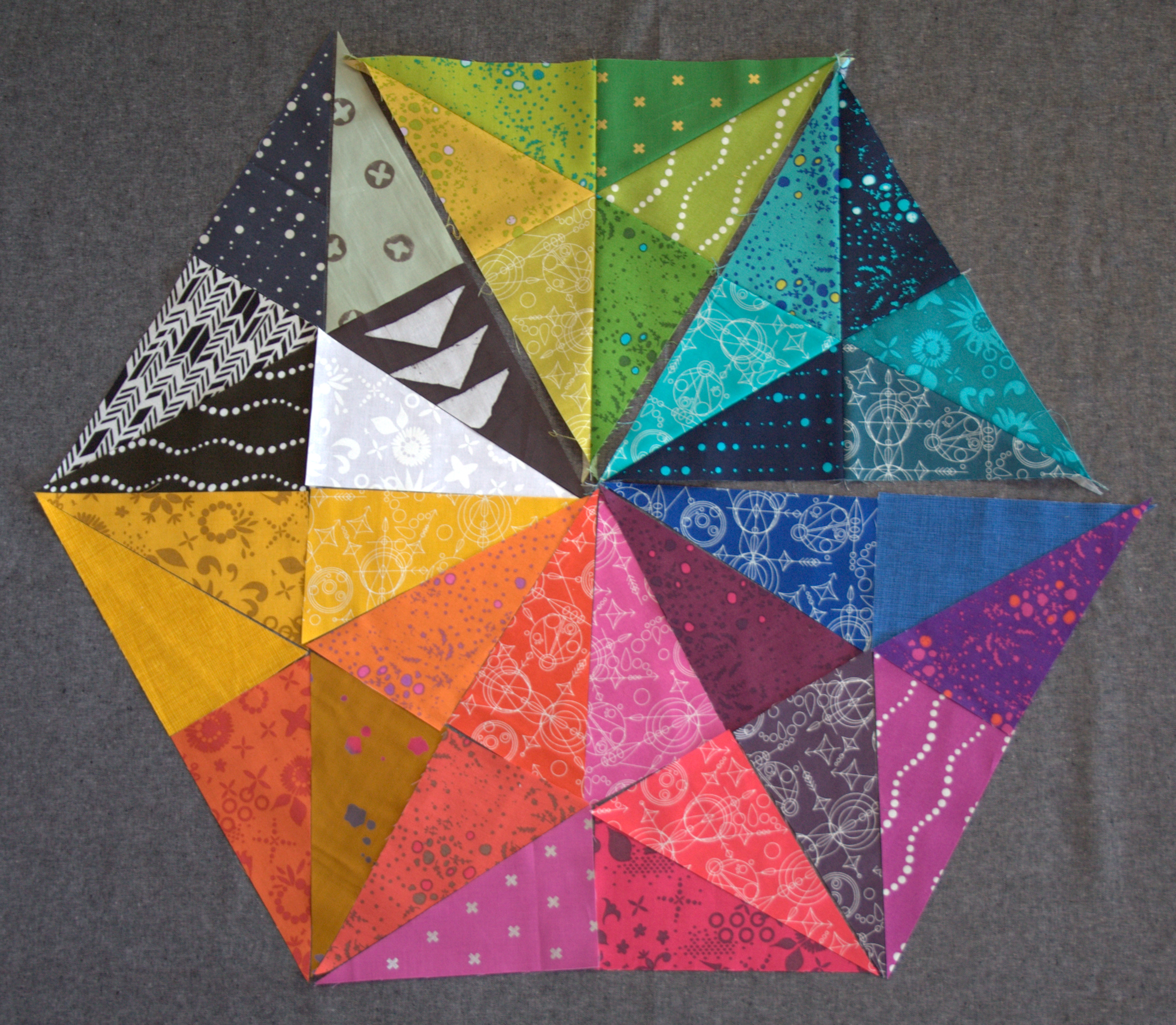
In the yellow/orange triangle (beneath the black and white one), I originally bought a fabric from Alison Glass’ s Handcrafted line to vary the colors a bit. Now I’m thinking it may be too brown for this palette. I’m leaning toward the brighter Cotton & Steel basics yellow instead.

prismatic medallion alison glass version
Magenta-purple spread out a bit in the bottom triangle.

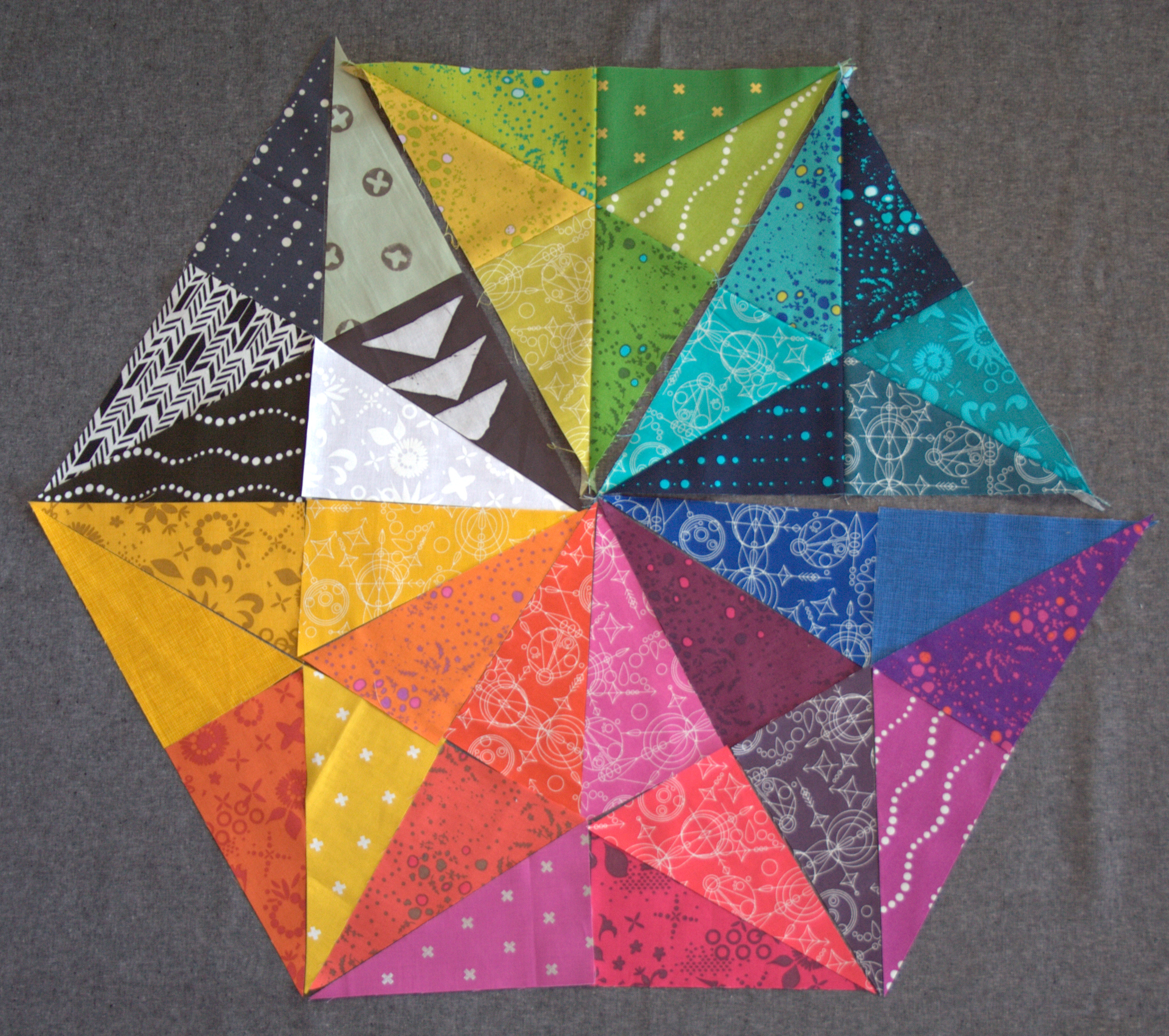
In the red/orange/magenta triangle (bottom center), I’m thinking I will spread out the purply magenta triangles a bit more. I’m thinking this bottom layout will be the final layout, with the C&S yellow and the spread out magenta. I need to decide soon and get this sewn together! What would you do?

embrace the rainbow

I’m linking up with Lee at Freshly Pieced for Work in Progress Wednesday.


Color Inspiration Thursday {43}

Meet Yvonne Fuchs, known as Quilting Jetgirl. I first met Yvonne in the New Quilt Bloggers Blog Hop hosted by Beth at Plum & June about a year ago. Since then, through blog comment exchange and other quilty interaction, we’ve become friends. I was fortunate enough to spend time with Yvonne in person at QuiltCon and I’m looking forward to many more quilting hang outs in our future, despite the fact that we live a country-width apart.

yvonne quilting jetgirl color palette

Corresponding solids from left to right:
Kona Pepper, Kona Tomato, Bella Longhorn, Kona Straw, Bella Pastel Blue, Kona Surf

Corresponding Aurifil thread from left to right:
4241 – V Dk Grey
2395 – Pumpkin Spice
2155 – Cinnamon
2320 – Lt Toast
2612 – Arctic Sky
2740 – Dk Cobalt

Today’s People Palette features Yvonne in front of her quilt Namibia Trees. The color play is fabulous, since who doesn’t want to pair bright reds & golds with royal blue!? Great choice in attire, Yvonne!

Yvonne is a big proponent of building and embracing the online quilting community, which is one of the many awesome things about her. She’s also not afraid to be real, and opens philosophical discussions about all things quilting and beyond. As she says on her blog, “Quilting is more than just a creative outlet for me. I want to pause and reflect on larger ideas to cultivate a community of discussion and insight.” You can read her philosophy discussion posts HERE. I particularly recommend The Four Agreements and Creativity and Time.

Quilting Jetgirl triangle-transparencyYvonne both creates custom quilts and designs quilt patterns, and recently released a gorgeous pattern called Triangle Transparency, which is currently available for sale in her CraftsyEtsy, and Payhip stores for $6 through Sunday, April 12th, which is a savings of 33% off of its regular price. Here are some more of my favorites from her recent quilts:

quilting jetgirl quilts
Top to bottom, left to right: Foothills Mystery Quilt, Love and Loss (Pantone quilt), Life: Ups and Downs, Tessellated Leaves

I asked Yvonne to answer three short questions to help the world get to know the color inspiration star of the week a little more intimately:

Where do you fit into the worldwide family tree of quilting?
I define my branch as the introverted, cat lady, quilter, blogger. I think I span between traditional and modern quilts in terms of style, but left to my own devices (aka with no commissioned quilts), I would lean heavier on the modern aesthetic.

What is the #1 most played song on your iPod?
I don’t know about song, but my favorite bands are Coldplay, Linkin Park, and Chevelle, and their songs are featured heavily in my music playlists. 🙂

What is your least favorite mode of transportation?
What an interesting question! That is really hard for me to answer. I love to walk, and I am amazed by cars, trains, and planes. I can get a bit motion sick in cars and boats, but a bit of planning ahead almost always solves that issue. I have only ridden a horse twice in my life, but both times were enjoyable experiences. Can I say riding a camel just because I never have (but I’d be willing to try!)?

I confirmed with Yvonne that she was choosing riding a camel as her least favorite mode of transportation, since she talked a lot about enjoyable transport, and she confirmed: I know it said LEAST favorite, and I guess I vote for riding a camel as least favorite (they spit, right?). I guess I just am super thankful I can still walk comfortably and I am amazed at modern contraptions to get me places faster than that.

Spit, they do! Thank you so much, Yvonne, for being my People Palette star!

You can find Yvonne in the bloggy quiltiverse here:

Blog
Instagram
Twitter
Facebook

Etsy

– – – – – – – – – – – – –

The color palette was created using Play Crafts’ Palette Builder 2.1 and a photo provided by Yvonne. All images were provided by Yvonne.

Color Inspiration Thursday {42}

Green, I need green! While the weather has been warming and mud season is almost officially upon us (yes, it’s a real season in Maine–it falls right between winter and spring), there is still a dire lack of green or signs of new life out in the world around us. So today I gathered all the green life I could find and had a little photo shoot. Sure, they are potted, but here is some springy green and life-filled color for your inspiration pleasure. Color palettes are created using Play Crafts’ Palette Builder 2.1 and my photographs.

green color palette

Corresponding solids from left to right:
Bella Betty’s Brown, Kona Black, Kona Basil, Kona Grass Green, Kona Old Green, Kona Baby Blue

Corresponding Aurifil thread from left to right:
5013 – Asphalt
2692 – Black
5023 – Medium Green
5018 – Grass Green
2850 – Med Juniper
2612 – Arctic Sky

Green, glorious green!

marsala color palette

Corresponding solids from left to right:
Kona Coal, Bella Cloud, Kona Pewter, Bella Peacoat, Bella Brick Red, Kona Black

Corresponding Aurifil thread from left to right:
1140 – Bark
2612 – Arctic Sky
2610 – Lt Blue Grey
1130 – V Dk Bark
2566 – Wisteria
5024 – Dark Brown

This may not be green, but it’s alive and beautiful. This lovely succulent is on top of the trends, since I dare say it’s sporting the lovely Pantone color of the year, marsala. Am I right? Even if there isn’t a solid that matches perfectly, I think if you mix Bella Peacoat with Bella Brick Red, that would land nicely on Marsala.

green color palette succulent

Corresponding solids from left to right:
Kona Coal, Kona Basil, Bella Fresh Grass, Kona Celadon, Kona Medium Grey, Kona Sky

Corresponding Aurifil thread from left to right:
1158 – Med Grey
5021 – Light Grey
2890 – Dk Grass Green
2845 – Lt Juniper
2625 – Arctic Ice
2560 – Iris

Glorious green. This succulent has seen better days, but I’m hoping that once the sun begins to shine more regularly, the temperatures warm, and perhaps I figure out the best succulent watering schedule for success, it will shine. I’m sure of it. For now, it offers promises for the days to come where green sprouts will be all around us!

Did anyone else notice that despite all the life in these palettes, “Arctic Sky” or “Arctic Ice” made an appearance in every palette!? I just have to laugh at that!

QuiltCon 2015 Reflection: Quilts

I’ve been home from QuiltCon for a good month now, but I cannot let the experience pass without some mention of the amazing quilts that hung in the show. I wish I could say that I spent hours gazing in awe at every quilt there, but to be honest, I’m SURE that there are quilts I didn’t even see. Every time I turned around, I found another quilt I had yet to see.

quiltcon 2015 quilts
Best of show – i Quilt by Kathy York.

QuiltCon was my first quilt show, and it was an amazing place to begin. Every single quilt was just one more bit of inspiration, and made my brain swirl with possibility. There is a lot of talk about what makes a quilt “modern”, but I think that the quilts hanging at QuiltCon definitely fit the bill, as vague and openly as that “modern” label extends. Being fairly new to quilting, there were quilts where my gut reaction was, “wow, THAT’s a cool idea/technique!”, where I had not even fathomed the possibility of a quilt made in such a way or in such a design. Like I said in earlier posts, I didn’t take nearly as many photos at QuiltCon as I would have liked, so here is just a collection of a few of my favorites. Click here to see most of the quilts from the show, care of Sew Mama Sew.

quiltcon 2015 quilts
Akhaten by Shannon Page. Description said: “This resulted from deconstructing my original design. I cut up the original top to make this and I could not be happier with the result.” –Can you imagine!? Now THAT is a bold idea that resulted in a cellularly fantastic outcome!
quiltcon 2015 quilts
Geometric Rainbow by Nicole Daksiewicz of Modern Handcraft
quiltcon 2015 quilts
Iceberg by Crystal McGann
quiltcon 2015 quilts
Group or Bee Quilt: Churn Dash 2: Complementary by Martha Peterson, Deborah Ferguson, Chandra Wu
quiltcon 2015 quilts
Spiraling Out of Control by Christa Watson of Christa Quilts
quilts of quiltcon 2015
Deconstructed Lonestar by Amy Struckmeyer
quiltcon 2015 quilts
Museum Windows by Melissa Fontanese
quiltcon 2015 quilts
Catenary by Carolyn Friedlander: even more amazing in person, if it can be imagined!
quiltcon 2015 quilts
Holy Sh*t Sherlock by Kristy Daum

I debated waiting until the crowd in front of Sherlock dissipated, but decided I really liked seeing him peek out and took the photo as shown. This quilt was one that begged to be visited multiple times!

quiltcon 2015 quilts
Chess on the Steps by Krista Hennebury of Poppyprint
quiltcon 2015 quilts
Quilting Excellence Award Winner: Coral Reef by Marla Varner
Check out that quilting!
quiltcon 2015 quilts
That Twitch by Cara Sheridan

Some may be surprised that I rank this quilt in my top picks, since one might think my typical OCD tendencies might twitch at the sight of this one. To be honest, it makes me giggle with glee. What a simple yet completely unique idea. It’s a collection of yellow squares, with one out of wack. Tell me it’s not brilliant!!?

paper pieced modern amy garro icy waters quilt
Icy Waters by Amy Garro of 13 Spools (pardon how cropped this one is. No excuses.)

In all the known quilting world, I find myself the most drawn to modern quilting and paper piecing. I’ve been designing paper pieced patterns for about a year, but still struggling with finding a way to mix the two: modern and paper piecing. Enter: Amy Garro. This quilt is from her new book Paper Pieced Modern*, and when I first saw it and realized it was from an entire book of awesomely paper pieced modern quilts, my reaction was, “Yesssssssssssssssssss!!!” Let the fun begin!

Modern Quilting Trends

A lot of quilter bloggers have written about trends in the quilts that were accepted into the QuiltCon show, and rather than repeat what has already been said, here are a few excerpts that I also definitely noticed in the show:

I most agree with Lee from Freshly Pieced‘s observation that “design is the single most important element of a modern quilt” and that “walking around the floor, it was pretty hard to miss the layout creativity that was on display.” Lee totally nailed my gut reaction mentioned above; the layout creativity blew my mind and explored design elements beyond my wildest dreams. Read her full post here. Of course, taking Lee’s Off the Grid: Alternate Layout class was an eye-opening highlight of my trip, so I may be a bit biased, but I really think that she hit the nail on the head regarding the direction modern quilting is headed.

Afton from Quilting Mod noticed a prevalence of dense free motion quilting, straight line or matchstick quilting, circles or quarter circles, pixelated quilts (swoon Sherlock), quilts with actual words, gemstones, architecture, bold saturated rainbow colors, and a more lenient look at perfect craftsmanship with more of a focus on design. I definitely noticed a strong prevalence of dense free motion quilting and matchstick quilting, which is one more motivator to improving my free motion quilting skills!

I also loved Christa from Christa Quilts‘ reflections on modern quilting post QuiltCon. My favorite bit of wisdom I got from her post was “…just because you enjoy modern quilts doesn’t mean you have to BE a modern quilter. And just because you consider yourself part of the movement doesn’t mean you have to make exclusively modern quilts.”  Christa mentioned being able to see the quilters’ heart and soul going into the quilts, and I agree that so many quilts not only were aesthetically gorgeous, showed masterful craftsmanship, and exhibited a thinking-out-of-the-box design element, but they also expressed emotion. Maybe I’m just a quilting sap who found my creative niche in the mostly-modern quilting world, but the quilts spoke to me. (No, I’m not weird. Just humor me, ok?) The quilts at QuiltCon were a huge inspiration for me to continue playing, creating, and stretching my boundaries.

Here are a few of the blog posts specifically about the quilts at QuiltCon, if you want to get a more in depth look at other bloggers’ observations and thoughts:

Bryan House Quilts QuiltCon in a Nutshell
Christa Quilts Christa’s Soapbox – My Thoughts About Modern Quilting Post QuiltCon
Christa Quilts My Experiences from QuiltCon 2015
Christa Quilts More Quilts from QuiltCon 2015
Don’t Call Me Becky QuiltCon 2015
Freshly Pieced QuiltCon: My Thoughts
On the Windy Side QuiltCon Recap 1: The Quilts
Quilting JetGirl QuiltCon 2015: Quilts!
QuiltingMod QuiltCon: Trends Part I
QuiltingMod QuiltCon: Trends Part II
QuiltingMod QuiltCon: Trends Part III
The Plaid Portico Multiple QuiltCon Quilt posts

Yvonne of Quilting Jetgirl has a pretty extensive list of quilt blogger posts about QuiltCon HERE.

Are you a quilter blogger who also posted about the quilts shown at QuiltCon? Let me know and I’ll add you to my list above!

*Amazon affiliate link included, which means if you buy Paper Pieced Modern by clicking through, I receive 4% compensation with no extra cost to you.

Color Inspiration Thursday {41}

You would think that by now, nearly to April, I would have a few signs of spring to share in this week’s color inspiration. But lo, Maine has not yet gotten the memo that spring begins officially tomorrow and the temperatures have been in the teens, with a rare high of 30. So I decided to embrace the winter for a little longer, and showcase some more of nature’s frigid beauty. Color palettes are created using Play Crafts’ Palette Builder 2.1 and my photographs.

snow weather vane moon

Corresponding solids from left to right:
Bella Peacoat, Bella Etchings Charcoal, Kona Silver, Bella Periwinkle, Kona Windsor, Kona Nightfall

Corresponding Aurifil thread from left to right:
2785 – V Dk Navy
1158 – Med Grey
2615 – Aluminum
2524 – Grey Violet
1248 – Grey Blue
2581 – Dk Dusty Grape

Believe it or not, this cute little weather vane sits atop quite a large cupola that we removed from the chicken coop roof while winterizing it. The snow is still a good 3-4′ deep, but the beauty of the whimsical moon pointing toward spring with sunny shadows cast on the deep snow had to make its way into a palette. As cold as it is, I personally love this palette. Blues and greys will definitely become a Storm at Sea quilt one of these days. Perhaps I’ll use this palette for planning!

pine branch in the snow color palette

Corresponding solids from left to right:
Bella Bunny Hill Blue, Kona Pewter, Bella Fir, Kona Biscuit, Bella Lead, Kona Moss

Corresponding Aurifil thread from left to right:
2560 – Iris
2610 – Lt Blue Grey
2372 – Dk Antique Gold
2335 – Lt Cinnamon
2370 – Sandstone
2905 – Army Green

A little pine branch, nestled in the icy depths. I was really hoping for a bit more green to read through, but really, the season for green is not *yet* upon us. This instead is an earthy, neutral palette, with just a touch toward green with that final Moss-Army Green.

blue sky buds color palette

Corresponding solids from left to right:
Bella Moda U Brown, Kona Mushroom, Bella Lt Blue, Bella Mauve, Kona Blue Jay, Kona Slate

Corresponding Aurifil thread from left to right:
2630 – Pewter
2370 – Sandstone
2560 – Iris
2566 – Wisteria
4140 – Wedgewood
1310 – Med Blue Grey

Shhh don’t tell anyone that these magnolia buds are on the tree all winter long. I’m pretending it’s a sign of new life! Spring! Blue skies at the very least are peeking through. The warm sun shines, and surely, SURELY spring must not be too far behind. Right!?

What season are you experiencing right now? Are you eager for the next, or enjoying the current weather? I find it easy to enjoy winter until those first teaser warm days. Then my mind is on planting seeds, raising chicks, digging in the earth, and spending our days outside. Our entryway may be full of potting soil in the very near future!

Color Inspiration Thursday {40}

It seems the QuiltCon blog posts are starting to slow to a trickle, but the influence of the experience lingers on. Before heading to QuiltCon, I had visions of finding and photographing dozens of fabulously talented quilters in front of their quilts for future people palettes. I didn’t take dozens. In fact, I only took one. But it’s a fabulous one, and of a woman I’m so fortunate to have met.  Today’s star is Krista Hennebury, quilter, retreat organizer, and author of her new book Make It, Take It for Martingale, which is meant to feel like a retreat in a book–sewing fun things with friends. I was fortunate enough to meet Krista through our serendipitous pairing in the Schnitzel and Boo Mini Quilt Swap, Round 3 earlier this year. I was tasked with creating a quilt for Krista, and fortunately she has great taste! I had a blast, made this quilt for her, and gained a friend in the process.

krista hennebury people palette

Corresponding solids from left to right:
Kona Black, Bella Brick Red, Bella Longhorn, Kona Cedar, Bella Etchings Charcoal, Bella Gray

Corresponding Aurifil thread from left to right:
2692 – Black
2355 – Rust
2350 – Copper
2235 – Orange
5013 – Asphalt
5011 – Rope Beige

This palette features Krista in front of her gorgeous quilt Chess on the Steps, which hung at QuiltCon. I’m intrigued by this quilt, which she calls “improv under the influence”, since it’s a quilt with a very improv feel, but created using traditional chain piecing methods. Those who know me know that I struggle with improv, but I feel like this quilt may be the place to begin! Fortunately, it was the pattern of the month in September 2014 and is available for free for members of the Modern Quilt Guild.

I asked Krista to answer three short questions to help the world get to know the color inspiration star of the week a little more intimately:

Where do you fit into the worldwide family tree of quilting?
I describe my quilting as traditionally-informed modern quilting if someone really needs a description, but really, I just like making quilts. I’ve been blogging over 5 years, teaching for 13, running a day-retreat business for 11. I love my local traditional and modern guilds, where I’m an active member of both.

What is your first memory of being really excited?
The Haunted House at Disneyworld, age 9.

If you could choose anyone, who would you choose as your mentor?
Gwen Marston

Krista actually wrote a really great blog post just the other day about a weekend spent sewing with Gwen Marston, so if you want to hear more about the amazing woman Krista wishes could be her third grandma, read the post here.

You can find Krista in the bloggy quiltiverse here:

Blog
Instagram
Facebook
Flickr
Twitter
or go on a virtual quilt retreat with her by buying her book:*Disclosure: Amazon affiliate link above, which means if you buy the book by clicking through, I receive 4% of the sale.

– – – – – – – – – – – – –

All color palettes are created using Play Crafts’ Palette Builder 2.1 and my photo, taken at QuiltCon 2015.

Color Inspiration Thursday {39}

Walking around the vendor booths at QuiltCon, there was such a delightful array of color. Color everywhere, as fabric, quilts, notions, signs, or quilts. As I said earlier, I took a surprisingly small number of photographs, but I still have a few colorful ones to share. Color palettes are created using Play Crafts’ Palette Builder 2.1 and my photographs.

aurifil color palette

Corresponding solids from left to right:
Bella Dark Teal, Bella Turquoise, Kona Bahama Blue, Bella Shocking Pink, Bella Bunny Hill Pink, Bella Home Town Sky

Corresponding Aurifil thread from left to right:
4182 – Med Turquoise
4093 – Jade
1148 – Lt Jade
2215 – Peach
2314 – Beige
2600 – Dove

The Aurifil booth did not disappoint when it comes to color. With this gorgeous display of colorful large spools of Aurifil thread, I had to stop and take a gabillion photos. I am wishing I had a tripod and another 20 minutes, but even with a few quick hold-my-breath-to-steady photos, I was able to get one suitable clear one. That front and center turquoise variegated thread is one I’ve had my eye on for quite some time but haven’t yet used. I think I may have to remedy that soon. Gorgeous colors of this, my favorite silky smooth thread! The palette reminds me of the beach, for some reason. The summery feel is much appreciated this time of year!

amy garro quilt color palette

Corresponding solids from left to right:
Bella Stone, Bella Sea, Bella Glacier, Bella Sapphire, Kona Regal, Kona Nautical

Corresponding Aurifil thread from left to right:
5011 – Rope Beige
4140 – Wedgewood
5008 – Sugar Paper
1248 – Grey Blue
2581 – Dk Dusty Grape
2785 – V Dk Navy

This palette is created from one of my top favorite quilts at the show, Icy Waters by Amy Garro. The color palette includes a gorgeous range of blues, which could be part of why I am so drawn to this quilt. Icy Waters is from Amy’s new book, Paper Pieced Modern*, which I really can’t wait to get my hands on. I am quite drawn to paper piecing but also to modern style, and Amy’s patterns are SUCH a fabulous melding of the two. I discovered her book during the book release blog hop, and was lucky enough to meet and have dinner with Amy while in Austin. Not only is she a fabulous designer, she’s sweet and fun to hang out with, too.

To share a somewhat unrelated side story from QuiltCon, after an evening of getting appetizers and drinks (for the non preggo ones in attendance) in a typical dimly lit and loud wine bar, Amy did something that really showed what a sincere and thoughtful person she is. As some of you know, I’m severely hard of hearing, so do best face to face where I can “read” lips. In a dark, loud restaurant in a group setting, it is a challenge for me to catch conversation, so I jump in where I can and just deal with missing out on the bulk of conversation. This particular evening, Stephanie was with us, so she took the time to fill me in with a bit of ASL signing here and there so that I could better participate in the conversation. As we were parting ways and hugging as old friends who just met do, Amy signed “Good to meet you” as she said farewell. My response? “Did you just SIGN to me!?” I learned that she had learned sign language quite a number of years ago, but still remembered some. It may seem like a tiny insubstantial thing, but it really stuck with me and made me appreciate my quilty friends more. So yeah, I like Amy 🙂

I will share more reflections about the quilts at QuiltCon in a future post, but Amy’s fabulous Icy Waters is a great example of the innovative, aesthetically flowing, modern quilts that hung in the show. There is SO much talent out there!


* Note: Amazon affiliate link included.


Color Inspiration Thursday {38}

In the spirit of QuiltCon decompression, this week’s color inspiration will feature photos from my travels. To be honest, I took FAR less photos than I typically do (hundreds or thousands less, in reality), since I was so caught up in meeting and conversing with people and seeing everything there was to see. I wish that I could have borrowed a Duplicator from Calvin & Hobbes (or maybe the Transmogrifier if I wanted to be a photographer lizard) to make four of myself: one to meet and converse with people; one to see and fully take in all of the amazing quilts; one to visit the booths and talk with admired fabric and pattern designers, fabric shop owners, and company figureheads; and one to photographically document the entire event. But lo, I am only one person, and one completely gobsmacked, overwhelmed, perma-grinning person at that. So here you go, your color inspiration pulled from the few gems I found in Austin during QuiltCon 2015. But first–did I mention that I got to meet Anne from Play Crafts, the creator of the beloved Palette Builder 2.1!?

kitty nightquilter with anne from playcrafts
Don’t mind the fact that I didn’t figure out where to look on the phone to actually look AT the photo until the very end of QuiltCon. Im not a selfie person!

The following color palettes are created using my (on the right) photographs made into color palettes using Play Craft’s (on the left) Palette Builder 2.1. Now you have a visual of the faces behind these weekly posts!

IMG_9199-palette (3)

Corresponding solids from left to right:
Bella Gray, Bella Home Town Sky, Kona Graphite, Bella Leaf, Kona Goldfish, Kona Sangria

Corresponding Aurifil thread from left to right:
2324 – Stone
2847 – Lt Grey Green
1126 – Blue Grey
5018 – Grass Green
2318 – Cachemire
2230 – Med Peony

This lovely stack is my pre-cut 7″ squares for Cheryl Arkison‘s Value class before she kindly suggested that we match value without looking at color at all (followed by a long sidelong glance in my direction–what!? is it that obvious that I’m totally hooked on color in rainbow order!? hah). I’ll talk much more about this in a future post, but Cheryl’s class was fabulous at making me stretch out of my comfort zone. I learned a ton, and am looking forward to playing with value more in coming projects. And color. Of course I can’t let go of color.

textile event space wall in austin texas

Corresponding solids from left to right:
Kona Charcoal, Bella Admiral Blue, Bella French Blue, Bella Rust, Cotton Gold, Bella Tan

Corresponding Aurifil thread from left to right:
2570 – Aubergine
1310 – Med Blue Grey
5008 – Sugar Paper
2385 – Terracotta
2930 – Toast
5010 – Beige

This fabulous structure was right across from the Conference Center hosting QuiltCon. The building is called “Textile”, which is just so appropriate for its gorgeous aesthetic. I could not pass by this terracotta/rust colored door paired with the admiral blue walls with french blue Xs without photographing it profusely. Sure, I may have lost the group of amazing women with whom I was walking, but being left behind for the sake of getting a great photo is nothing new for me–did I ever tell you about the time I almost got left in the Mexican jungle because I was photographing hearts in a palm leaf?–Anyway, this is my favorite photo from Austin (and I was able to finally catch up with and join my friends after snapping it). I only wish I lived nearer to Austin so that this could become a quilt photo backdrop!

If you went to QuiltCon, did you take any stellar photos? I’d love to see them!


Color Inspiration Thursday {37}

It seems the online quilting world has become a swarm of buzzing bees in preparation for QuiltCon. Either we are frantically prepping for our classes, making our handmade accessories, and plotting the long journey, or we are vicariously living through all of the other ubiquitous Instagram and blog posts about QuiltCon. I admit, I’m one of those bees. I’m super excited to be attending QuiltCon, my first ever quilting event, and am definitely caught up in the energy and excitement. This buzz of excitement around QuiltCon got me thinking about color inspiration, and I thought it was the perfect time for another People Palette. Stage left, enter the Modern Quilt Guild email introducing their new staff members, with the bright and colorful Riane Menardi introductory photo. Viola! Our next People Palette:

riane menardi color palette

Corresponding solids from left to right:
Bella Etchings Stone, Bella Pond, Bella Lemon, Bella Amelia Orange, Kona Kumquat, Kona Tangerine

Corresponding Aurifil thread from left to right:
5020 – Light Military Green
2850 – Med Juniper
1135 – Pale Yellow
2150 – Pumpkin
5009 – Medium Orange
1154 – Dusty Orange

Meet Riane (pronounced Ree-ann). She’s the new Communications Manager at the Modern Quilt Guild (MQG). Trust me, she’s great at what she does! I contacted her yesterday morning asking if she would be interested in this last minute whirlwind People Palette moment of stardom (I’m a busy bee preparing for QuiltCon, remember? I’m drinking the last-minute-nectar this week!), and by noon all the photos were sent, questions answered, and communication clearly and efficiently handled. Awesome.

For a little bit of background, here is an excerpt from her MQG intro:

My background is in journalism, but I’ve done just about everything under the sun in communications. I worked for ReadyMade magazine before it was put to rest (R.I.P.), and then went on to help indie handmade companies do promotions, events and social media. I also worked as a community builder for a startup handmade marketplace (not Etsy, but close). And for the past year, I’ve been with an agency, helping clients run marketing campaigns and communications. I also contribute words, designs and project management to Fresh Quilts from time to time.

I’m based in the sweet, sweet heartland of Des Moines, Iowa, and when I’m not sewing or writing, you can find me sipping craft beer, doing yoga or cycling (but only in weather over 50 degrees).

The quilt behind Riane is one that she designed, and which was featured in Fresh Quilts magazine. The pattern is available in the most recent issue (though a new one is due out soon, so you may have to backorder it).

fresh quilts magazine

I asked Riane to answer three short questions to help the world get to know the color inspiration star of the week a little more intimately:

Where do you fit into the worldwide family tree of quilting?
I love this question. Right now, I would say that I’m that independent, fun-loving niece who’s trying to learn as much as possible from the amazing, crazy and inspirational women in her life (aunts, grandmothers, cousins, etc.). I’m like a sponge — trying new things, going new places and developing my personal style, but all while remembering the lessons and wisdom learned from my quilt family.

My favorite branches to swing from, however, are the ones where we play with modern minimalism, neutral linens and the sweet, sweet joys of hand-quilting (especially sashiko).

-and if you want to get technical-

I am the new Communications Manager for the MQG and a contributor and project editor for Fresh Quilts magazine.

What is your least favorite mode of transportation?
Walking in heels. I love heels, but I always seem to encounter a TON of unexpected walking when I’m in my highest get-ups. And while I generally rely on my trusty (Kia Soul) steed to get me from here to there, my favorite mode of transportation would probably be via camel, if I had that option. They’re such badasses!

If you could choose anyone, who would you choose as your mentor?
Dustin Hoffman, hands down. Have you ever seen the movie Stranger Than Fiction? Ever since I first watched it, Dustin Hoffman has been my spirit animal. Even though he’s (probably?) not a quilter, I’d like him to guide me through life with his calm, quirky wisdom.

You can find Riane in the bloggy quiltiverse here:

Or you can say hi in person at QuiltCon. I can’t wait to meet Riane next week and welcome her to the MQG family. Say hi if you see her! She’ll be the one riding a badass camel (maybe?)!

– – – – – – – – – – – – –

All color palettes are created using Play Crafts’ Palette Builder 2.1 and photos were provided by Riane.

Color Inspiration Thursday {36}

The snow just keeps on coming. Just about every other day for the past two weeks, we have had a snowstorm drop another 6-12″ of snow. We live in a veritable snow fortress! I know a lot of New Englanders are getting tired of it, but I admit–I still love it. It’s so pristine and gorgeous, and to be honest, having to dig tunnels to get out our front door is living a childhood dream for me. Walking down those paths with snow towering on either side is just so cool! My children love it, too, so I won’t be complaining.

Loving the snow  doesn’t mean I wouldn’t mind a little getaway to the tropics. Here are my final photos from our vacation in Cozumel and Belize early last month. Color palettes are created using Play Crafts’ Palette Builder 2.1 and my photographs.

green palm leaf color palette

Corresponding Kona cottons from left to right:
Palm, Ivy, Grasshopper, Lime, O.D. Green, Olive

Corresponding Aurifil thread from left to right:
5021 – Light Grey
2887 – Olive
5018 – Grass Green
2888 – Fern Green
4173 – Dk Olive
5015 – Gold Yellow

With all this white, I really needed some green. We are nearing the time of year when I feel that strong desire to grow something–anything! and often get my seeds planted under a grow light. There’s something about the tiny green sprouts of new life that help make the last cold days of winter linger a little less closely. This color palette gives me a good dose of green during a very green-less season!

belize flowers color palette

Corresponding solids from left to right:
Bella Cherry, Kona Wine, Kona Hunter Green, Kona Basil, Bella Avocado, Bella Popsicle, Bella Cayenne

Corresponding Aurifil thread from left to right:
2395 – Pumpkin Spice
2355 – Rust
5021 – Light Grey
2892 – Pine
2887 – Olive
2230 – Med Peony
2270 – Paprika

These bright beauties were spotted at Bacab Eco Park in Belize. Bright flowers sure know how to brighten a snowy day. I added an extra color to this palette, because I really wanted the pinks and reds to be well represented. In playing around with this palette, I also discovered that Play Crafts has been updating their Palette Builder! Now not only can you get matching Kona Cottons, but you can also get matching Moda Bella solids OR opt for “All Solids”, which will match the closest color regardless of collection. I love this option, since I’ve noticed that some of the Kona matches aren’t always true to the color in the palette/photo, so adding the entire pool of Moda solids to the mix is a great idea! This makes the available matches quite long, though, so I plan to include a little of each in my Color Inspiration posts each week. I most likely will opt for “All Solids” and will list the best matching fabric solids for each palette, in addition to the matching Aurifil thread. Quilty color overload!

Do you mix and match your solids when you quilt, or do you opt for all one brand?