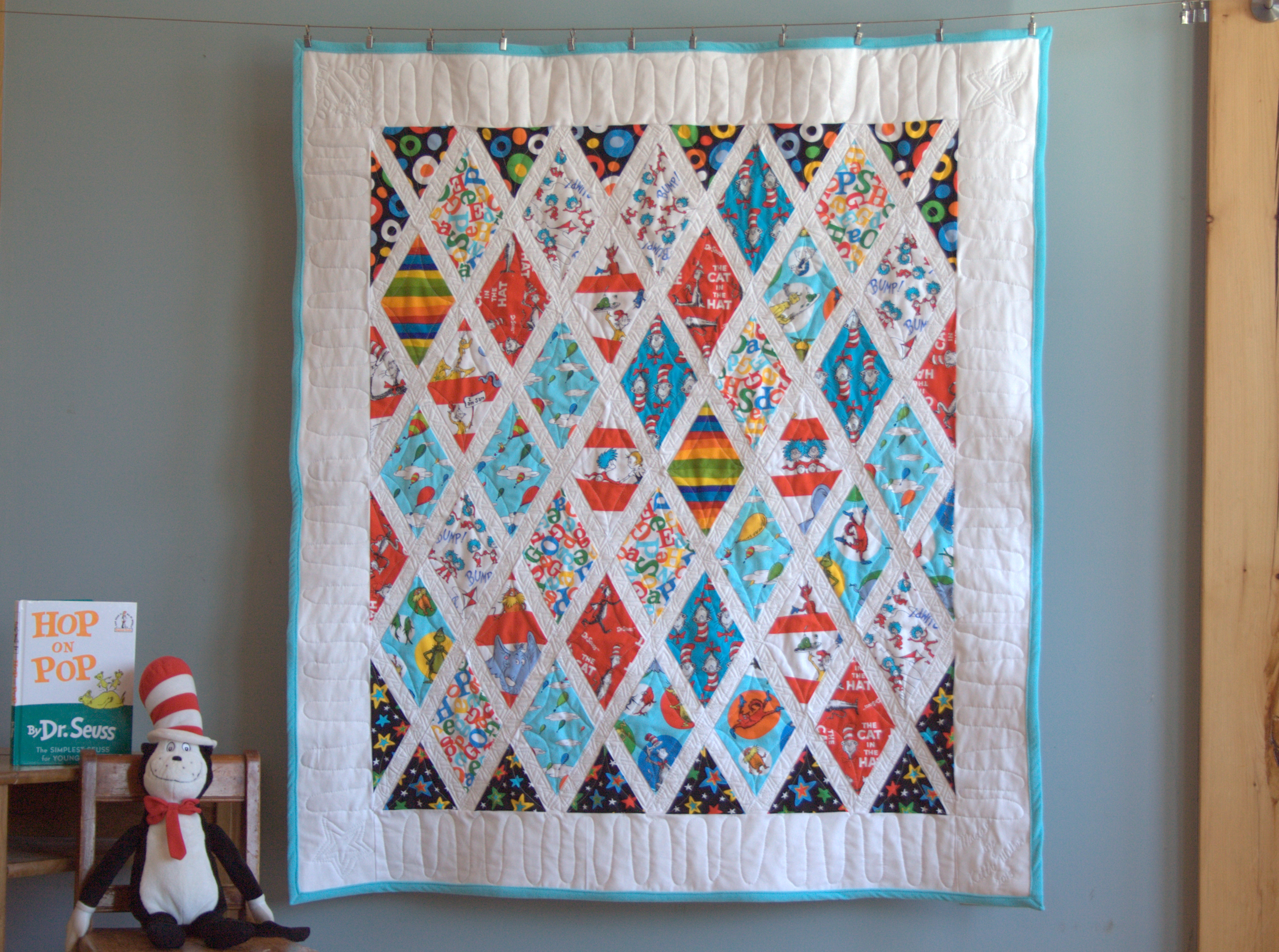
The weeks leading up to QuiltCon registration, one suggestion echoed in the blogosphere from people who had attended the previous QuiltCon: don’t pack your schedule too tightly. I decided that I would take two all-day workshops and sign up for three lectures on the other two days, limiting the lectures more because I wasn’t sure how I would do in a lecture with my hearing as it is (I’m severely hard of hearing) and less because I thought I would need more time to see the quilts and visit the vendors and booths. Even still, before heading to QuiltCon, I made all sorts of tentative plans for “down time”–maybe a pedicure? maybe some blogging? Hah! Down time? What is that!? There was none. Zero. Zilch. As I said in my previous post, if there were four of me, maybe there might have been a bit of down time. With just me, myself, and I: no chance. But boy did I learn a LOT. Here is a bit of a synopsis of the classes and lectures I attended.
Value with Cheryl Arkison {Workshop}
I kicked off the entire QuiltCon experience with a full-day workshop on Value with Cheryl Arkison. Since I arrived late Wednesday evening after an entire day of flying, and stayed with my awesome friend Michelle (the other half of the Late Night Quilter blog) about 45 minutes away from the convention center, we decided to register Thursday morning. That means we arrived at around 8:20am, I registered in my first whirlwind flurry of adventure, and then rushed off to find the classroom in time for the 9am start.
Of course I arrived to the class with my required pre cut fabric squares sorted in rainbow order. That’s just how I am. I’m a color girl. But I went to QuiltCon hoping to try new things and stretch out of my comfort zone. Cheryl’s class was the perfect opening.

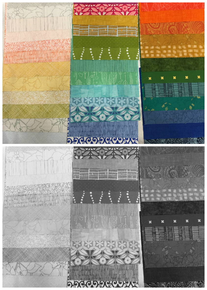
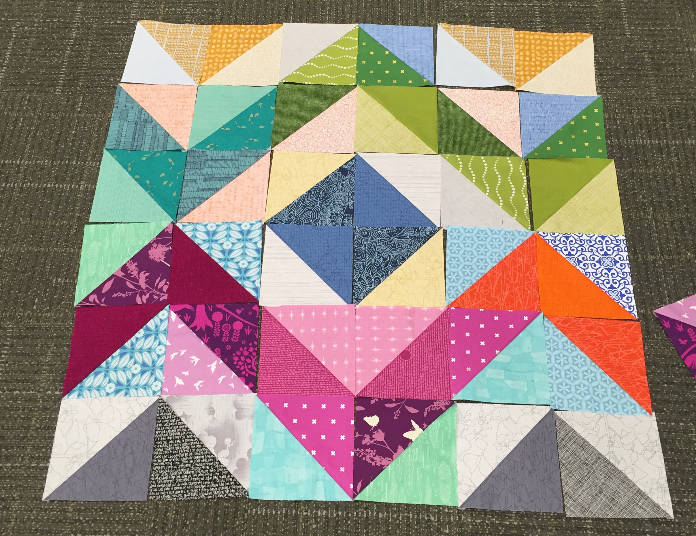
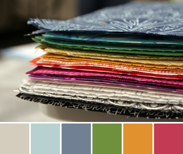
Cheryl’s class was great. She reviewed the basics of value, and emphasized how value is the *relative* light or darkness of a fabric. This is best seen when it comes to fabrics of medium value: a medium reads as a dark when paired with a very light fabric, but a medium reads as a light when paired with a very dark fabric. It’s all relative. Cheryl showed us the fairly well known and infinitely helpful trick of taking a photo of fabrics and converting it to black and white to see how each fabric “reads” value-wise, and we went to work sorting our fabrics. Here is a portion of my initial sort, with (left to right) lights, mediums, and darks.

As you can see when it is converted to black and white, there are a few fabrics in the medium pile that really belong with the darks, and at least one (maybe two) in the dark pile that would belong better with the mediums. After fixing those fabrics, we were ready to pair. Here’s the key hint for making value work in your quilt: start by pairing the medium pile. If you pair a medium with a really truly dark, or a clearly very light, you’re all good. If you pair all of the darks and lights first, then you are stuck with a bunch of mediums with no clearly value-different pair.
Of course I started pairing my fabrics by color: light blue with dark blue; light pink with dark pink, etc. After a moment, Cheryl said, “Try to pair your fabrics looking at value withOUT thinking about color” with a nice, long, sidelong glance in my direction. Sigh. Okay, okay! It was just the push I needed to really step outside of my comfort zone and (painfully, I might add) I started pairing fabrics trying my hardest not to mind color. It was HARD for me, let me tell you!
But I did it, and after creating half square triangles (HST) out of our pairings and playing with some arrangements, I found one that I was happy with and that is VERY different than anything I would put together by my own forces.

One thing I realized through these exercises, though, is that as much as I liked the look of the quilt in a photograph or from very far away, when I look at it up close, it still grates on me a bit because of the inadvertent color pairings. Cheryl was extremely helpful in helping me overcome my smooth color aesthetic obsession, and gave me some tips on how to focus on value while still maintaining or creating some control of color. I definitely want to play some more with value, maybe with a bit more predetermined organization of color. I would highly recommend Cheryl as a teacher and sharer of inspiration, so if you ever have a chance to learn from her, do it!
I also thought it was awesome that later in the week, after a lecture by Carolyn Friedlander, I was talking with Carolyn and Cheryl and Krista Hennesbury (another awesome quilter blogger and the recipient of my Schnitzel and Boo mini swap a month or so ago) about something Carolyn had said in her lecture–when you try a new skill, sometimes you will love it, but if it doesn’t work for you, feel free to toss it aside and use the techniques that DO work for you. Cheryl brought up my in-person aversion to the value-focused and color-ignored quilt arrangements and said that if I found it didn’t work for me, I could just choose not use it. I’m not ready to give up on value-focused quilts, but it is really interesting to see how different people are aesthetically drawn to different styles, and that’s okay.
Color for the Modern Quilter with Heather Jones {Lecture}
I actually was able to hear much of the lectures, since I made it a point to sit front and center, which was quite exciting for me. Heather Jones‘ lecture on color was a great review of color theory, which is the science of mixing colors. She went over the basics of color (primary, secondary, tertiary colors, shades, tones, hues, saturation, temperature, etc.), shared some actual color theory, and showed some lovely examples and inspiration photos. One tip Heather suggested was to use the color key on the selvedge of the fabric. I had never even thought of using the color key to help find coordinating and complimentary fabrics; I always just thought those colorful dots on the selvedge were there to look pretty and add interest. *mind blown* Another bit I found particularly interesting is that tone on tone fabrics often “read” as solids. That makes a whole lot of sense, since I find myself particularly drawn to solids and tone on tone fabrics. Using tone on tone fabrics is my sneaky way of getting a very solid look while still technically using prints!
How to take Better Quilt Photos with Meg Cox {Lecture}
This lecture was great because it confirmed many of my thoughts on quilt photography, and added a few key tips and bits of new information. Meg Cox‘s impressive background and experience at the Wall Street Journal definitely gave her lecture an extra “wow, she absolutely knows what she’s talking about!”, and it was fun to see examples of both good and not-so-good (okay, horrible) quilt photos. She confirmed that in order for your photos to be stellar, using a camera instead of an iPhone is a must. MUST. (Of course I’m promptly breaking that rule with this post, since many of my lecture and classroom photos were taken with my phone due to lack of light and tripod availability). I had recommitted to using only high quality camera photos for my blog a few months ago, and have been really working at improving my blog photos taken with my Canon Rebel XT.
I went away from this lecture inspired that I’m on the right track, with a list of camera functions I need to better master, and a few indoor photography props I hope to buy. One big tip that I found VERY useful and can’t wait to implement is using Daylight Balanced Compact Fluorescent CFL Bulbs to light indoor photo shoots. Getting sufficient light for indoor photos is something I struggle with, so I’m looking forward to giving these bulbs a try! (Disclosure: Amazon affiliate link above)
Architexture, Quilts, and Us with Carolyn Friedlander {Lecture}

I wasn’t quick enough to register for a full day workshop with Carolyn, so I was excited to get in on this lecture of hers. If you are a regular reader of my blog, my fangirl status of everything Carolyn Friedlander is no secret. I love her work. I love her background. I love her sources of inspiration. I love how real she is. I think part of why I’m so drawn to Carolyn’s work is its simple aesthetic and seemingly mundane source of inspiration. Carolyn studied and worked as an architect before becoming a quilt pattern and fabric designer. I worked as an environmental scientist wetland and land use specialist for 6+ years before becoming a momma (and aspiring quilt designer), so I spent much of that time working closely with landscape architects.
At this lecture, I loved listening to Carolyn talk about architecture and her sources of inspiration, since it all hits so close to home for me. She finds inspiration in the world around her, as do I. She finds hers particularly in architecture; I find mine in the complex architecture of nature. I loved how she explained pattern design as “solving a problem”. Carolyn walked through her design process: think of a design for a finished product, and then solve the problem of finding the best method of obtaining the desired outcome. This is how she got into needle-turn applique, and what sparked the discussion about us quilters seeking new knowledge and techniques, but needing to find the techniques that work for us as individuals in solving our own pattern design “problems”. I am looking forward to hearing more from Carolyn and hope to be able to attend a full class taught by her one day. She’s such a huge inspiration to me!
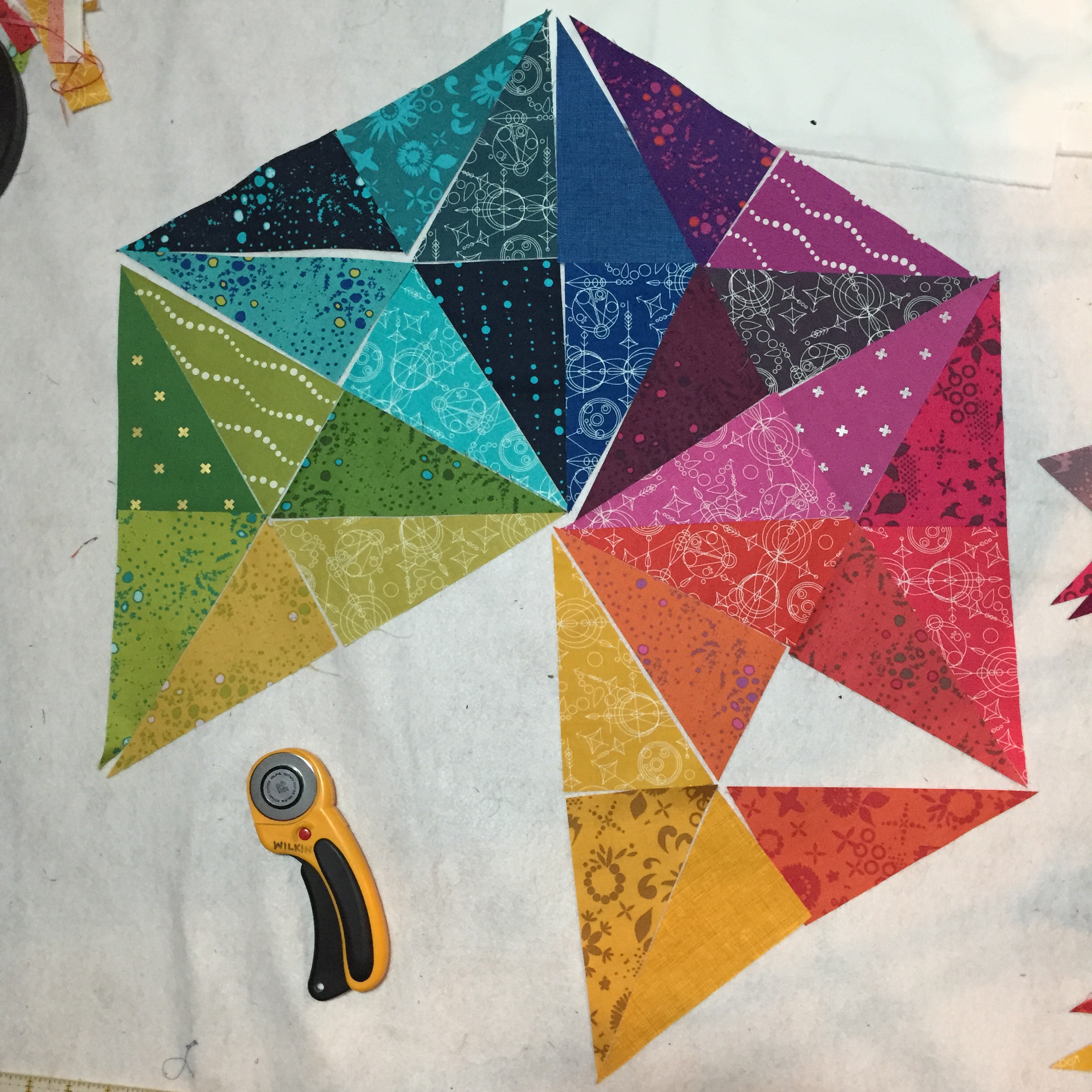
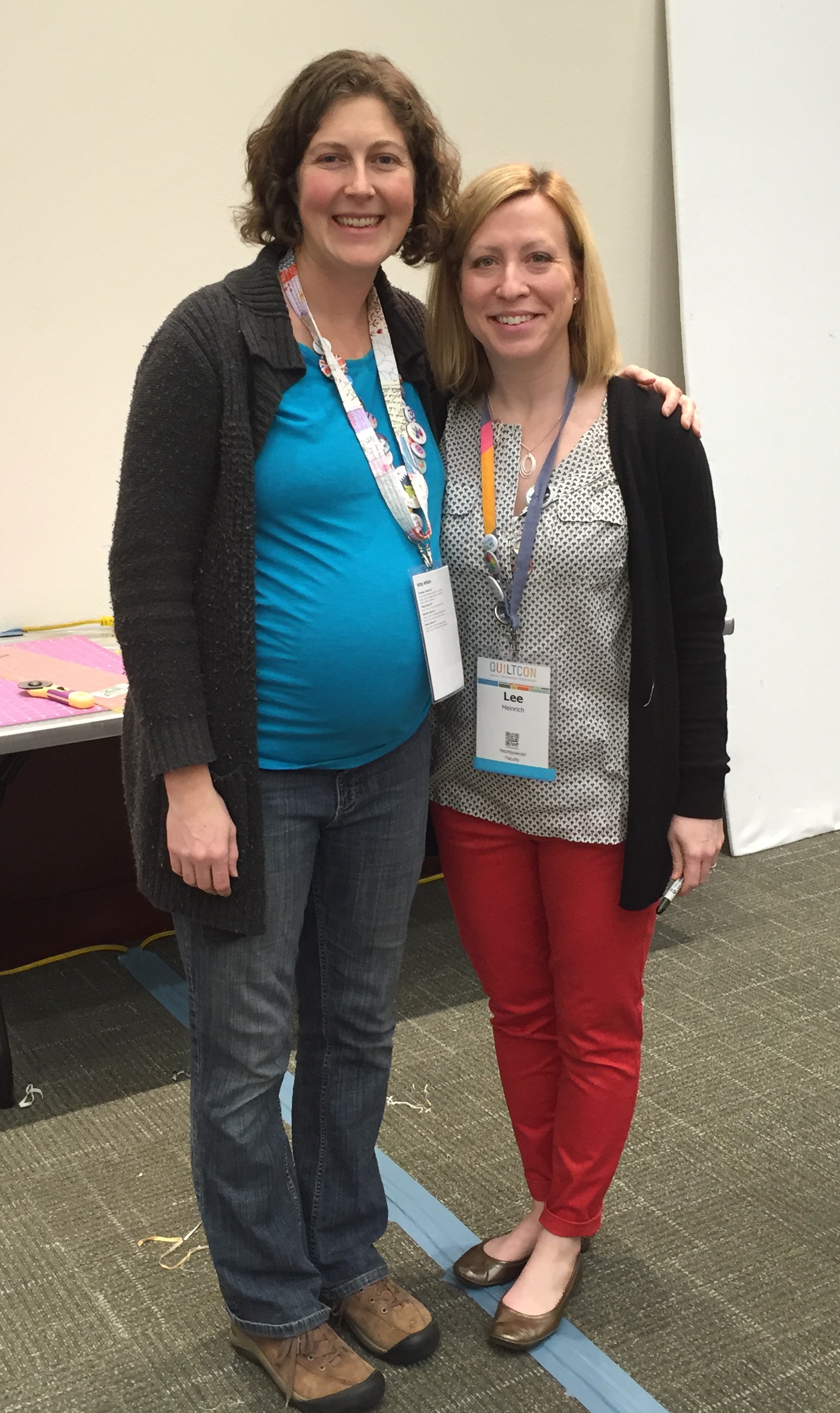
Off the Grid: Alternate Quilt Layouts with Lee Heinrich {Workshop}

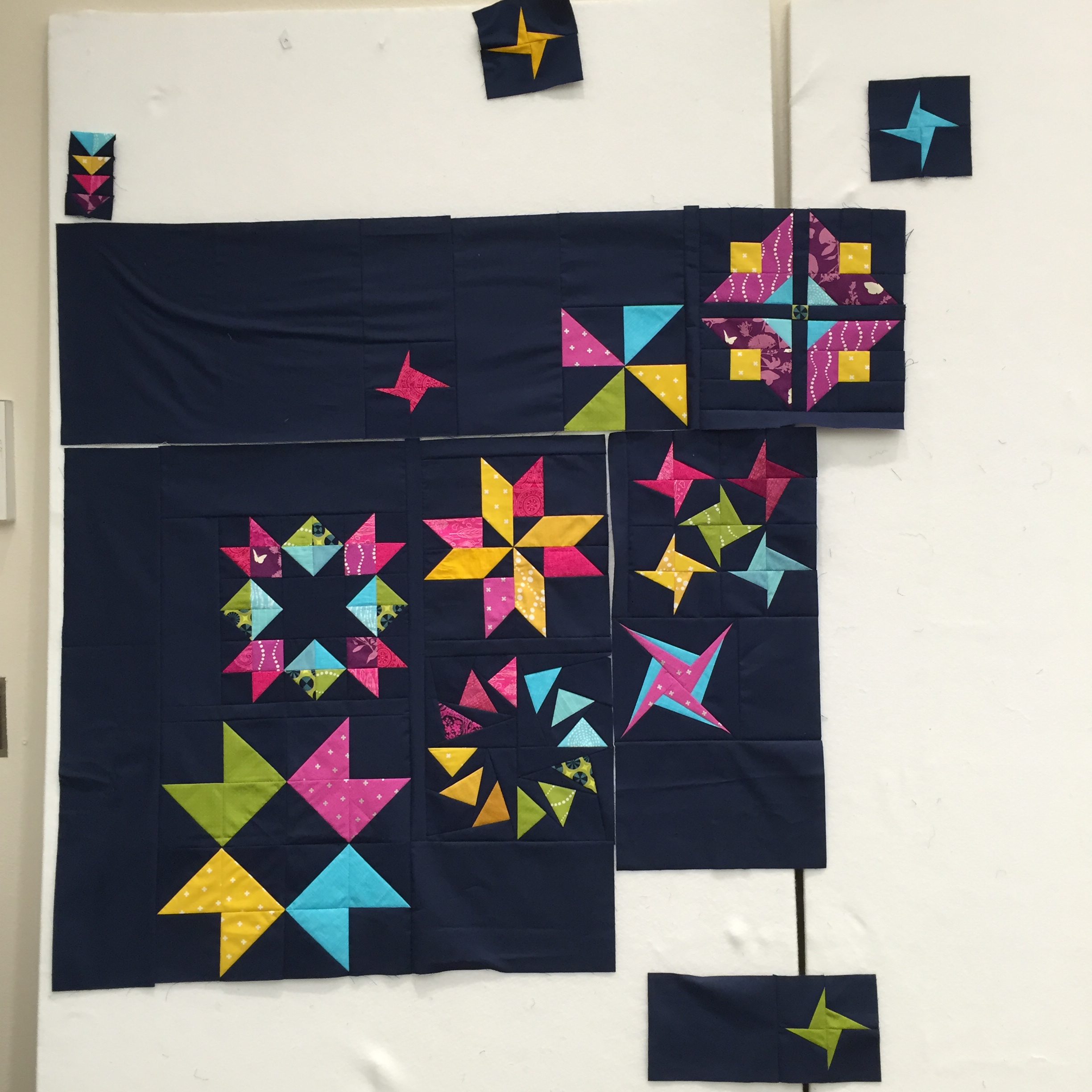
I closed out my first QuiltCon experience with another full day workshop: an alternate layout class taught by Lee Heinrich from Freshly Pieced. Lee is another one of my big quilt inspirations. I love her simple and bold aesthetic, and even during her presentation, I could pick out the sample quilts that she had designed and made since they were always the ones I instinctually reacted to with “Wow, I LOVE that one”. Her workshop was super helpful, finally putting names and technical know-how to my current method of “oh, that looks good” or “oh, that doesn’t look good”. It was fascinating to go through each “alternate layout” method and see how it worked (or didn’t work) with our quilt blocks. Different types of quilt blocks definitely lent themselves to different layout styles. For my blocks, I almost went with a modular layout with variable framing, but because I had very varied sized blocks, I ultimately opted for paneling so as to avoid trapping negative space between the blocks. Imagine the navy blue background extending all the way to the edges of the design board:

I would definitely recommend taking a class with Lee if you get the chance, too. This workshop was very well organized, with an introduction in the beginning, and then a break after each category or style of alternate grid layouts to allow us to try the methods with our own blocks. While we played, we not only had the input of our group members, but Lee would also circle the room providing feedback and suggestions. Next, she would explain and show examples of the next category or style of alternate grid layouts, and then we would again have a chance to try them with our blocks. It was a fantastic way to not only learn about many different layout options, but also see how they worked with a set of our own prepared blocks.
 One aspect of Lee’s class that really resonated with me is the idea of going “off the grid” as far as quilt layout, but still using the grid as a guide. It is a much more organized and sense-filled method than my usually slap-blocks-up-on-my-design-wall-until-they-look-good method. The outcome is fresh and modern, yet with that balanced feel that is so difficult to attain without any grid at all. I am very much looking forward to utilizing some of the different layout styles in my future quilts. Lee has a great reflection about the presences of alternate grid layouts in the QuiltCon quilt show that I highly suggest reading HERE.
As you can see, my whirlwind QuiltCon experience included a TON of learning and inspiration. I’m excited to start using this inspiration in future quilt designs and projects and I will be sure to point out aspects of future quilts where the skills and styles I learned are implemented. Now, where to begin?


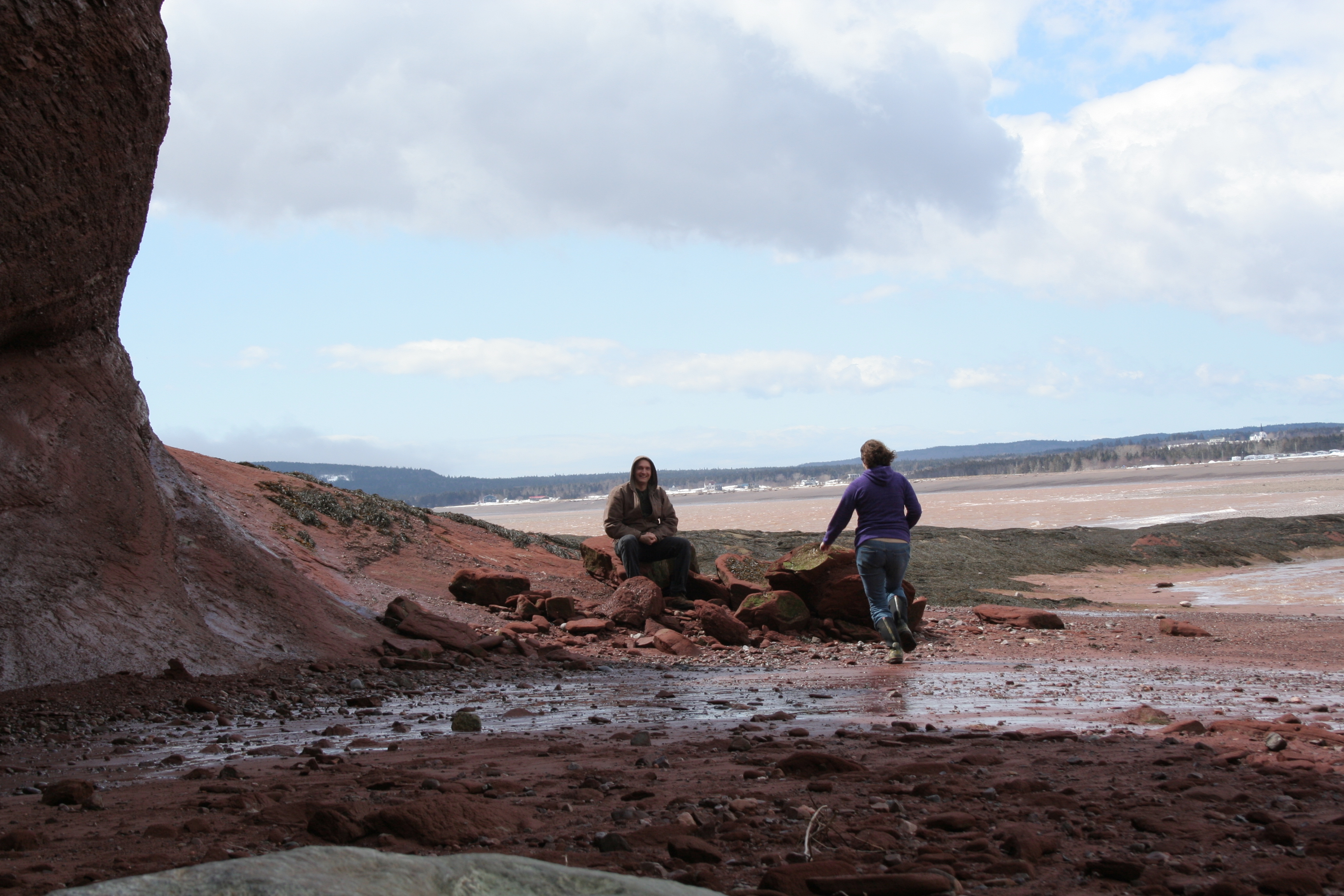
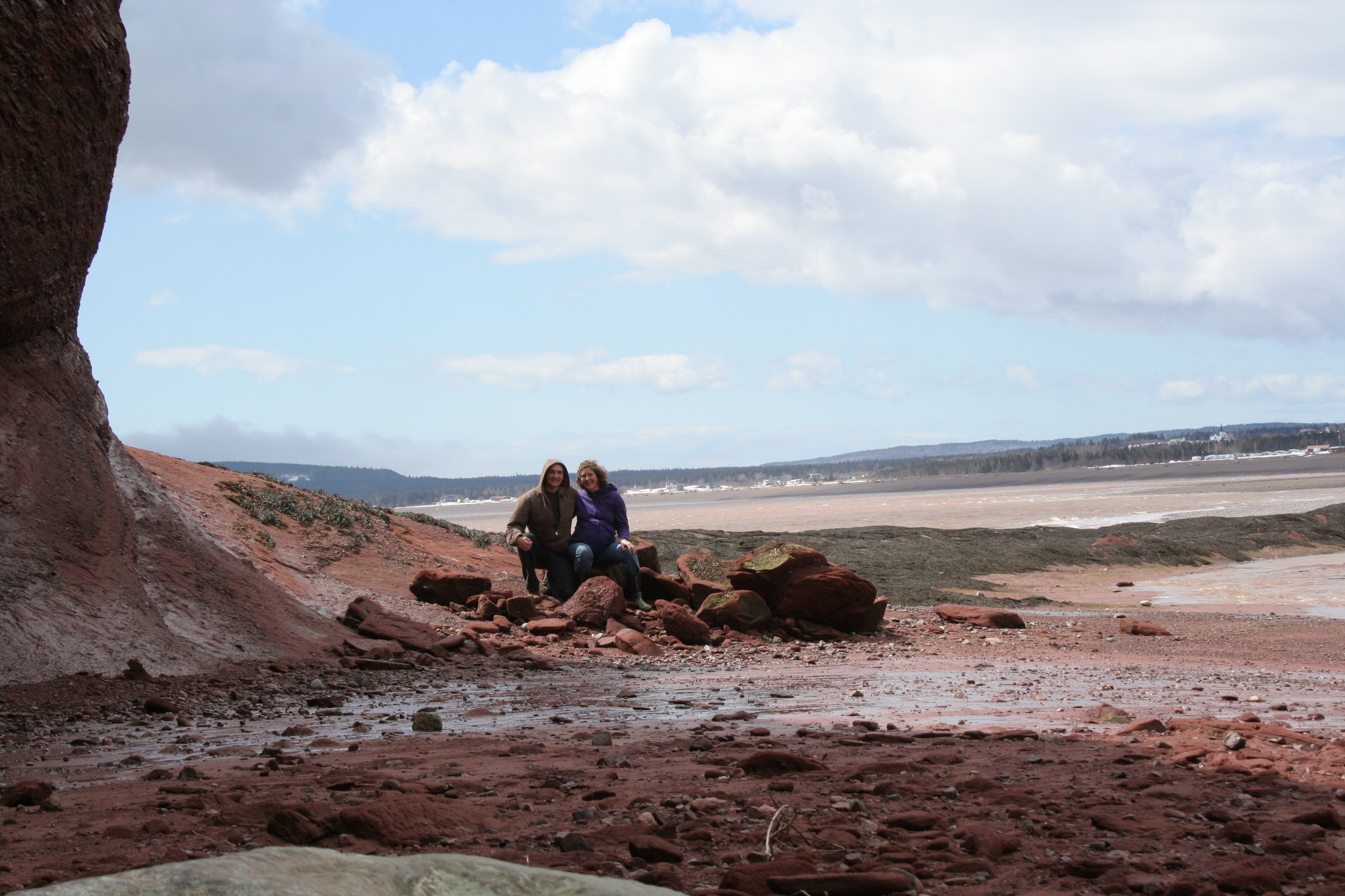
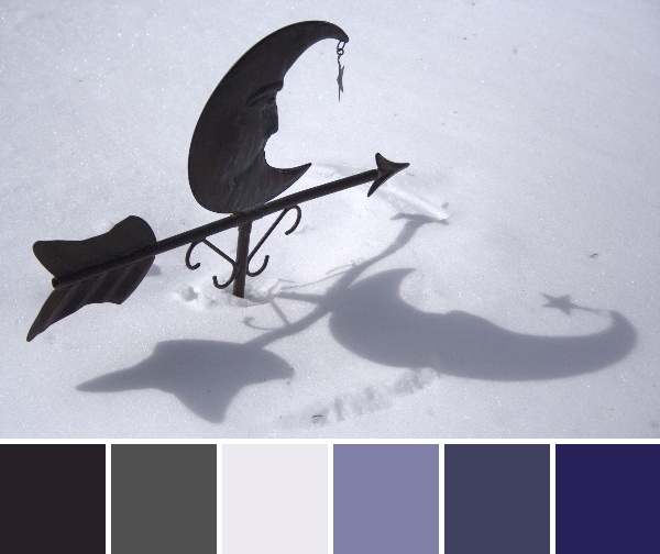
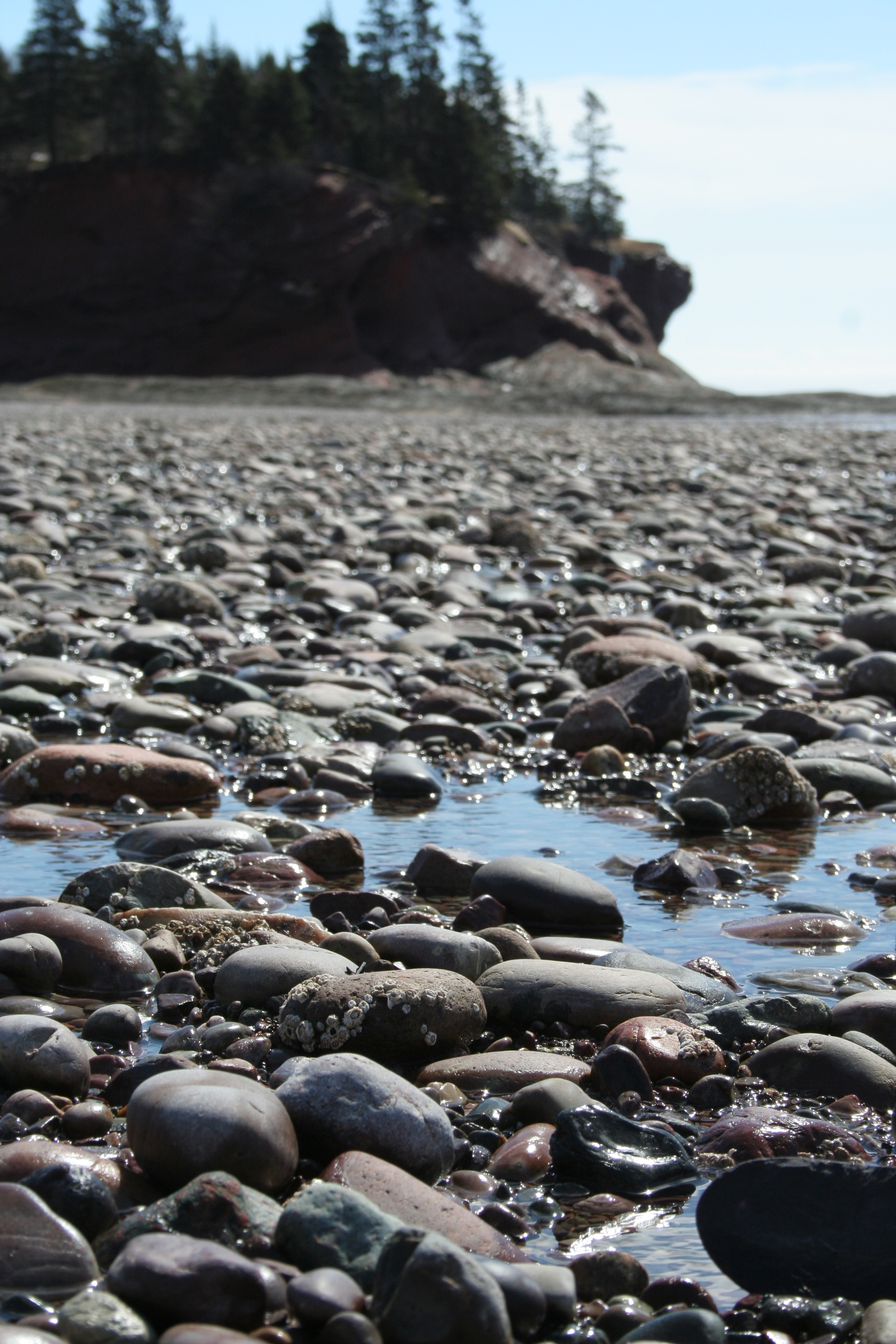 The Bay of Fundy is known for having the highest tidal range in the world. I’ve wanted to travel to the Bay of Fundy in Canada since my estuarine ecology studies in college. There’s something about 40 foot tides and vast mud flats that makes me happy. Our short timeframe and my 8 months pregnant body didn’t really allow for as much exploring as I’d have liked, but we had a great time anyway. Today I’ll be sharing some color palettes from photographs taken on our trip, created with Play Crafts’ Palette Builder 2.1.
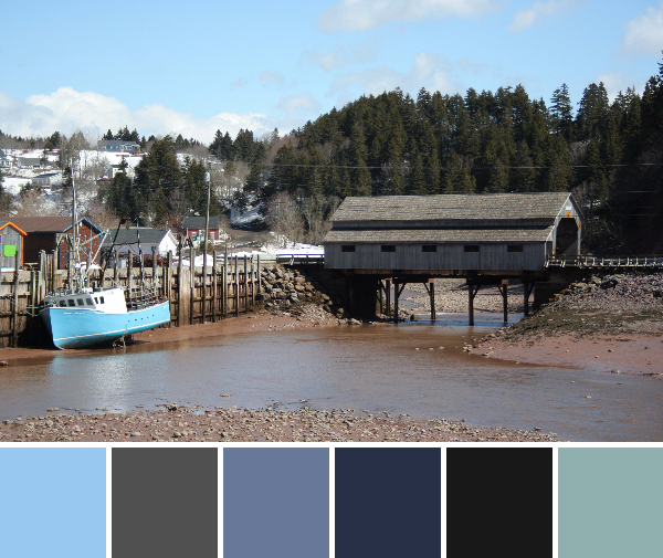 Corresponding solids from left to right:
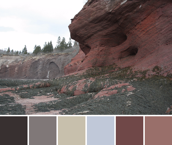 Corresponding solids from left to right:
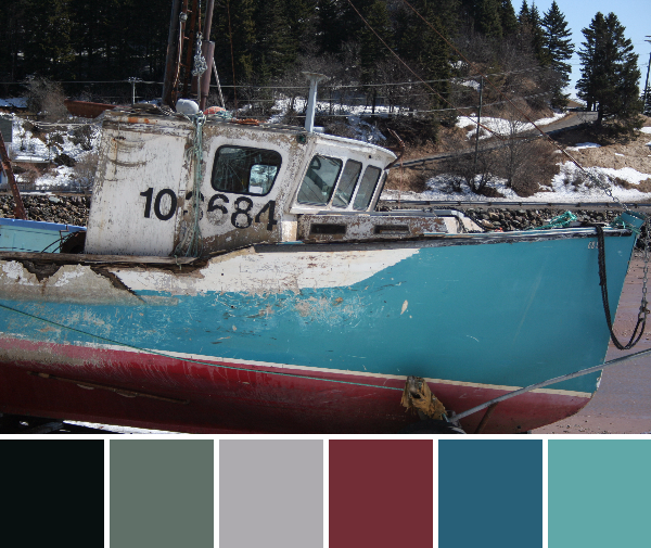 Corresponding solids from left to right:
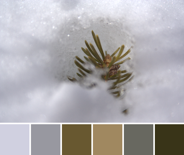
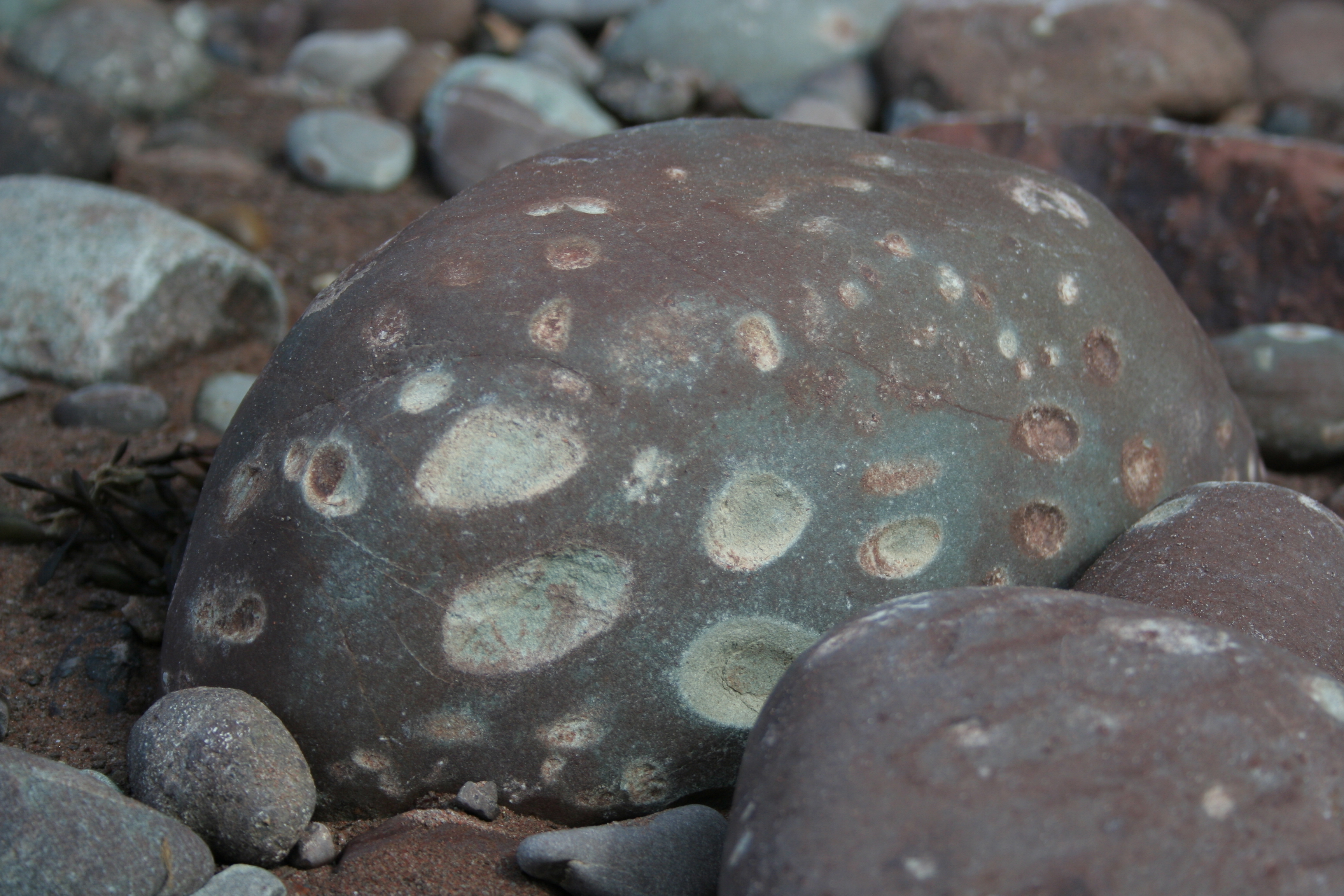 Rocks as pocked and battered as this one littered the beach. I suppose this is what happens when 40 feet worth of tides come in and out each day, rolling and bashing the rocks against each other.
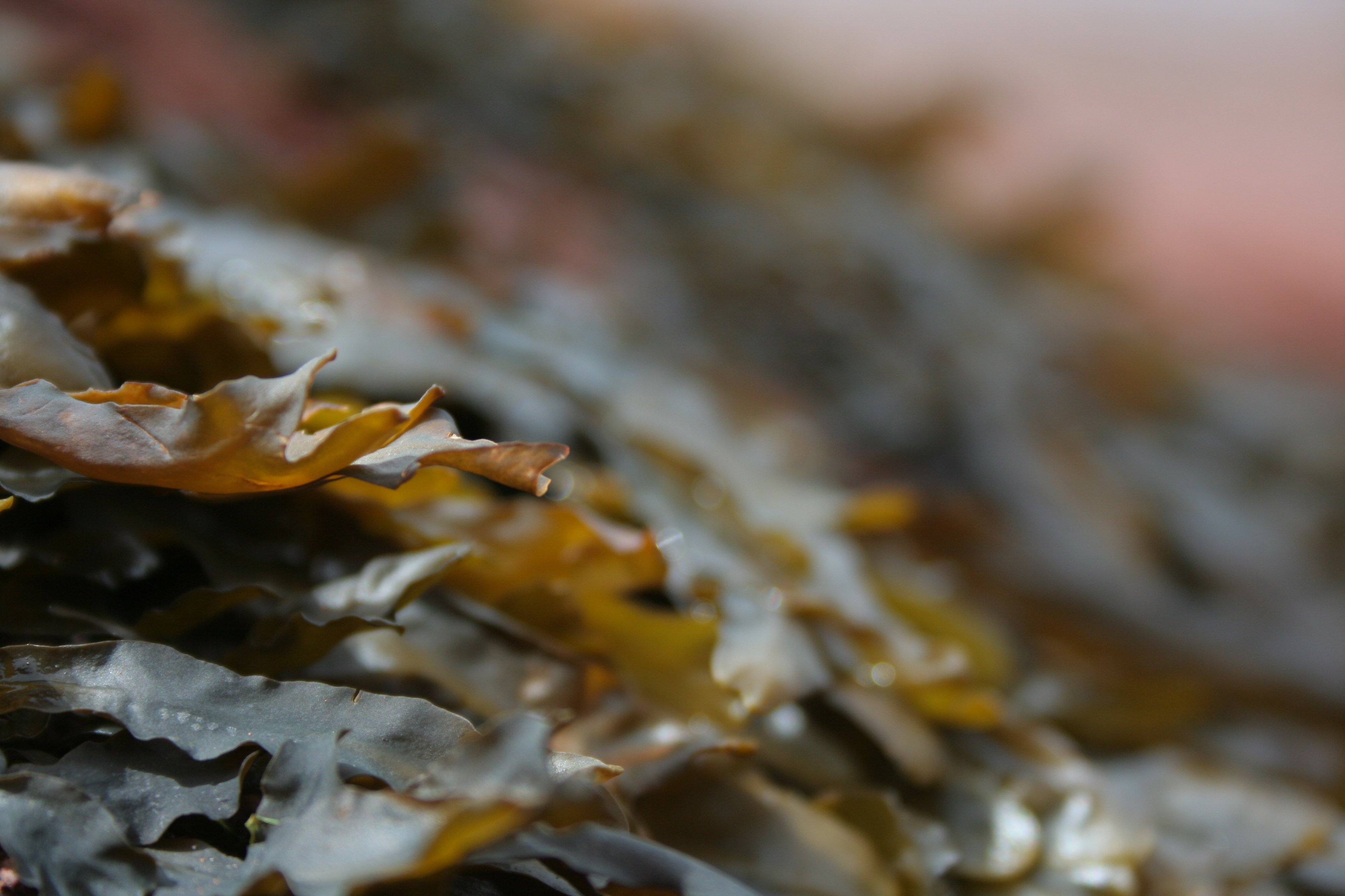 Seaweed. Gorgeous. This feathery seaweed covered the exposed rocks, creating a seascape of brown-green-red as far as the eye could see.
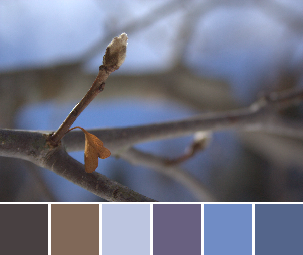
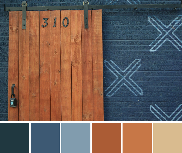
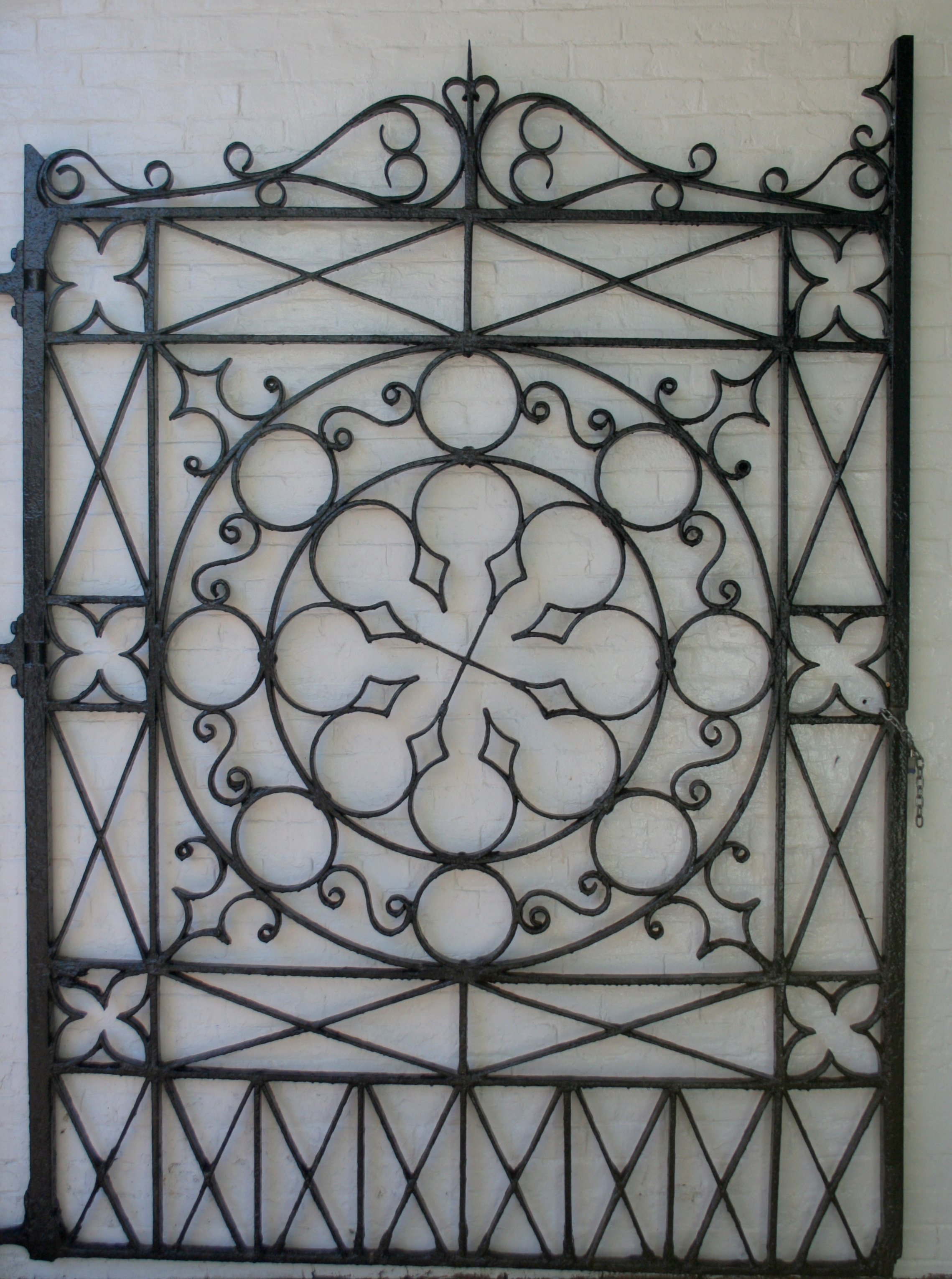 I loved the gate at City Market in St. John’s. It’s a lovely balance of geometry and balanced aesthetic. Quilt inspiration is everywhere!