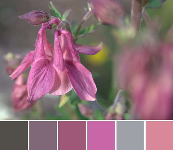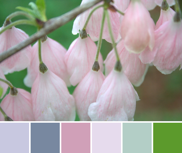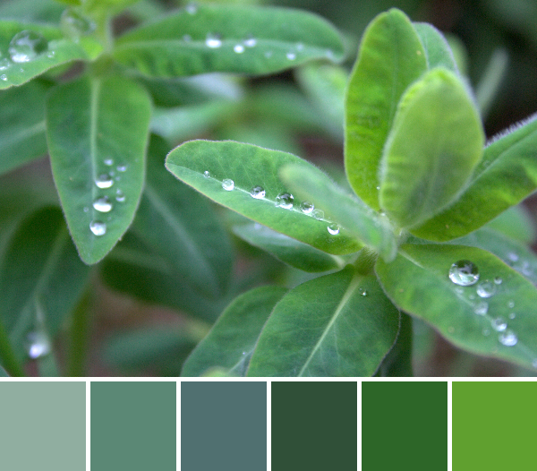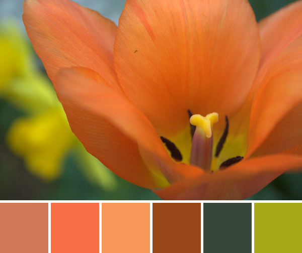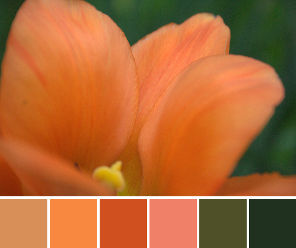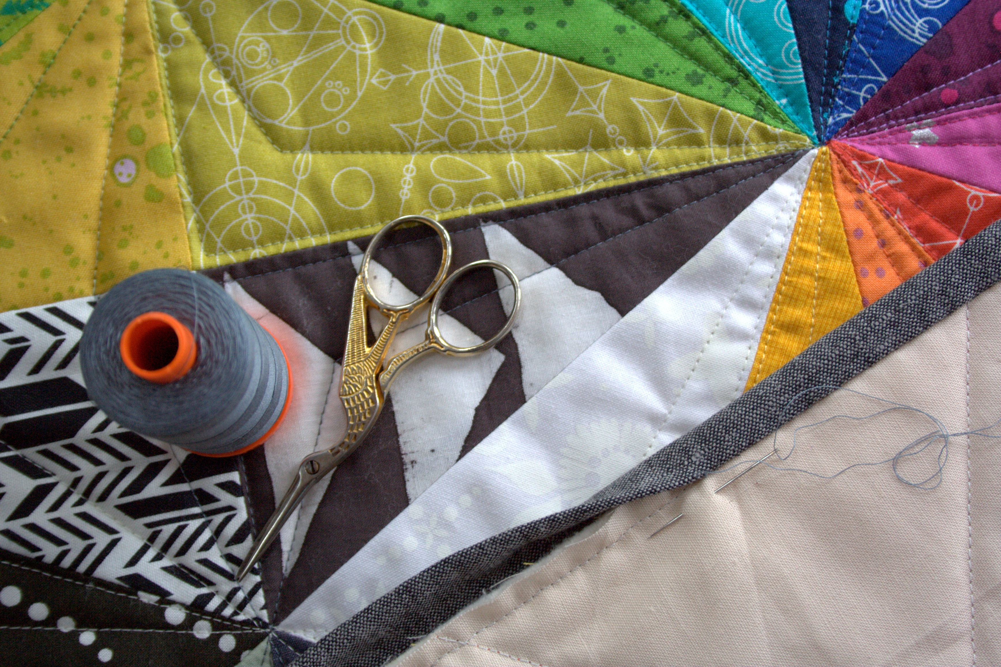

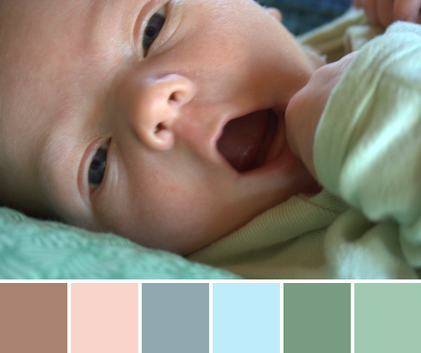
I promised some baby fingers and toes for this week’s color inspiration, but forgot how difficult it is to photograph a squirmy baby, especially the flailing limbs. This week I’ll be sharing one baby color palette, since I never tire of looking at this little miracle, and also a couple of palettes from photographs of the gorgeous flowers my brother and sister-in-law sent. Color palettes are made using Play Crafts’ Palette Builder 2.1 and my photographs.
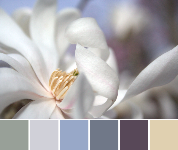
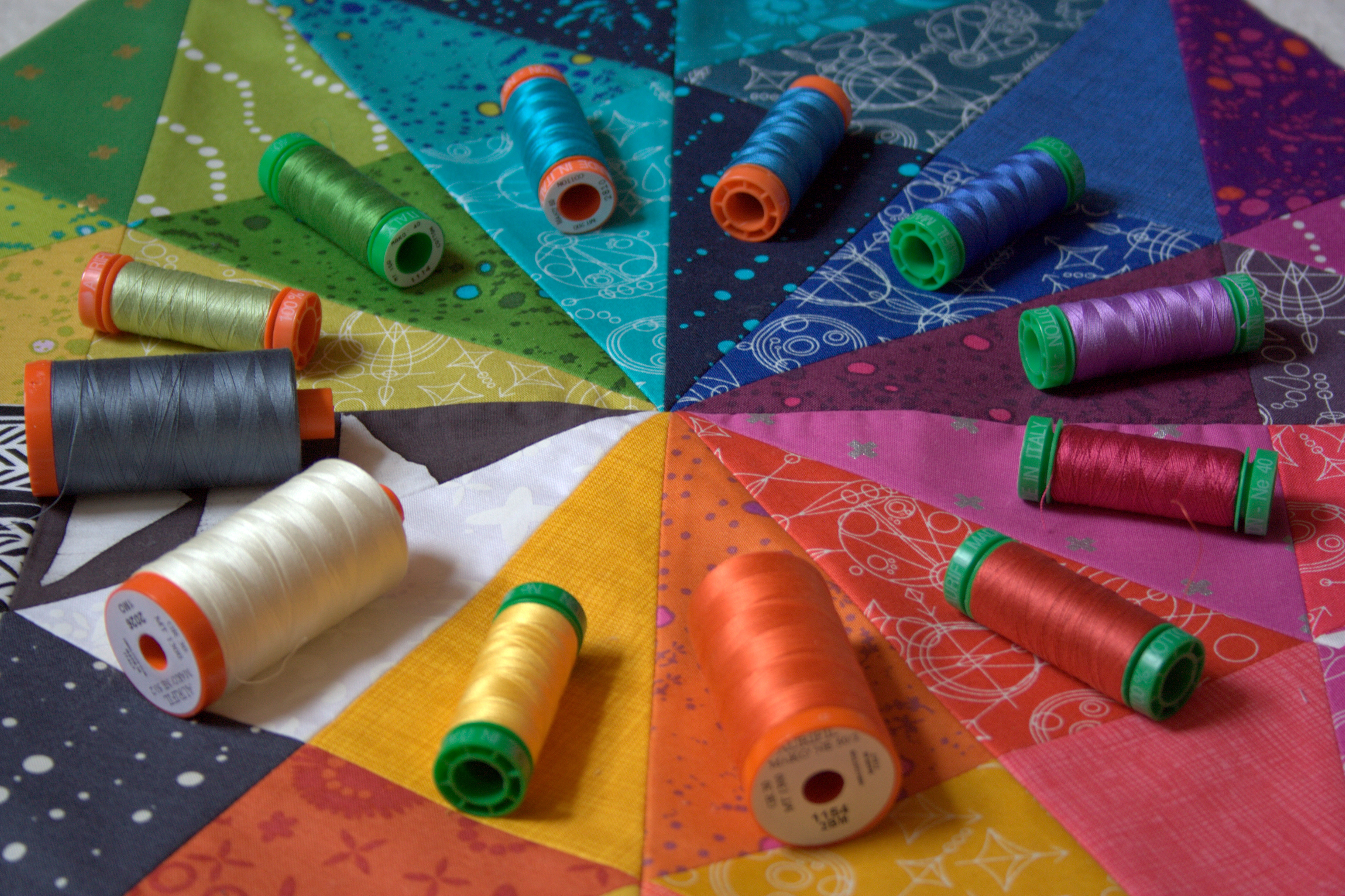
 Corresponding solids from left to right:
Kona Taupe, Kona Pale Flesh, Kona Iron, Kona Aqua, Kona Old Green, Bella Green
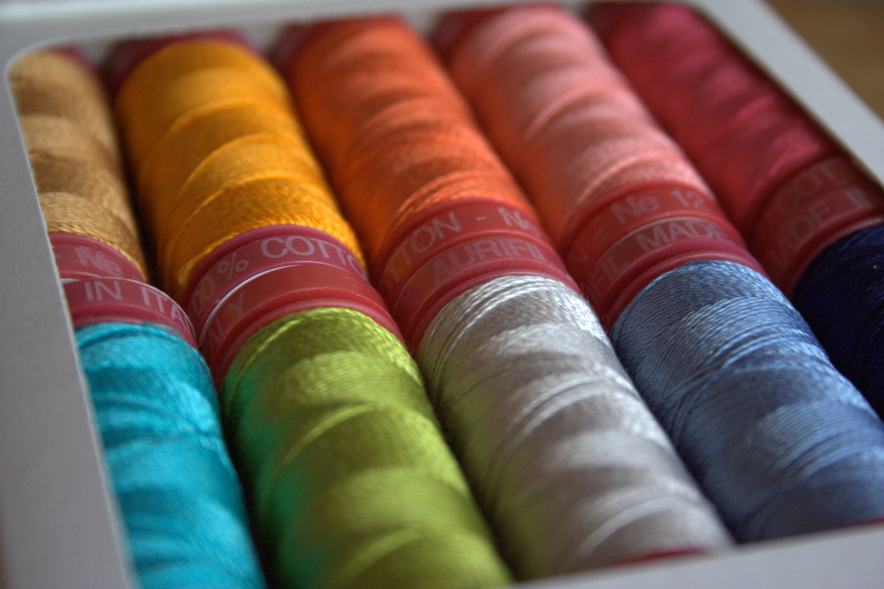
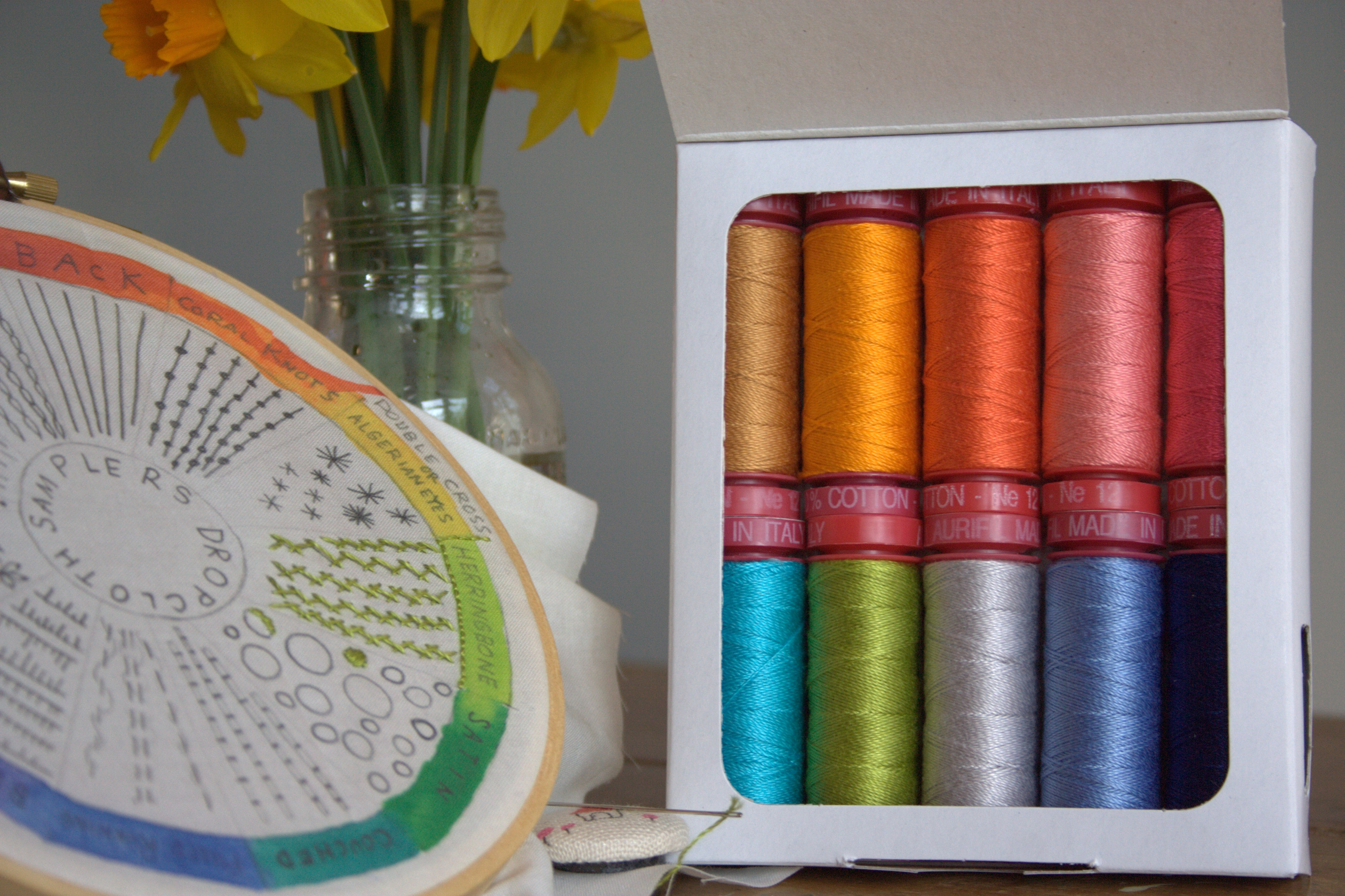
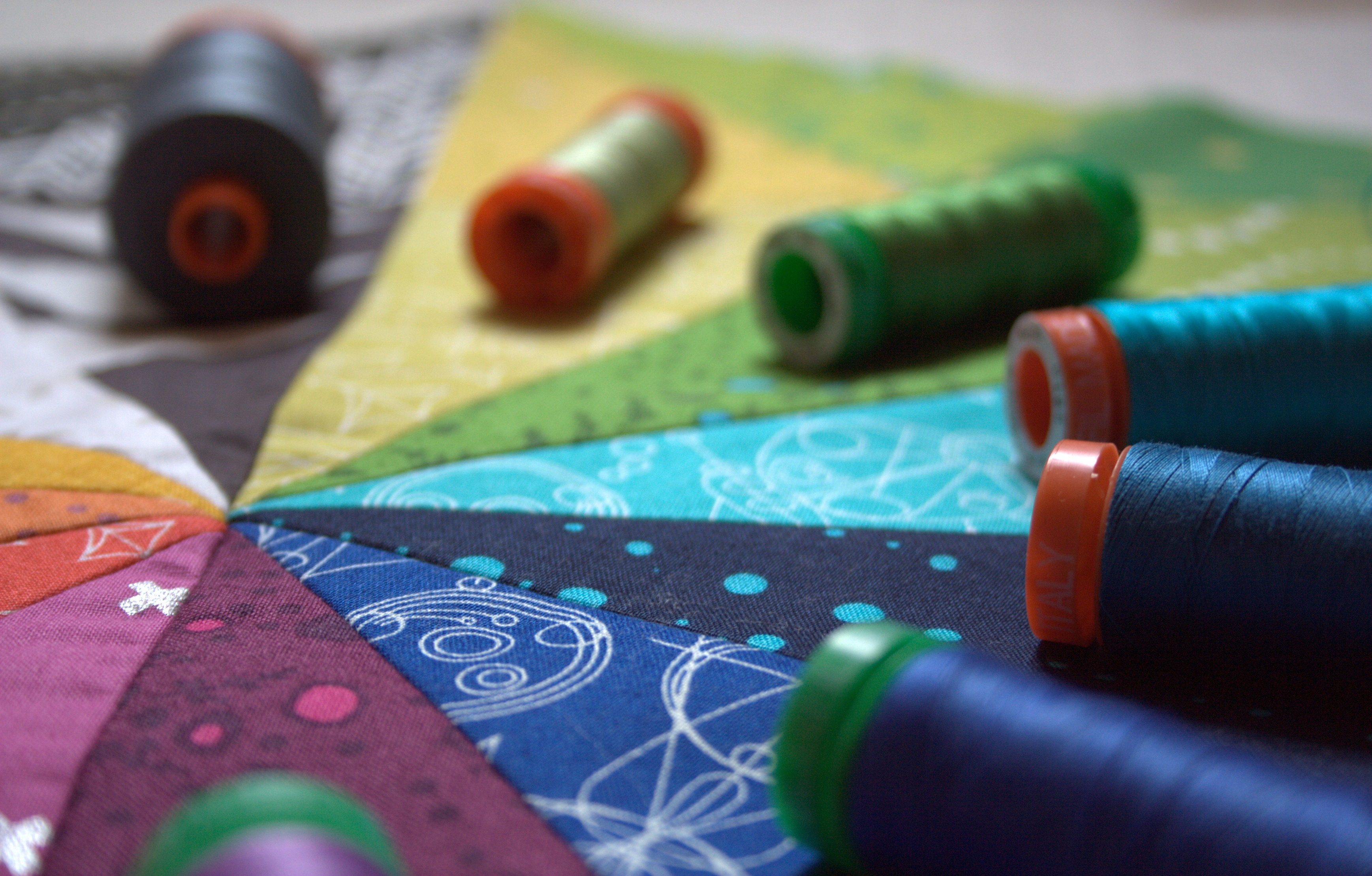
Corresponding Aurifil thread from left to right:
2375 – Antique Blush
2420 – Fleshy Pink
5008 – Sugar Paper
5007 – Grey Blue
2850 – Med Juniper
5014 – Marine Water
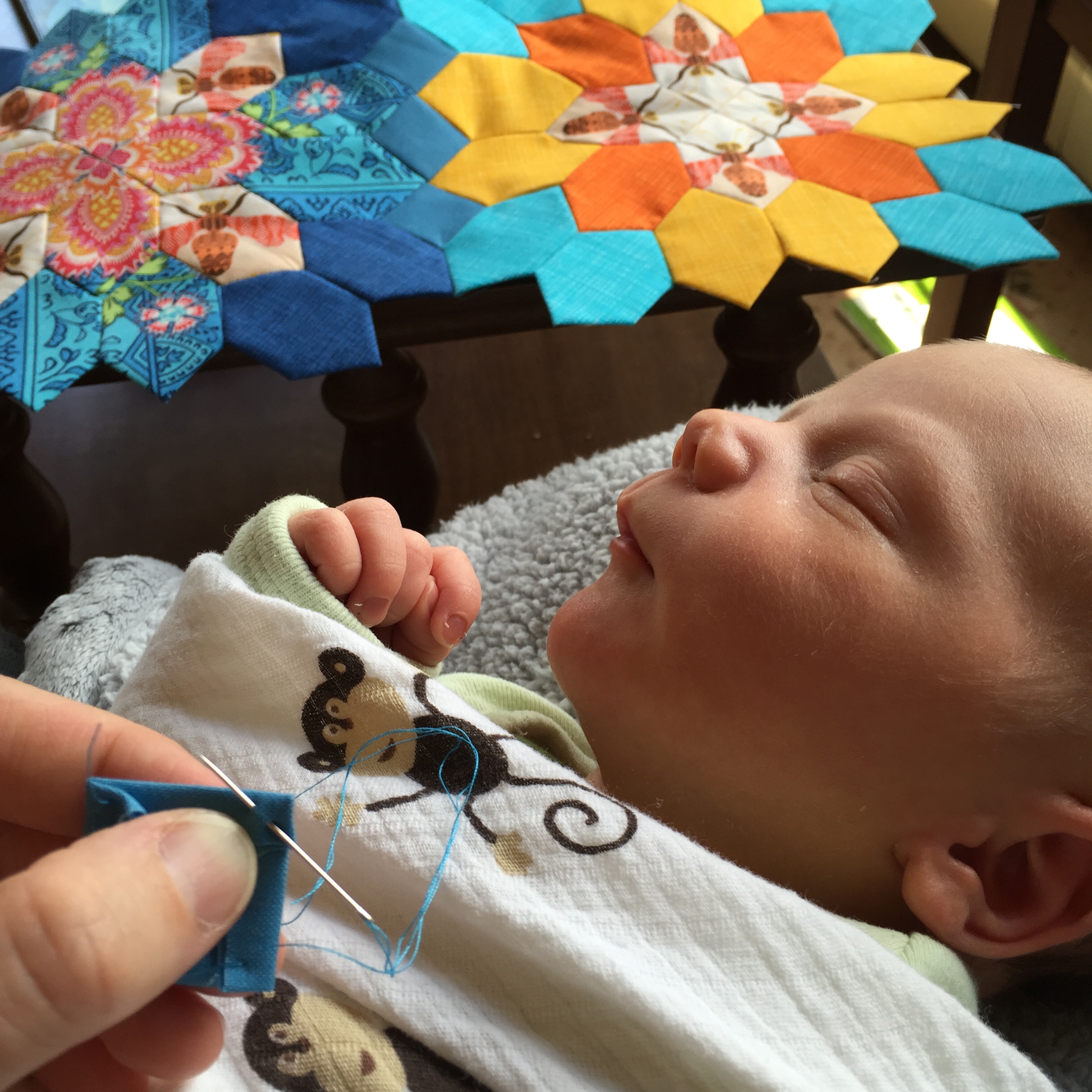
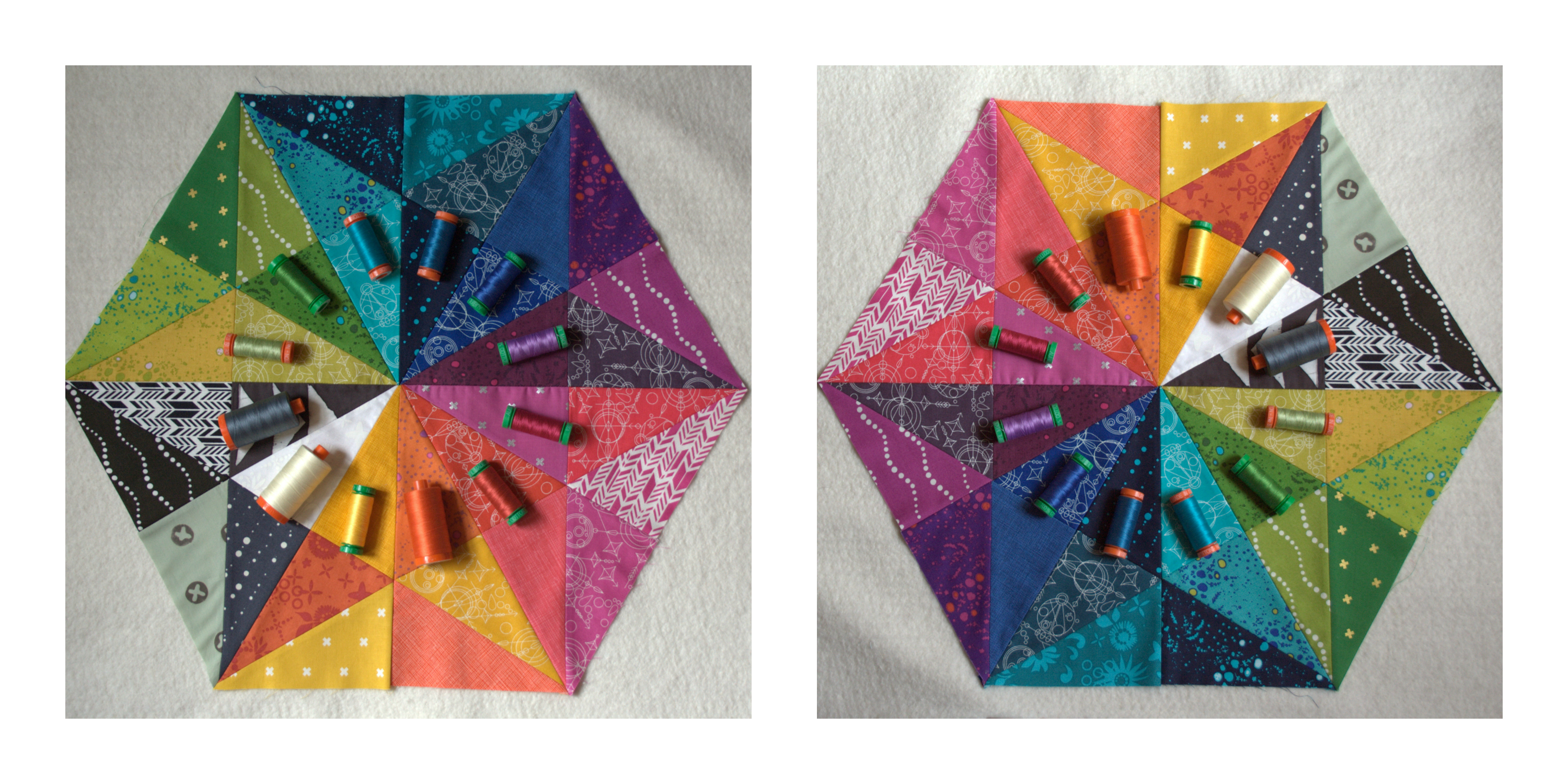
I am still in the thick of newborn baby blissland, made sweeter by the fact that little Finn is actually sleeping fairly well now that my milk has come in. I attribute a lot of that to the fact that we co-sleep and he can snuggle me all night long, but whatever the case may be, I feel rested and in love. I know that there surely will be sleepless nights–probably many consecutive sleepless nights–but for now I’m enjoying this wonderful rested and full-hearted time.
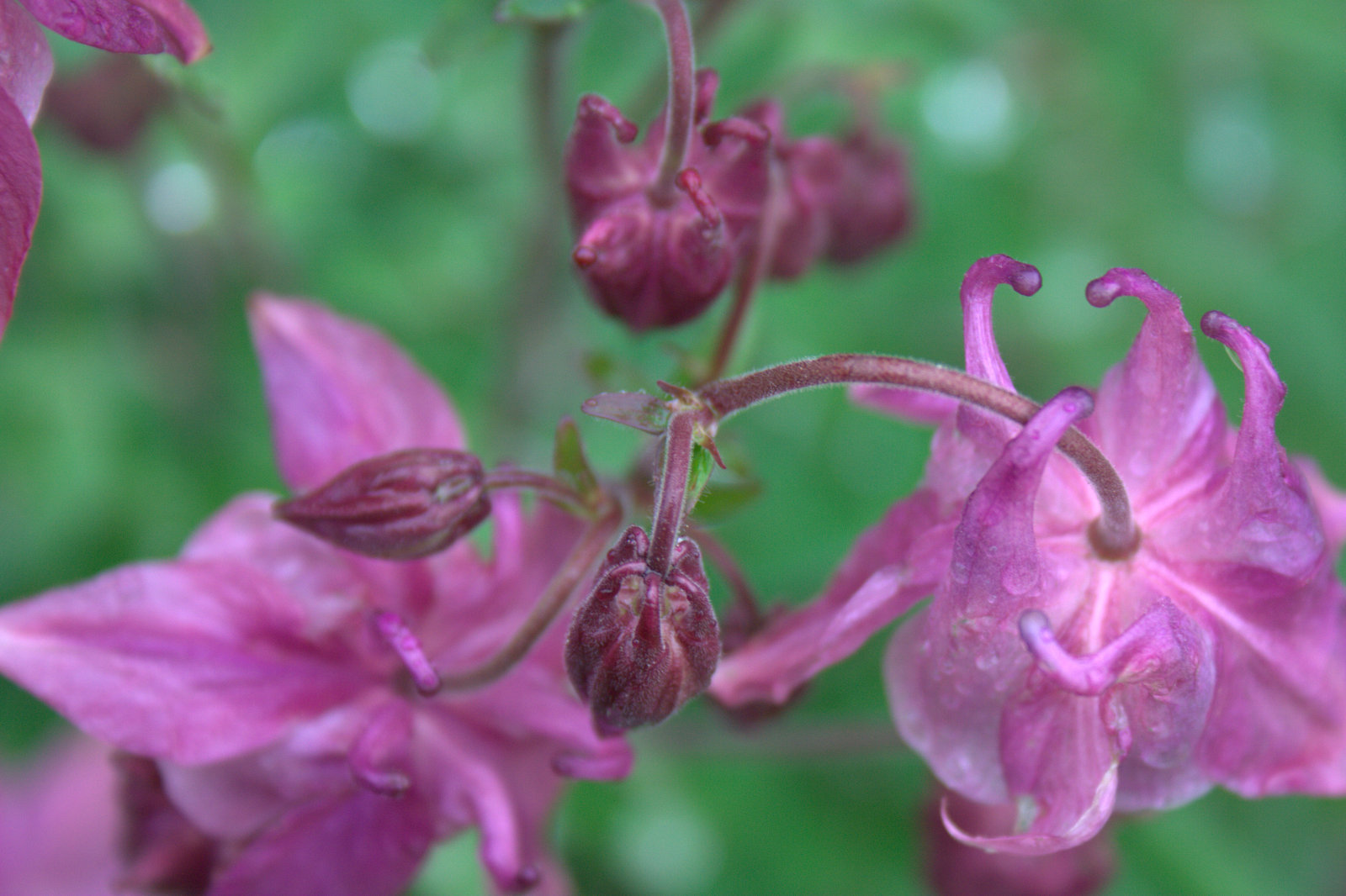
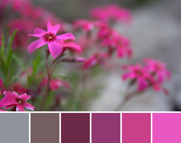
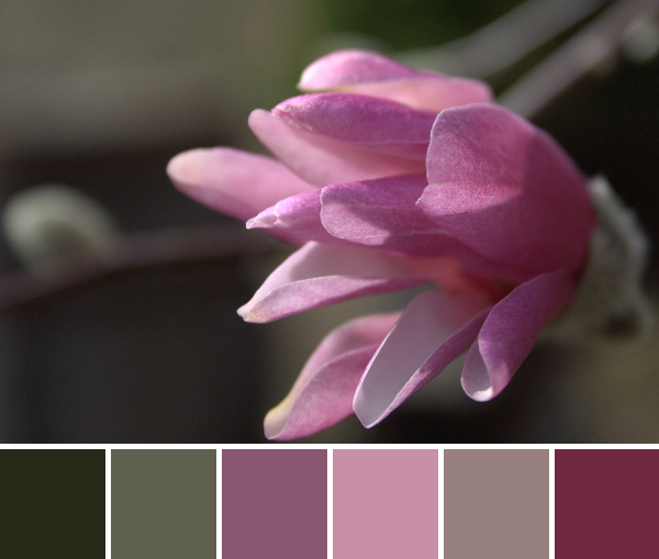
 Corresponding solids from left to right:
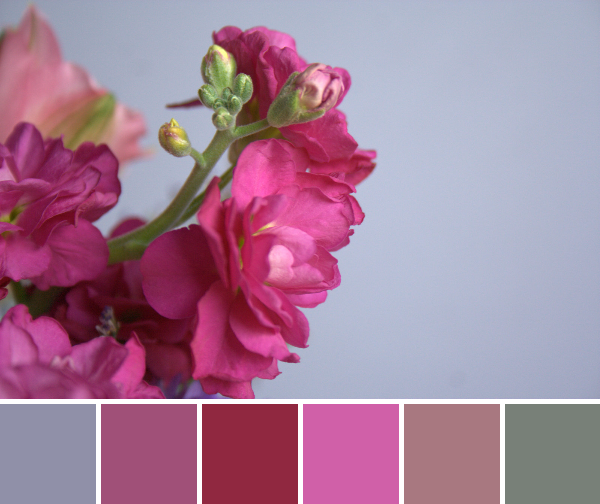
Bella Wisteria, Kona Geranium, Bella Cherry, Bella Peony, Bella Plum, Bella Etchings Slate
Corresponding Aurifil thread from left to right:
2524 – Grey Violet
4030 – Plum
1103 – Burgundy
2479 – Med Orchid
2566 – Wisteria
5004 – Grey Smoke
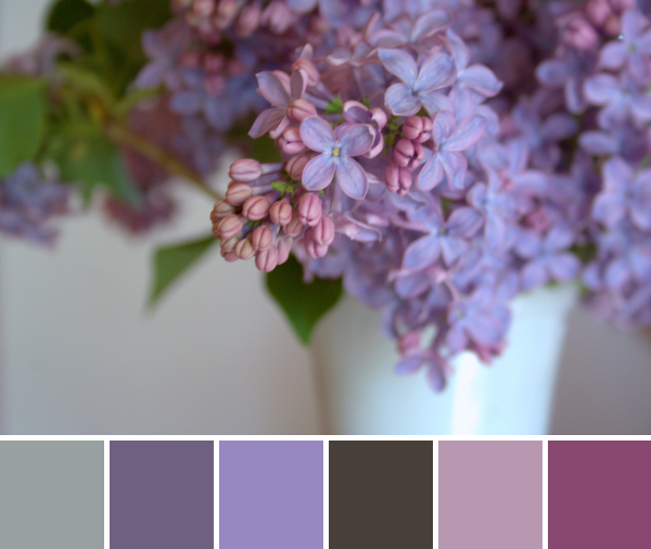
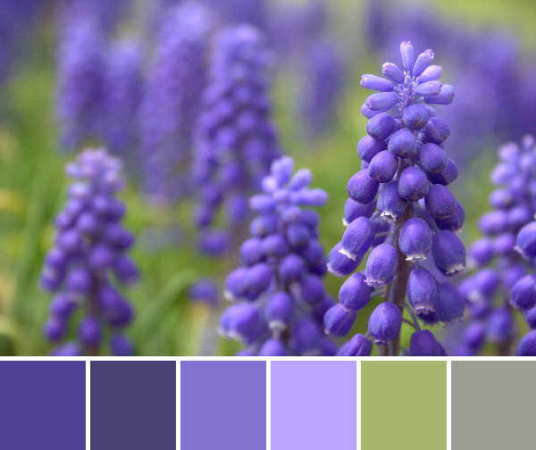
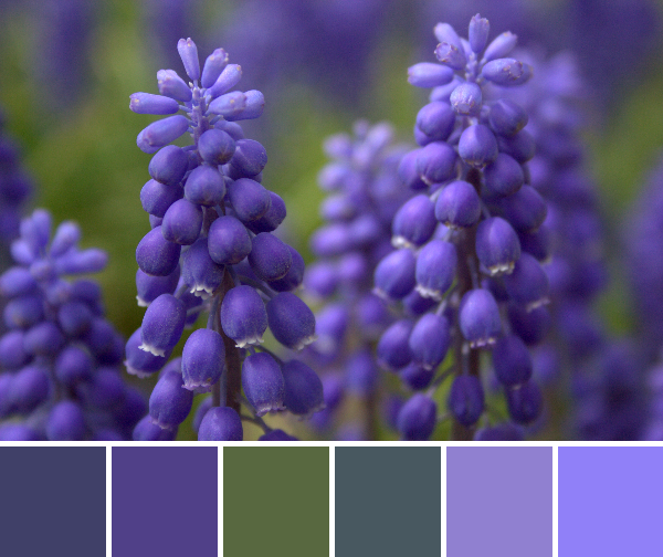
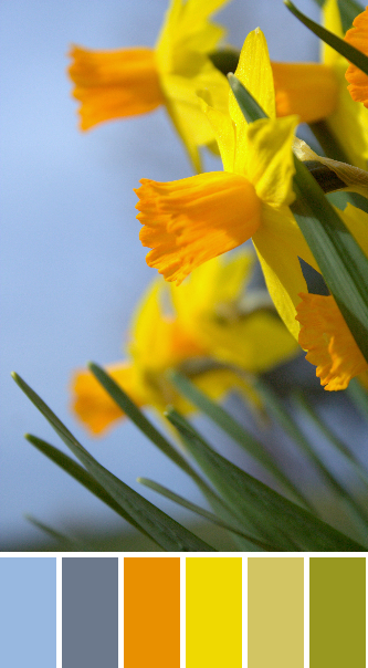
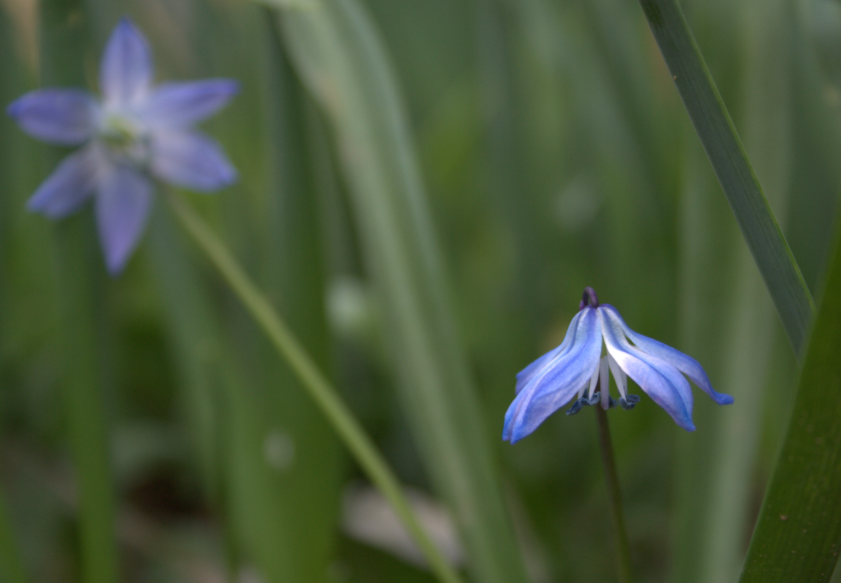
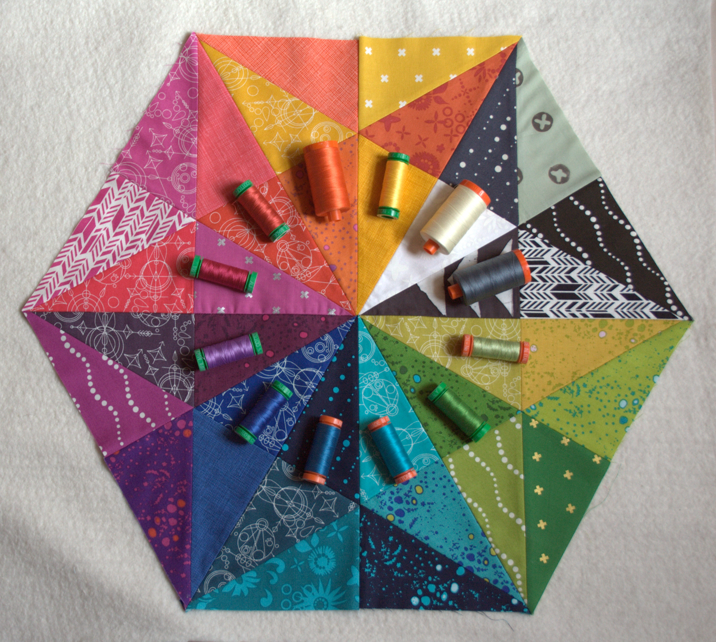
A few days after Finn was born, we received the sweetest delivery–a florist’s van dropped off a gorgeous vase and bouquet of flowers from my brother and sister-in-law in New Jersey. Their divine smell has been wrapping us in love daily, and the colors brighten the room.
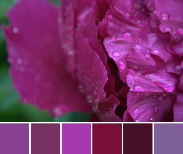
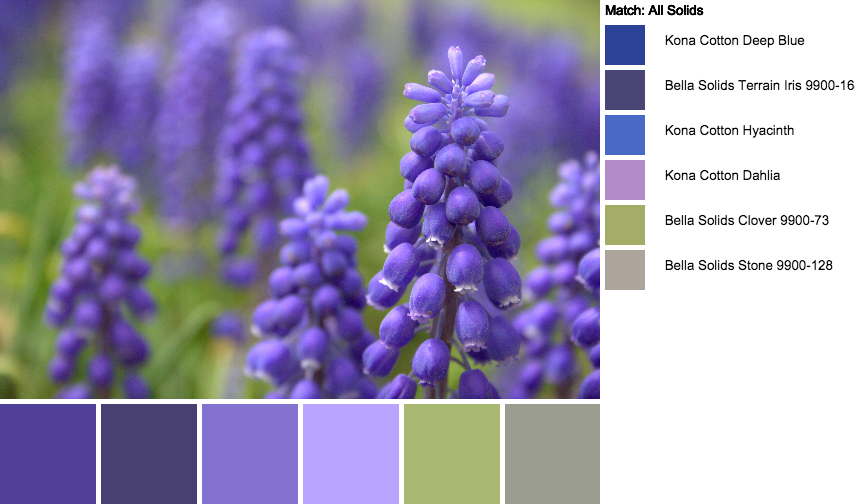
 Corresponding solids from left to right:
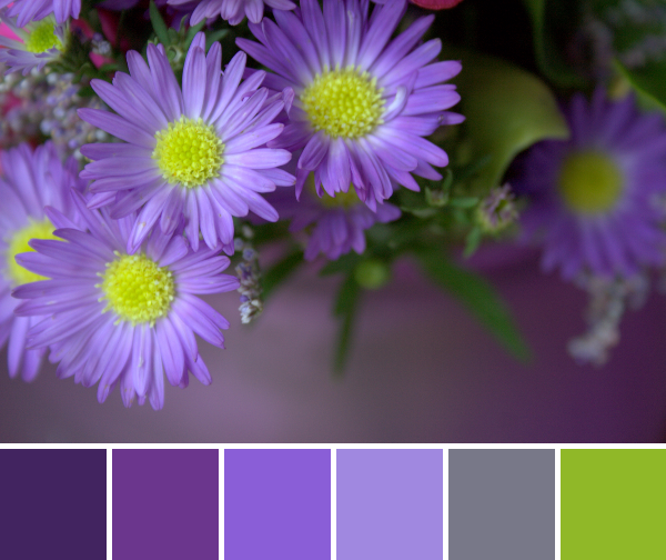
Kona Mulberry, Kona Magenta, Bella Purple, Kona Lavender, Kona Medium Grey, Kona Lime
Corresponding Aurifil thread from left to right:
4225 – Eggplant
2545 – Med Purple
2525 – Dusty Blue Violet
2520 – Violet
2625 – Arctic Ice
1231 – Spring Green
I absolutely love this palette! I’m not usually a big purple person, but that pop of lime green does it for me! I can see this being a really fun palette for a quilt for a purple-loving person. The grey adds some balance and the lime green adds interest. I might even lime-up the green a bit more–maybe Kona wasabi style?