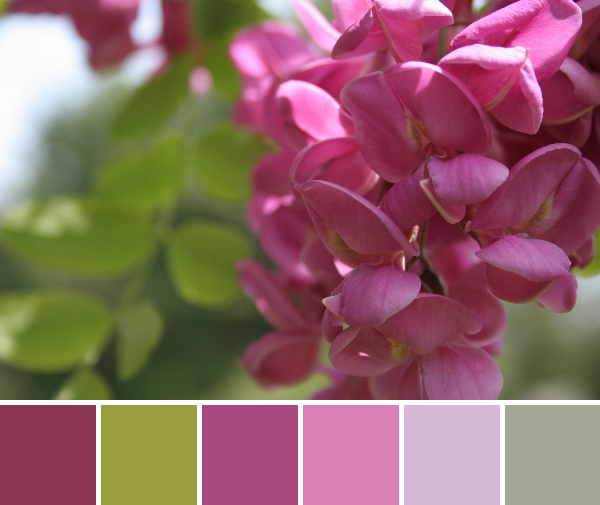
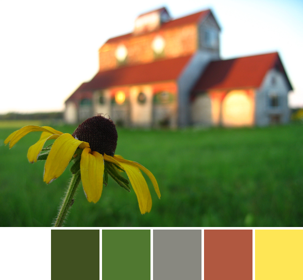
This week’s color inspiration comes from yet another flower adorning our yard: the locust tree’s gorgeous pink blooms. Many locust trees have white flowers, but the previous owners of our house had a serious thing for beautiful flowers, so it does not surprise me that ours flowers pink. These flowers not only look beautiful, but they smell great as well. Here are color palettes from two very different photographs of these beautiful blooms, created with Play Crafts’ Palette Builder 2.1 combined with my photographs. I hope they inspire you!
Corresponding Kona cottons from left to right:
Cerise, Olive, Plum, Lupine, Petunia, Raffia
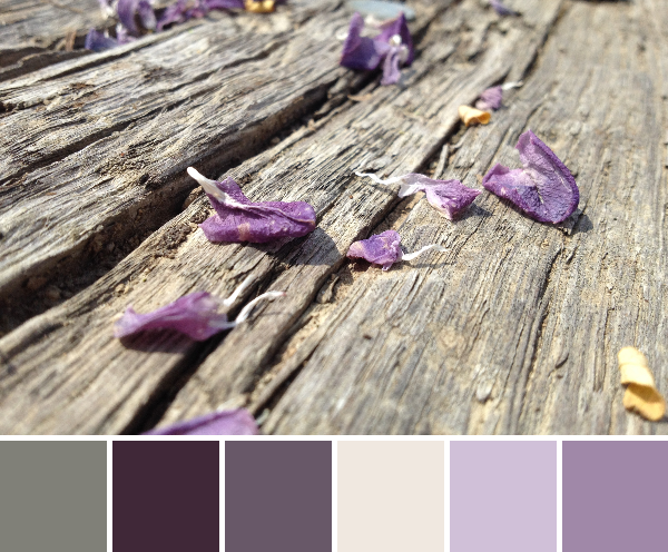
The locust blooms begin with this glorious, vibrant pink, but slowly fade to a hazy purple as the petals die and blow off the tree. The tree’s show of beauty is not yet complete, however. The purple petals cover the ground beneath the tree, blowing about in the breeze and making everything prettier.
Corresponding Kona cottons from left to right: Steel, Raisin, Coal, Bone, Pansy, Lilac
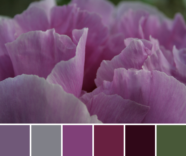
It’s peony time in my garden, so today’s inspiration comes entirely from those large, voluptuous flowers. There’s something about flowers that makes me reflect in awe about nature’s complexity. The petals are so soft, often symmetrical, yet abstractly swirling, the centers are a little universe of stamen and pistil, drawing the bees and butterflies into their little world to ensure the spread of future generations. It’s just flat out amazing!
Here are your color inspiration palettes for the week, created using Play Crafts’ Palette Builder 2.1. I hope they inspire you in the creation of a new quilt or project, or even just to take an extra moment to pause, get close, and really look at the next flower you pass. You may be surprised at what a closer look reveals.
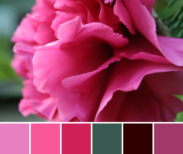
Corresponding Kona cottons from left to right: Coal, Steel, Magenta, Garnet, Raisin, Palm
Corresponding Kona cottons from left to right: Candy Pink, Azalea, Pomegranate, Kelly, Brick, Cerise
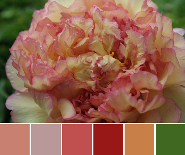
Corresponding Kona cottons from left to right: Salmon, Smoke, Sienna, Poppy, Gold, Grass Green
Can you think of anything more beautiful than a freshly blooming peony?
Yesterday when I checked the forecast for today and the next three days, it said “rain, rain, rain.” We woke up this morning to a bit of drizzle, but blue skies. By the time I got home from dropping my daughter at preschool, it was sunny and gorgeous, as it remained all day. Needless to say, we spent the day outside!
Now that night has fallen and my kiddos are sleeping, it’s time for me to keep my word and post my second weekly Color Inspiration Thursday. As I explained last week, on Thursdays I plan to post a color palette or two that I have created using the Play Crafts Palette Builder and my old photographs. I will also include the corresponding Kona Cottons since the Palette Builder lists them for me!
My hope is that these palettes help inspire you, maybe spur an idea for a new quilt or sewing project, or even just brighten your day and trigger those happy aesthetically-driven feelings. Even if you didn’t get to enjoy a sunny day filled with spring-time joy, new blooms, and keeping-the-bugs-at-bay breeze, here’s your dose of color:
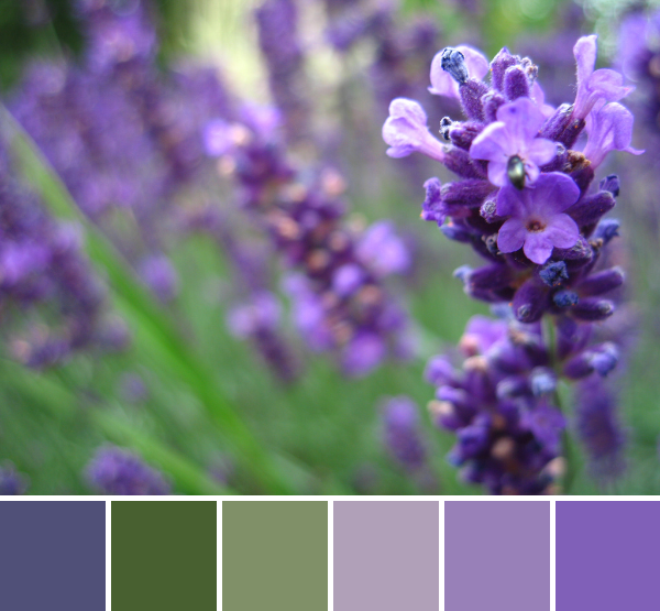
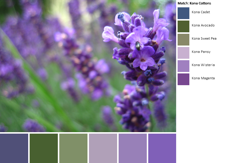
Corresponding Kona cottons from left to right: Cadet, Avocado, Sweet pea, Pansy, Wisteria, Magenta
For this palette, some of the Kona matches were a bit of a stretch (specifically the colors on the outer edges–do they look like cadet and magenta?), but when looking at the Kona colors together, I almost prefer them to actual colors pulled from the photograph.
The coordinating Kona cotton thumbnails are shown above. I like the cadet–a little bluer, and the magenta–a little brighter!
Regardless of whether you go with the range of purples from the photo, or the Kona colors chosen to match, I could see these colors becoming a quilt for my late Grammy June. Grammy was the sole quilter in the family, and my inspiration to begin quilting. She loved purple! I have to say: purple is certainly growing on me.
Corresponding Kona cottons from left to right:
White, Avocado, Grass green, Stone, Sienna, Wasabi
I’m partial to this palette since it includes both white and gray, which find their way into my quilts alwaysvery often these days. I feel like this palette has a country, down home feel. Do colors do that for you; do they illicit a specific “feel”? They definitely do for me!
I love color. I’ve always loved color. There’s just something about bright, coordinating, complimenting, or even sometimes clashing color that makes me happy. I’m a very aesthetically driven person, so I often admire the color combinations that appear around me.
You store your colored pencils in color order, too, right?
I’ve written before about the Palette Builder 2.1 on Play Crafts in my post Playing with Color Palettes, and I haven’t grown tired of playing with the Palette Builder to create unique palettes from my photographs. In fact, I’ve gathered quite a collection of color palettes. After a few gray sunless days, I need a burst of color to brighten my day. Both this need for color, and a recently found post called Weekly Inspiration on Nini & The Sea’s blog have inspired me to join in with the weekly inspiration idea. Each week, I will post a color palette or two that I have created using the Play Crafts Palette Builder and my old photographs. I will include the corresponding Kona Cottons since that is one of the coolest features of the Palette Builder in my opinion.
My hope is that these palettes help inspire you, maybe spur an idea for a new quilt or sewing project, or even just brighten your day and trigger those happy aesthetically-driven feelings. Open up those synapses, because here comes color!
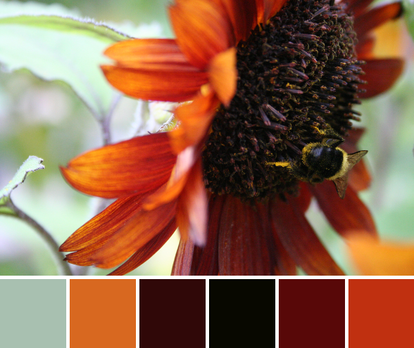
Bright autumnal color palette from a busy bee on a sunflower.
Corresponding Kona cottons from left to right: Seafoam, Cedar, Mahogany, Black, Wine, Lipstick.
I love this palette because it includes black AND a spot for low volume, both of which find their way into many of my quilts these days.
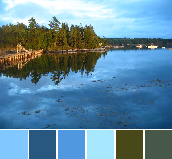
Summer blues!
Corresponding Kona cottons from left to right:
Lake, Cadet, Evening, Azure, Avocado, Moss.
I just love those blues, and this photo reminds me of summer evenings on the coast of Maine. I hope you enjoyed these bursts of happy color!
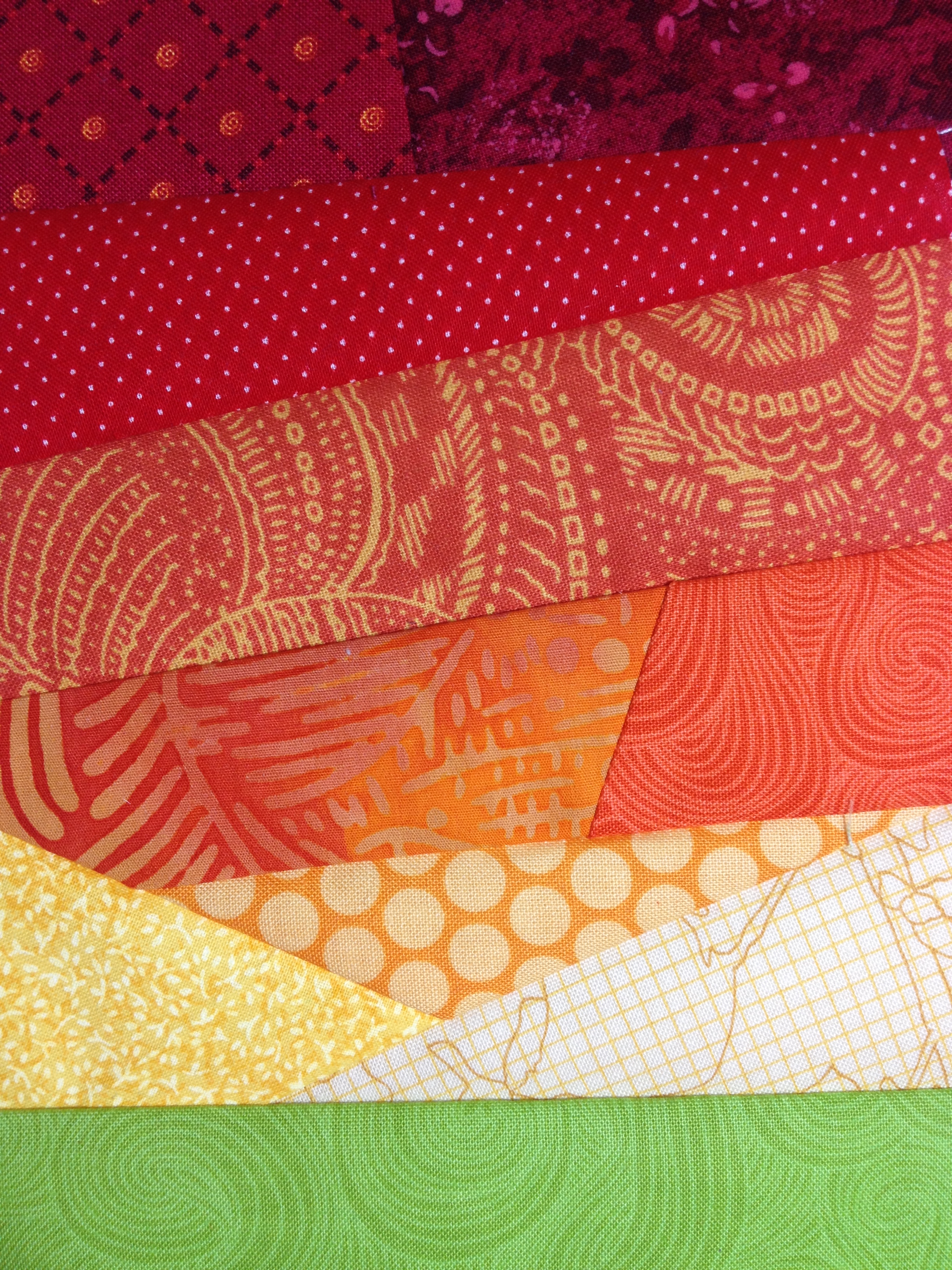
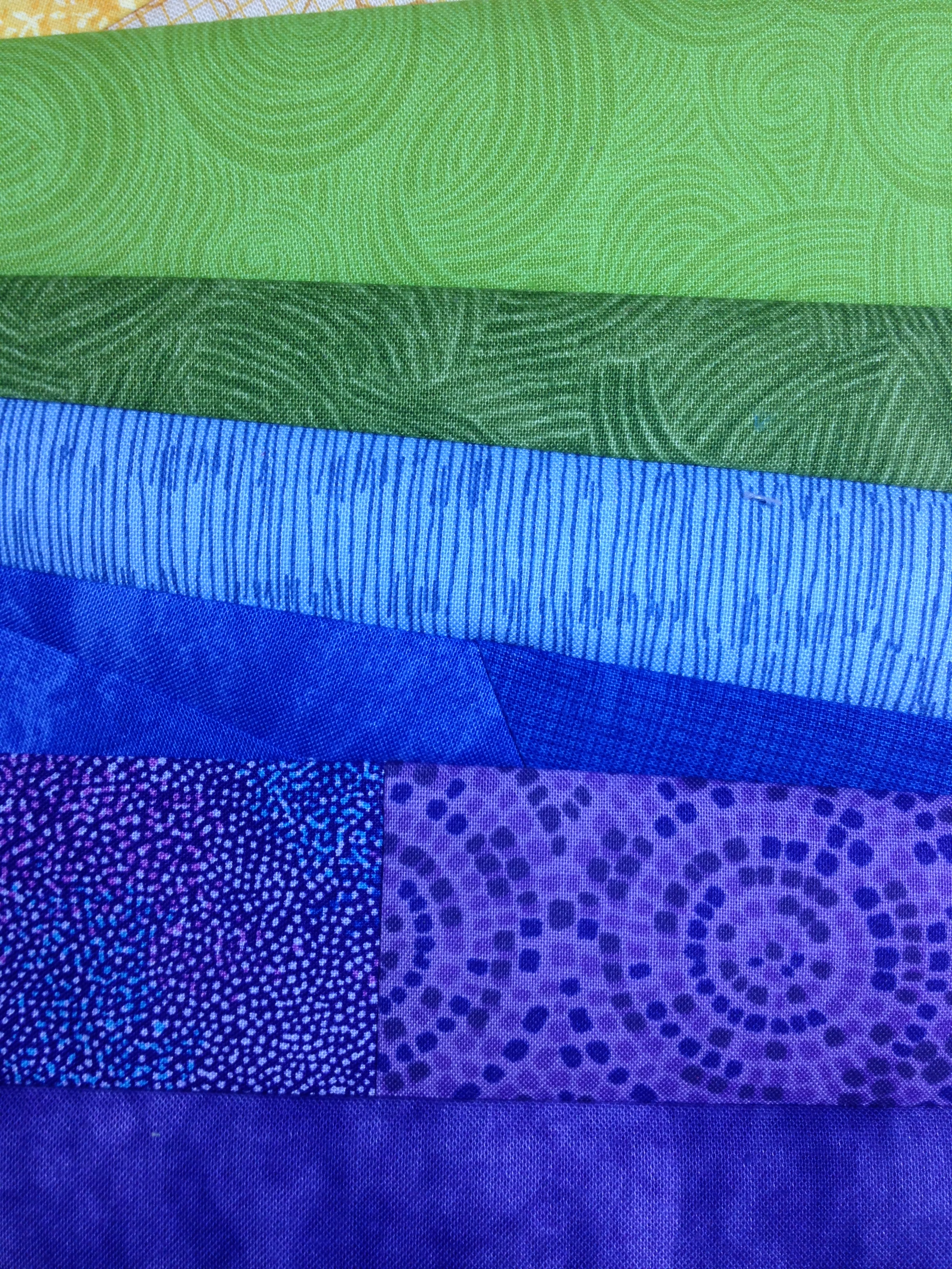
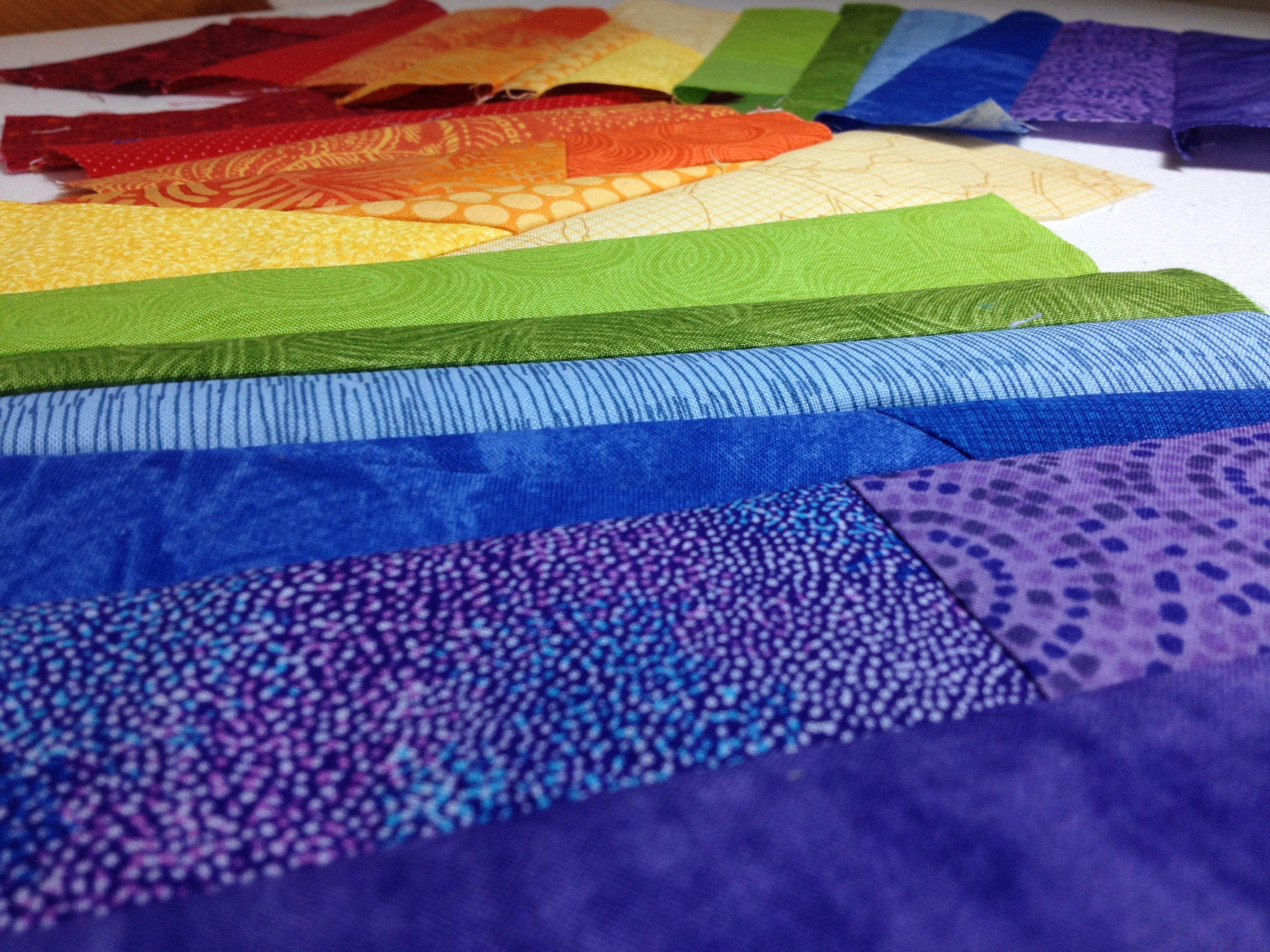
I’m attempting my first wonky anything in quilting. “Wonky” is a word I rarely heard before getting into the modern quilting world. The first quilting blog I ever followed is Bijou Lovely, and it’s still one of my favorite blogs! The photography is always stellar with lots of bokeh (narrow focal length resulting in that gorgeous blur around the point of focus), the projects are gorgeous, her tutorials are the best I’ve found, and I’m always on top of the newest fabric lines by following. Holly, the creator of Bijou Lovely, creates a lot of “wonky” quilts.
The “wonky star” in this awesome wall hanging was the first wonky that really caught my eye. It’s actually a gift quilt made by Holly’s friend Jen at http://mjandco-quilting.blogspot.com/. Click the picture to go to the Bijou Lovely blog post to see more of the little details. Trust me, it’s worth the side trip!
Quilting is traditionally very exact and symmetrical. With “wonky” quilting, elements of the quilt are all a kilter, asymmetrical, or otherwise skewed. There’s a lot of wonky in the modern quilting world. Come to think of it, the project I’m working on may not even be categorized as wonky; it might be more scrappy. I’m still learning this quilting lingo! Whether scrappy or wonky, it’s a bit uncomfortable for me. I like exact. I like precise. I really like symmetrical.
So far, despite this new-to-me wonk (something with wonk is wonky, right? :)), I like the way this is turning out. I can’t show you more, since I’m testing a pattern for a fellow designer, and the pattern isn’t out yet! Once the pattern is published and I’m cleared to show you, I’ll be sure to show you the finished work. Maybe you’ll be able to tell me whether it’s wonky or scrappy!
I grab a needle and thread once the kids are in bed