Tag Archives: quilting

Rainbow Thread Eye Candy

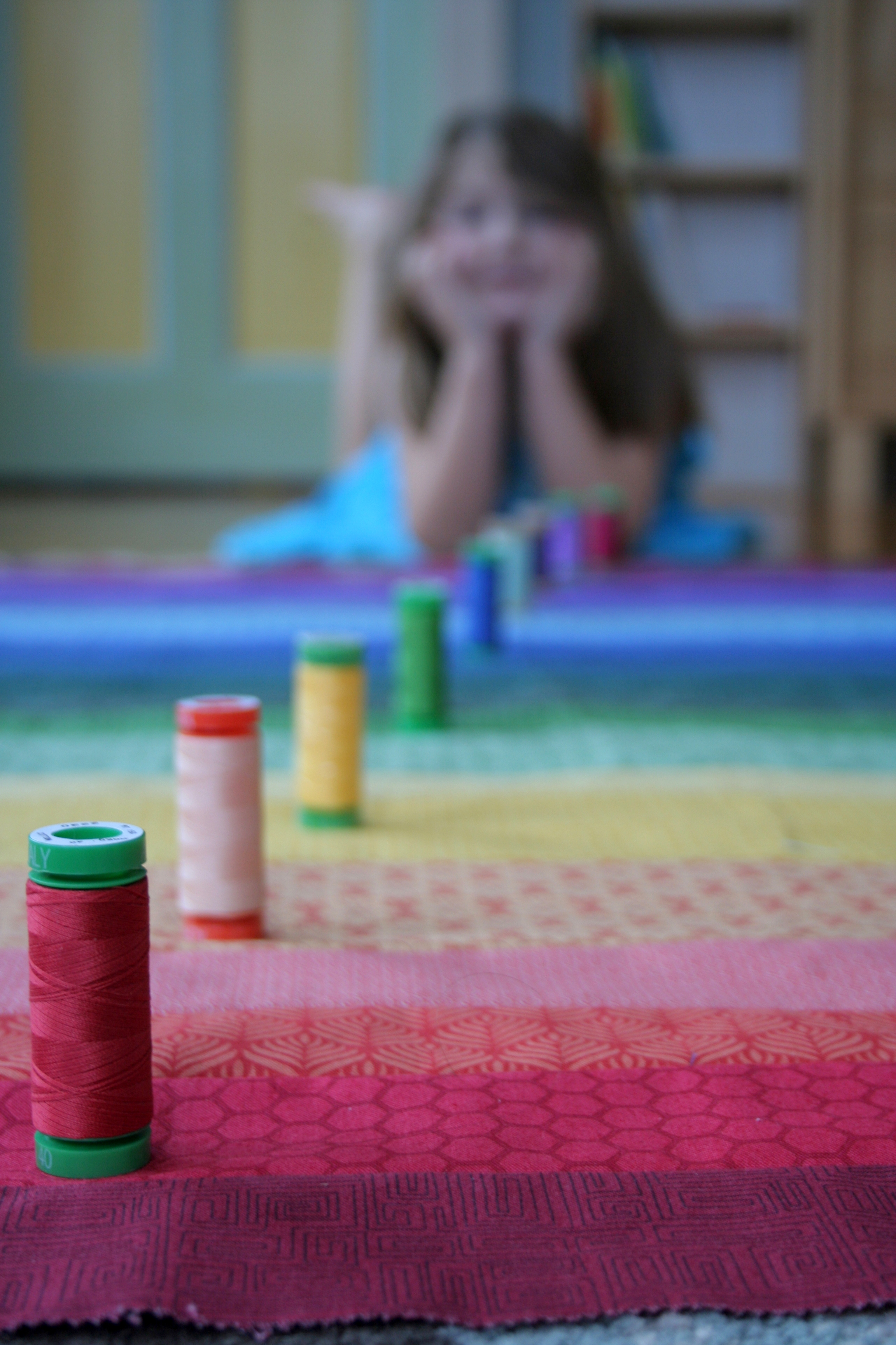
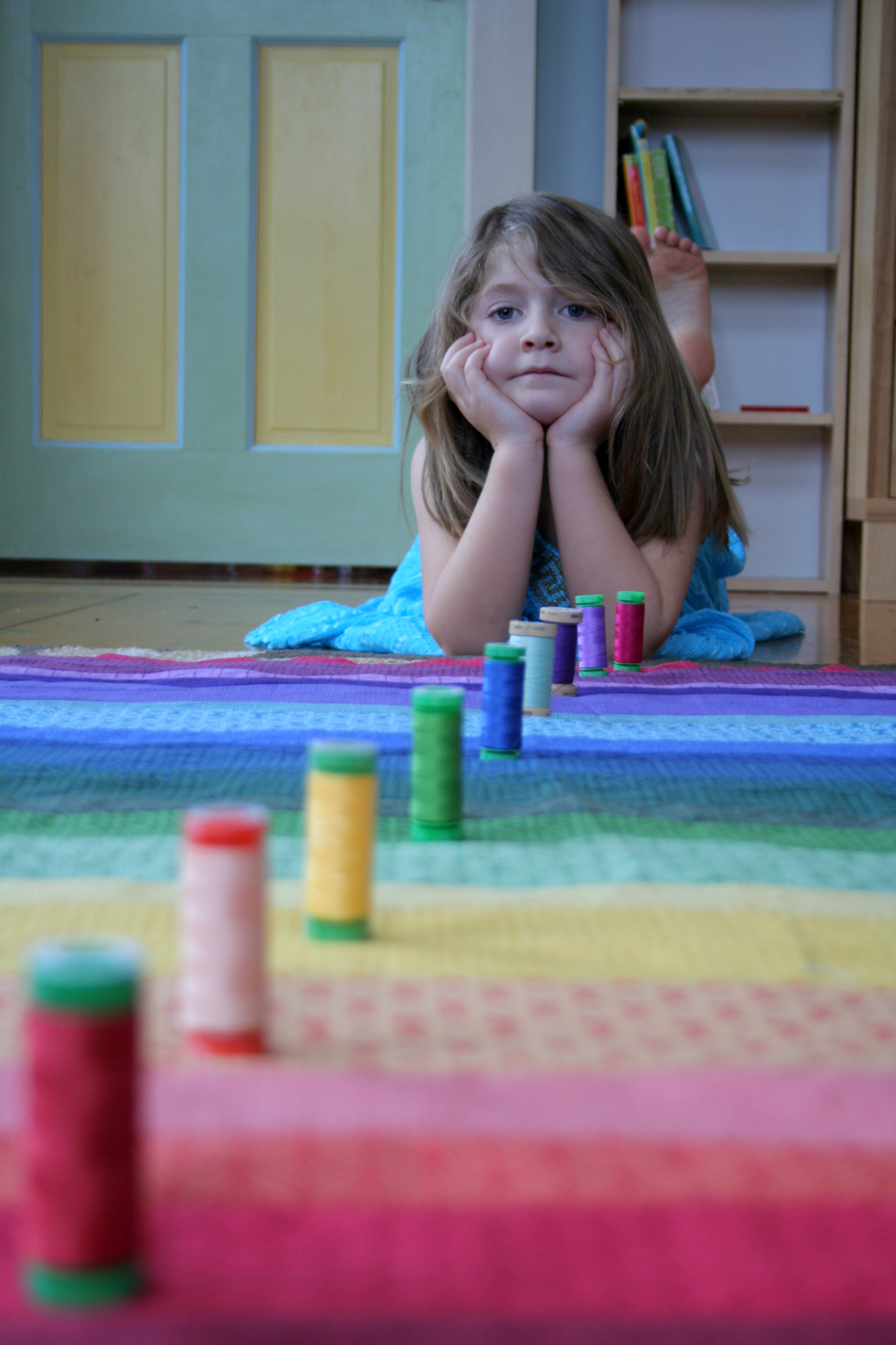
I have a confession to make: I’ve never made a quilt for an immediate family member. There, I said it. Yes, I have two kids and another on the way. Yet, I’ve never made a baby quilt for one of my own babes let alone myself or my husband. Well, that’s finally about to change! I’ve been working on a Rainbow Jelly Roll quilt for my daughter Maddie since early July of last year (as seen HERE and HERE), but it always seems to get shoved to the back burner behind projects for other babies, baby showers, and other family members. Finally, on Maddie’s birthday right before Christmas, we laid out the quilt and matched some threads to help psyche myself up for quilting and hopefully finishing her very first quilt.

matching rainbow thread

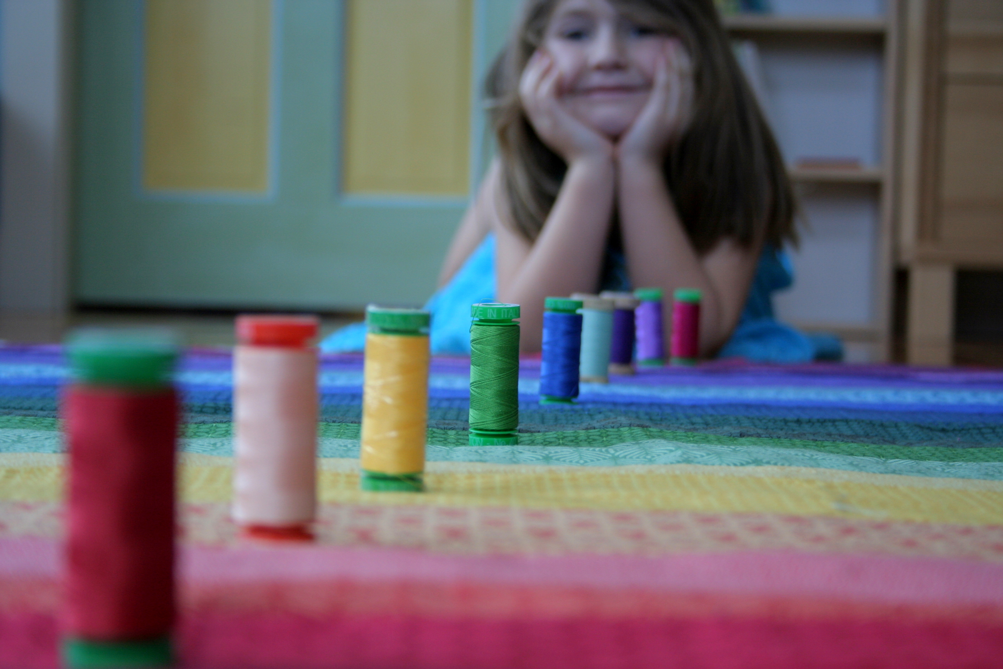
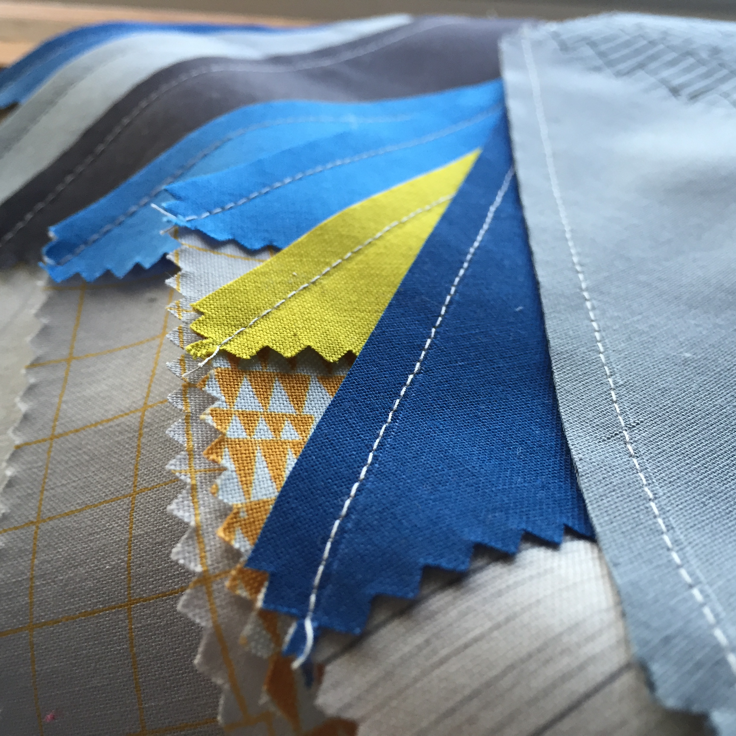
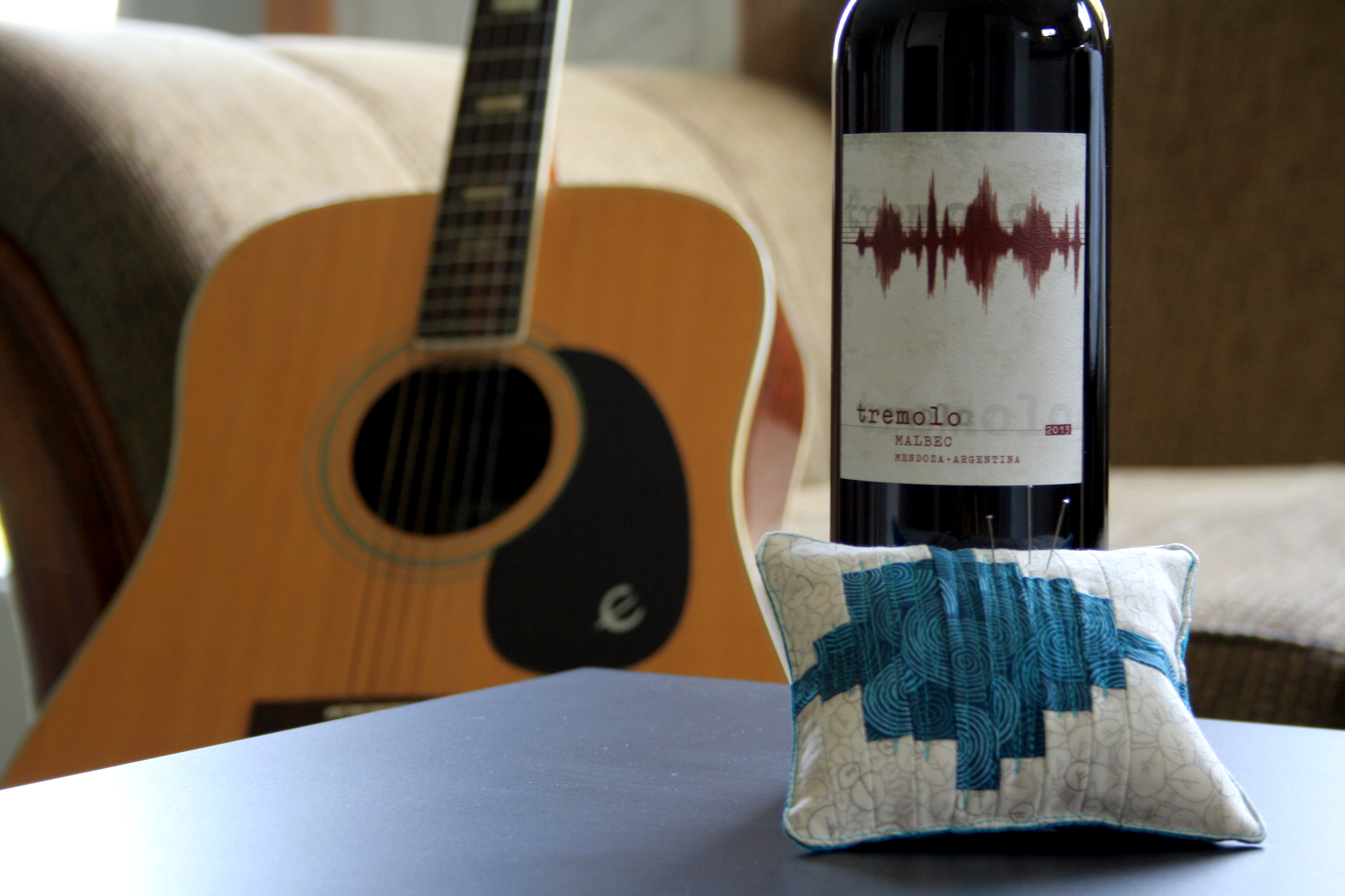
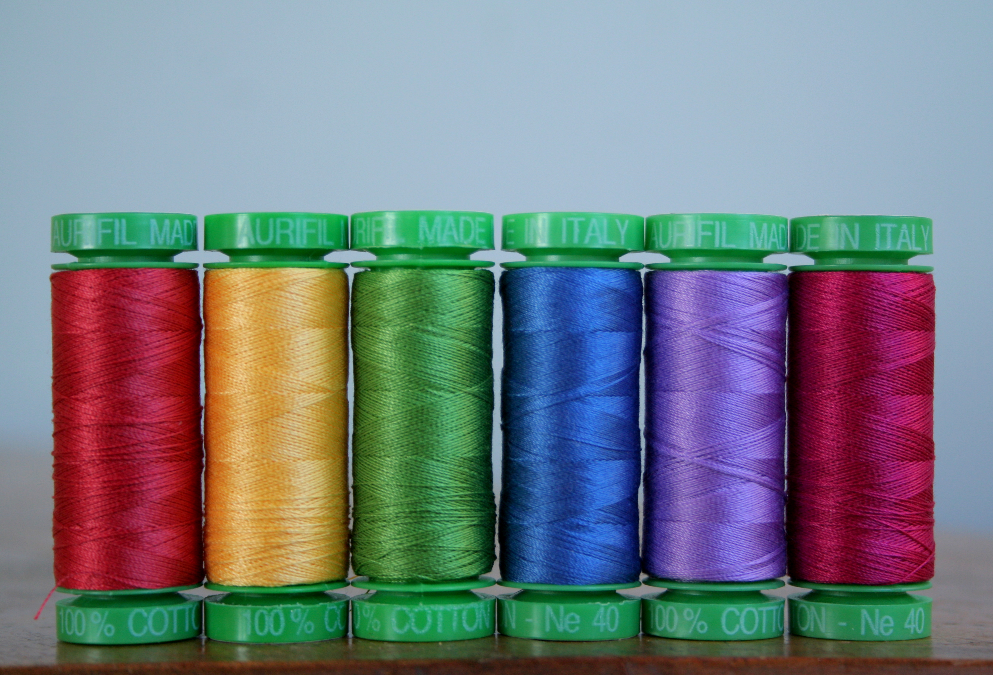
I decided that I wanted to quilt this with simple seam-echoing straight lines in coordinating thread, but that would require a rainbow gradient of thread (awww, darn! I have to buy a spectrum of Aurifil!?). I had a couple of spools of organic cotton Scanfil and one 50wt spool of Aurifil that already matched, so I went onto the Hawthorne Threads site and ordered the supplementary colors. I opted for 40wt since I had never tried them before and the website said they were good for machine quilting. I figured a little bit thicker than 50wt wouldn’t hurt, so these 40wt beauties were added to my stash.

rainbow aurifil thread

I’ve since then started and almost finished quilting this Rainbow Jellyroll Quilt, so I think my eye candy photo shoot worked! Here are some more gorgeous photos from my photo shoot with my adorable five year old, her rainbow jellyroll quilt, and the matching Aurifil thread.

matching rainbow thread

matching rainbow thread
Most of the time, Maddie had fun giving me a smile for these photos.

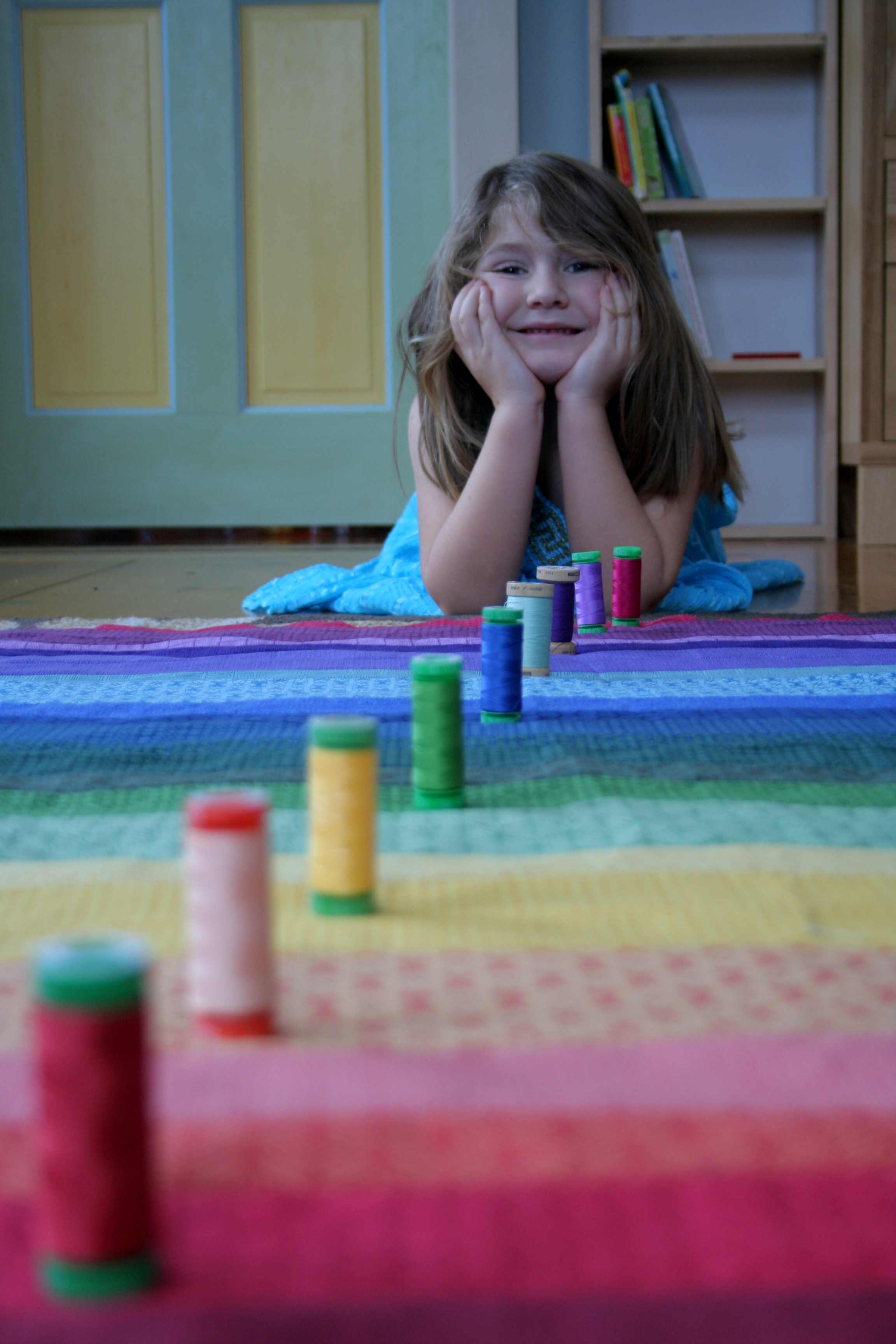
I think she may have been a bit bored during some of it, though! LOL!

matching rainbow thread
Bored Maddie

I seriously love Aurifil thread. It shines, has never broken once, and doesn’t fuzz up my machine NEARLY as much as other hand-me-down threads I use upon occasion. I’m excited to be slowly growing my supply of Aurifil.

rainbow aurifil thread gradient

rainbow thread gradient

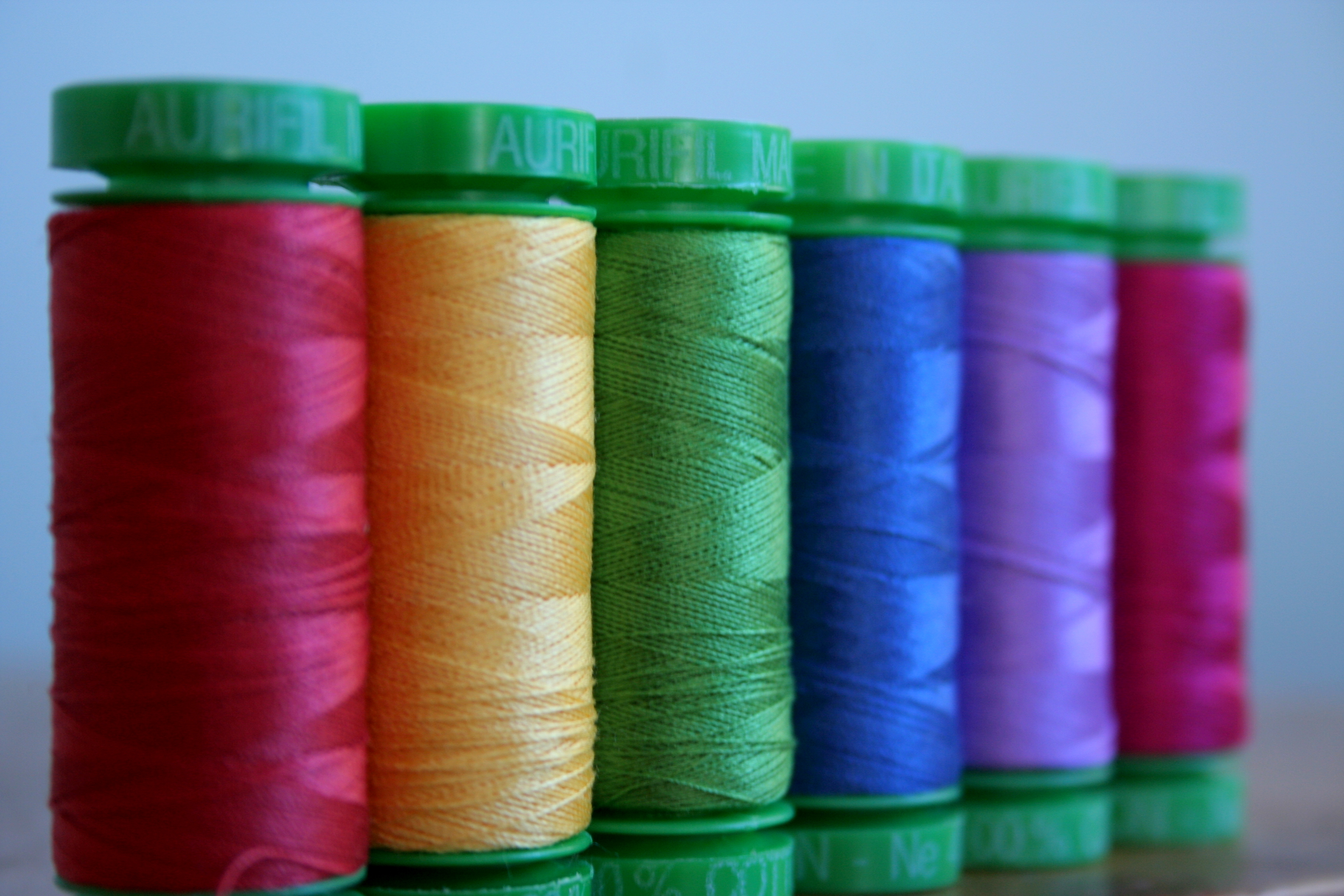
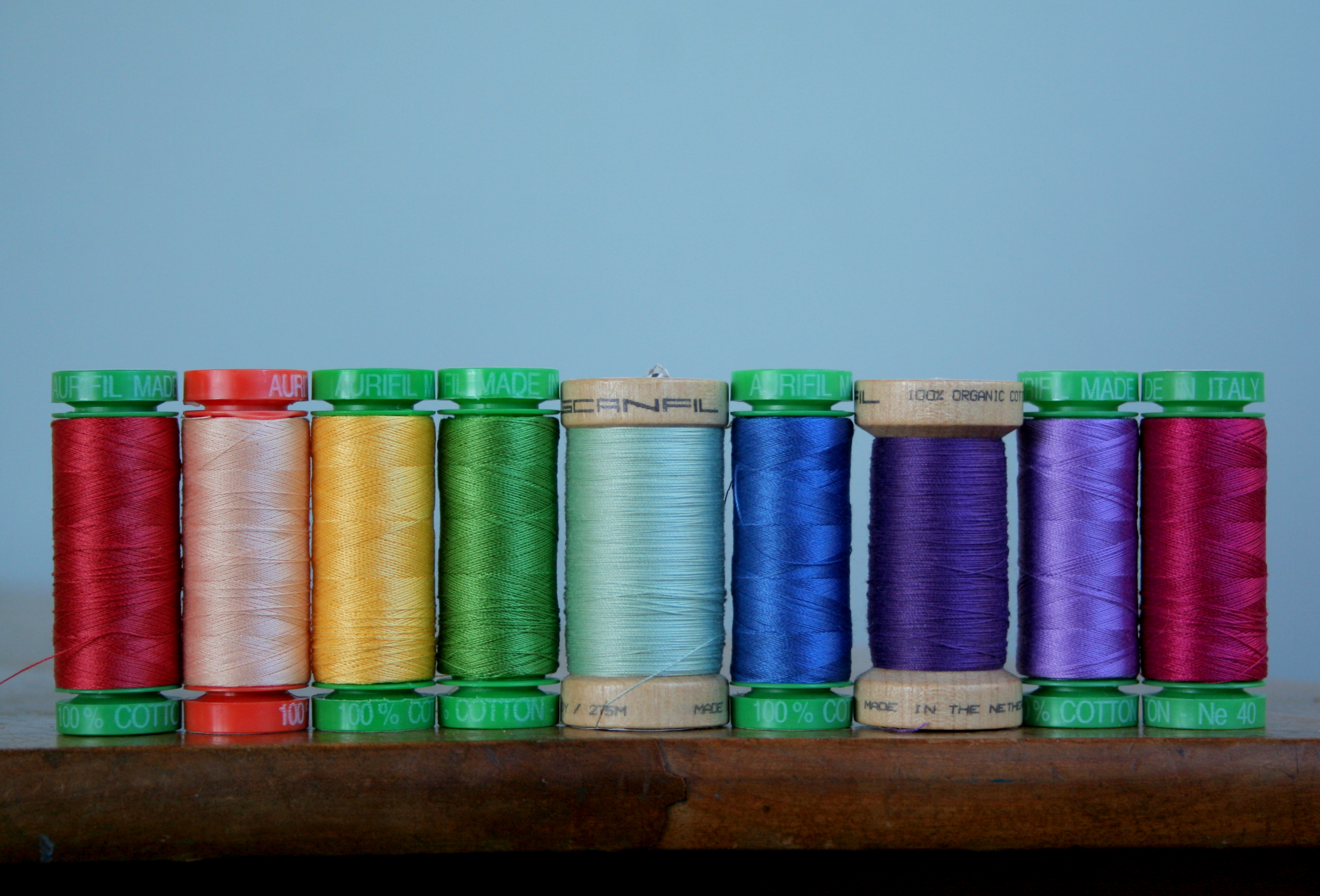
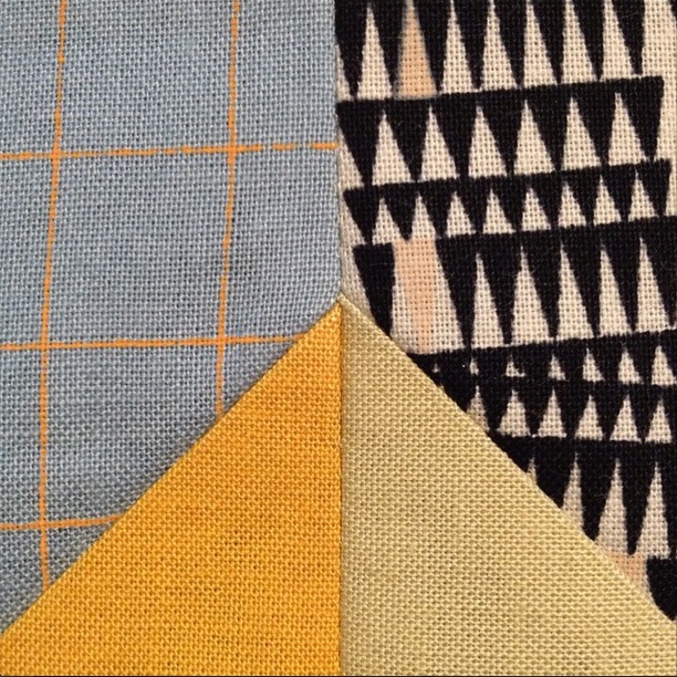
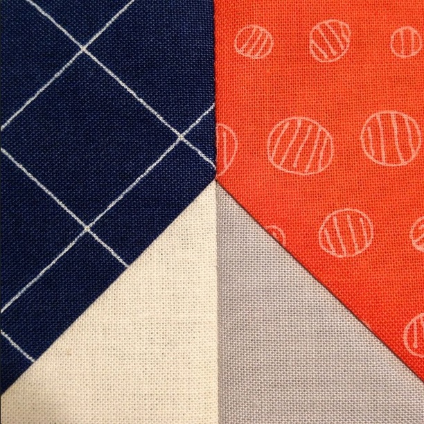
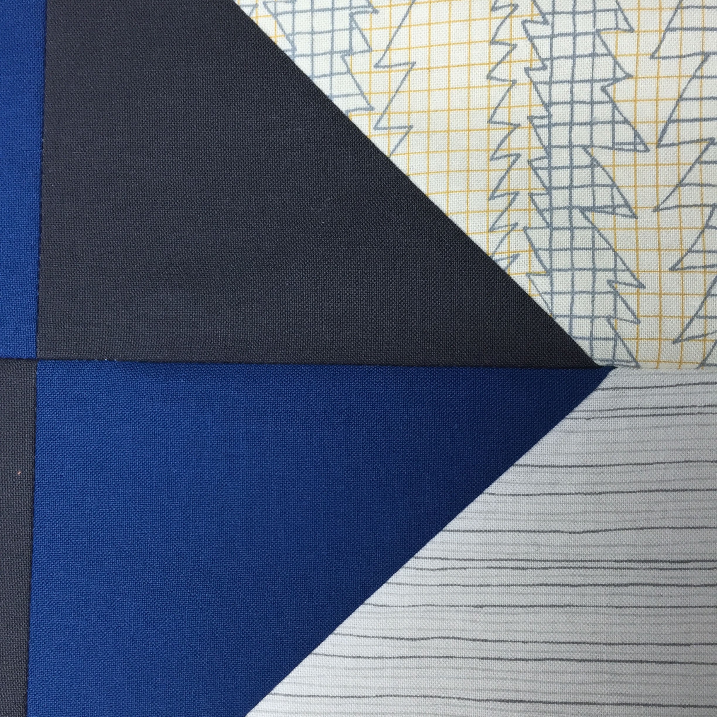
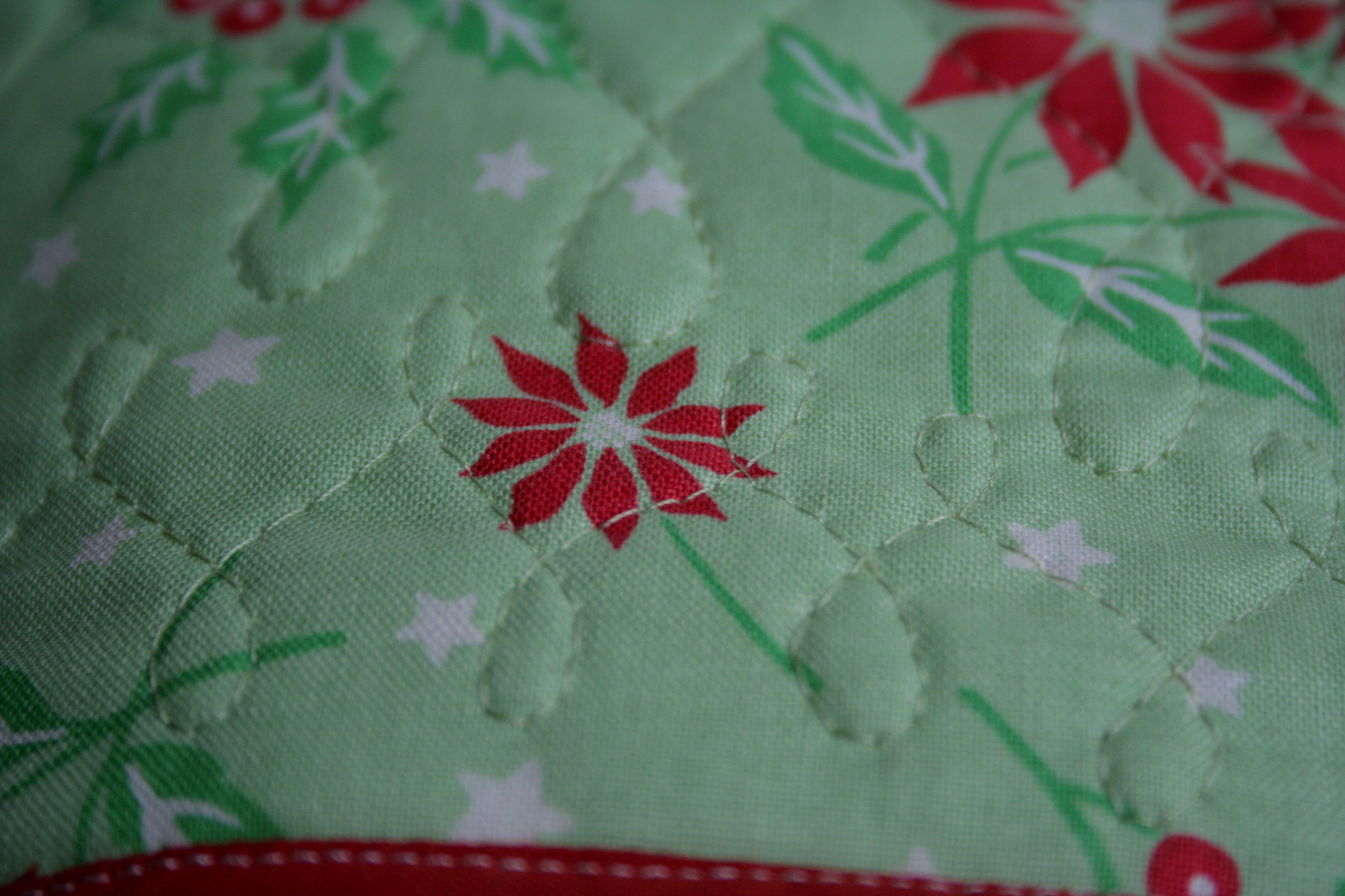
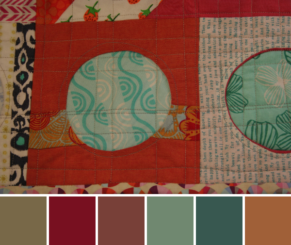
It’s a bit of a motley crew, but I think the resulting quilting is going to be gorgeous!!

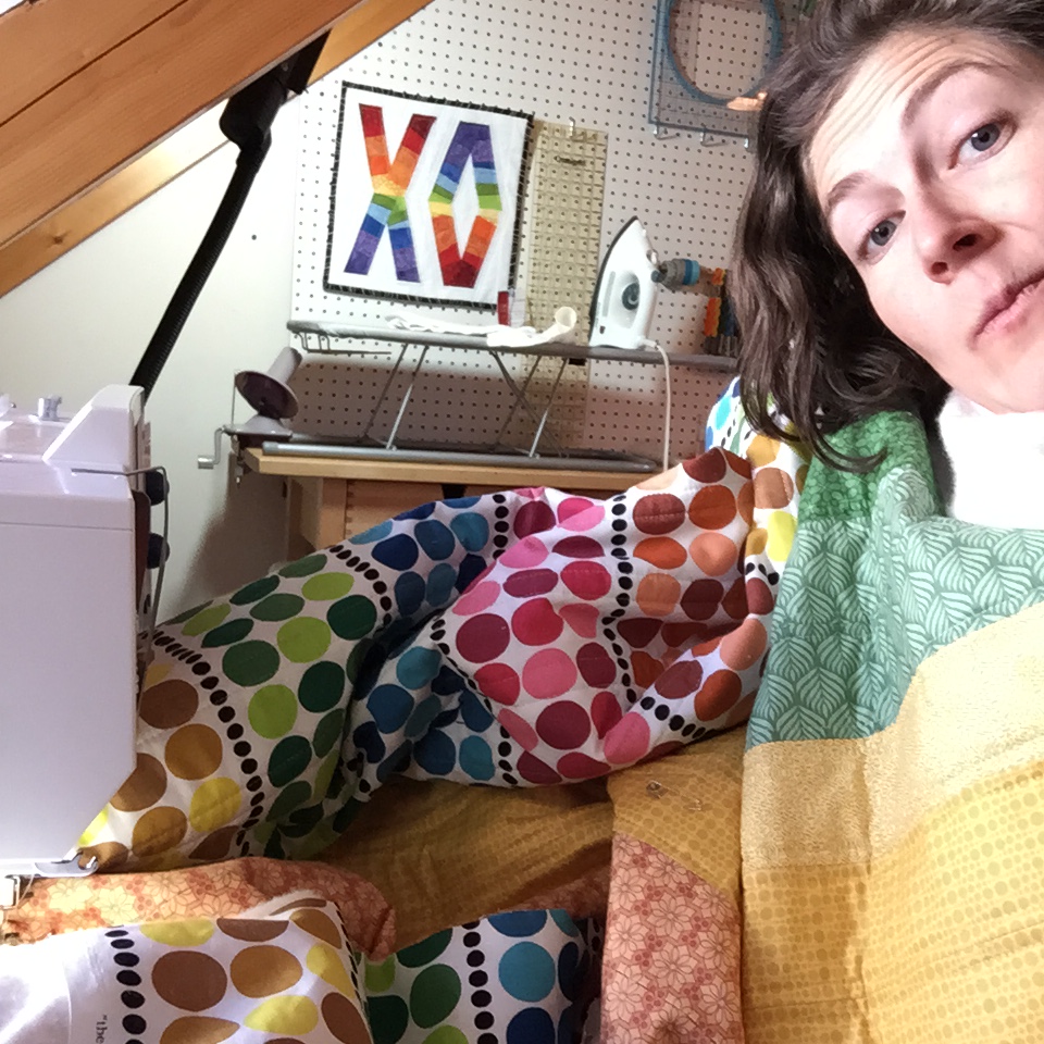
Here’s an Instagram selfie I posted while quilting. It’s my first-ever quilting selfie! See!? I’m making progress!

quilting IG selfie

I’m linking up with Molli’s Sunday Stash and Lee’s WiP Wednesday. Building my stash to move a work in progress forward a bit more is always fun!

Color Inspiration Thursday {33}

Weather in Maine this past week has varied between -20 degrees F and a balmy 20 degrees, but I’m still dreaming of the hot 88 degree sun in Cozumel. This week’s color inspiration is your first little taste of the tropics, care of my vacation photographs and Play Crafts’ Palette Builder 2.1. No worries; If you don’t get your fill of the tropical warmth with these palettes, I have enough to last through all of the frigid northeast’s winter month of January.

Take a little trip with me. Imagine you’re here, just getting off your catamaran to spend the rest of the morning on a soft, warm beach…

cozumel beach mexico

beach cozumel mexico

Ah, the warm, white sand!

beach cozumel color palette

Corresponding Kona cottons from left to right:
Ash, Medium Grey, Coal, Sky, Sand, Taupe

Corresponding Aurifil thread from left to right:
2600 – Dove
2625 – Arctic Ice
1158 – Med Grey
2024 – White
2205 – Flesh
2335 – Lt Cinnamon

The beach at Cozumel was so glorious. Between the warm white sand, the huggable green palm trees, and the perfectly turquoise water, I was in heaven. After getting off the boat, it seemed it was only right to flop down in the sand and get a closer look. This rope tied around a piece of driftwood seemed like a perfect place to start with the warm color inspiration. The combination of textures paired with the soft, soothing colors makes this a lovely palette that makes me dream of the beach in the summertime.

palm tree cozumel color palette

 Corresponding Kona cottons from left to right:
Evergreen, Coal, Titanium, Ivy, Black, PFD Bleach White

Corresponding Aurifil thread from left to right:
5021 – Light Grey
1158 – Med Grey
5008 – Sugar Paper
4173 – Dk Olive
2692 – Black
2843 – Lt Grey Green

Who doesn’t love to hug a palm tree? Seriously. Is it just me, or is it literally impossible to walk by a palm tree without hugging it? Maybe it’s just me, but either way, the view up the trunk into the tropical fronds is worth the extra hug. No coconuts fell on my head during the taking of this photograph, so no worries!

maddie hugging palm tree cozumel mexicoAt least my girl Maddie agreed with me. She’s a girl after my own heart!

So seriously, you hug palm trees, too, right?!


A New Year’s Goal: Balance

I’m  baaaaack!! Did you miss me!? I hope you all had a wonderful Christmas, and that the new year is off to a great start. As lovely as our extended vacation was, I’m happy to be home, even if it is -12 degrees outside right now. I’m also happy to be back in this space, sharing inspiration with you. I have some gifty and secret projects  I am itching to show you… all in good time. There’s so much to share, I hardly know where to begin. So I’ll begin with my favorite, a photo:

hexies in paradise
I did not do a stitch of sewing while actually on vacation, but I brought these hexies along for a tropical photo shoot in Cozumel. Talk about paradise!!

Every new year, it feels like a chance to begin fresh, set new goals, and form new habits. I am so excited for this new year and all the potential it holds. I have some big goals for this year, both crafty and family-related. I’m heading to my first QuiltCon in February, and our family is welcoming a third child in late May or early June. Many of you have shared a word to guide your year, and I’ve decided that my word should be “balance”. I love to sew, quilt,  create patterns, and share inspiration. I’m also a full-time wife and mom to a wonderful 5 year old and busy, busy, busy (and equally wonderful) 2 1/2 year old. With another baby coming into our family mid-year, I know that finding a good balance between family and sewing is going to be my biggest goal. On a slightly jestful note, I’ve already been practicing balance; I spent the first week of the year in the 80+ degree tropics and the second week of the year (and every one hereafter) in -10 degree Maine! giggle-freeze

2015 balance

To help me learn to focus on one main goal project at a time, I’ve decided to join in with A Lovely Year of Finishes. I missed the January goal-setting post deadline since I was away, but that doesn’t mean I can’t set a goal! I think my favorite part about ALYoF is that it forces you encourages you to choose just one project to finish each month. I am a perfect case of an ADD quilter–I often work on many projects simultaneously, not making any serious progress on any particular one. I’m hoping that joining ALYoF will help me stay focused and actually FINISH some serious projects.

A Lovely Year of Finishes 2015

For January, my goal is to finish my secret sewing quilt. I know, I know… I can’t show you much since it’s a secret!! But I can show you the little peeks I’ve shared on Instagram, and can tell you that so far I have the quilt top finished. I need to piece the back (I have a grand plan of trying needle-turn applique for the first time ever to make the back as awesome as the front), baste, quilt, and finish the quilt. For a busy momma who gets maybe 5 hours tops per week to sew, this is a big goal. Why not start with a bang, right!?

Since this is already one of the wordiest posts I’ve written, I’ll finish up with some peeks at my secret quilt progress. I get to play with Carolyn Friedlander’s new Doe fabric, which Robert Kaufman Fabrics was kind enough to send me a month in advance so that I could get the quilt finished in time despite the late December release date in the US.

doe fabric peek

doe fabric peek

doe fabric peek
Doe goes SO well with its coordinating Kona solids.
This project has helped me let go of a bit of my OCD. I let this imperfect seam match go, but the perfect center (far left) made up for it!

I can’t wait to show you more, and I hope I can get it finished!!

What are your goals for the new year? 

Much to Sew, About Nothing (to Blog)

This is a tough time of year for me in terms of blogging. I mostly like to share photographs of my progress and projects, but this time of year I’m spending every free second frantically trying to get projects done (and not very many free seconds blogging). On top of that, I’m currently working on two secret projects and three Christmas gifts, so there’s not a whole lot I can really share in full. I’m considering taking an official “Christmas vacation” from my blog, but also don’t want to miss all of you too much.

For now, I decided to take some crazy close-up photographs of some of my works in progress to share with you in an aura of mystery. Here are some of the things I’ve been working on. Go ahead and guess what they are, if you want! It reminds me of the backs of Ranger Rick magazines I read as a child, where they had a grid of super macro photographs of everyday objects and you had to guess the object. Have fun!

secret sewing peek

secret sewing peek

secret sewing peek

secret sewing peek

secret sewing peek

I also have to include this process shot, completely unedited. This was my first time using my new Massdropped pink clover clips, and this one glows in the dying light. I think it’s such a cool photo!

secret sewing peek glowing clover clip

If you’re a quilter-blogger who also has a lot of holiday and family obligations this time of year, what do you do to ease your stress levels? Take a break from blogging? Let go of obligations or personal expectations? I’d love to know!

Color Inspiration Thursday {30}

Sometimes, just sometimes, your iPhone photo comes out better than the ones you take with your “real” camera. This week was one of those times. I had a blast outside photographing beauty after an ice storm, and put up a quick Instagram photo just for fun. I came home and uploaded the photos from my camera, and while I got some shots I’m happy with, the particular photo I posted on Instagram wasn’t even close to rivaled. And so, this week, the final photo is indeed an iPhone photo. C’est la vie.

All color palettes are created using Play Crafts’ Palette Builder 2.1 and my photographs.

icy evergreen color palette

  Corresponding Kona cottons from left to right:
Graphite, Evergreen, Black, Old Green, Dresden Blue, Blue Bell

This palette elicits peace and stillness. Maybe it’s the fact that the fine pine needles are trapped, frozen still in the ice. Maybe it’s the presence of calming light greens and blues. Either way, I could see this palette in a little boy’s baby quilt, or a lap quilt for a rustic living room.

red osier dogwood color palette

Corresponding Kona cottons from left to right:
Steel, Crimson, Iron, Brick, Cayenne, Sky

Corresponding Aurifil thread from left to right:
2625 – Arctic Ice
2245 – Red Orange
2845 – Lt Juniper
2345 – Raisin
2355 – Rust
2710 – Lt Robins Egg

The botanist/naturalist in me loves this photo, since it is such a classic example of red osier dogwood (Cornus sericea) in winter. The opposite branching and bright red bark are dead giveaways to the species. I also love the shades of red paired with light blue and greys that appear in the resulting color palette.

icy queen anne's lace color palette

Corresponding Kona cottons from left to right:
Steel, Charcoal, Coal, Windsor, Amethyst, Shale

This is my favorite from my Canon Rebel XT photos of this particular ice-bejeweled Queen Anne’s Lace (Daucus carota) remnant. I love the movement and the muted, subdued tones. But lo, the photo I took with my iPhone captures the light better and thus shines even brighter:

Instagram icy blues color palette

Corresponding Kona cottons from left to right:
Dresden Blue, Blue, Charcoal, Indigo, Amethyst, Regal

Corresponding Aurifil thread from left to right:
5008 – Sugar Paper
2560 – Iris
2606 – Mist
2785 – V Dk Navy
4140 – Wedgewood
2783 – Med Delft Blue

This photo glistens, doesn’t it? I love the resulting palette, too, although it is no secret that I’m a blue girl. Okay, and a magenta and turquoise girl. So maybe I’m just a color-in-general girl. Either way, I love this palette. I think I may actually use this palette for a future quilt. I need to make a Storm at Sea quilt one day, and these blues and stormy grey might be just the perfect shades.

What color do you find the most in your quilts?

Color Inspiration Thursday {28}

Today I am taking a trip down memory lane for our color inspiration. I admit, I was waiting for the perfect frosty morning to take photos for today’s color inspiration and the day simply did not come; it was cooooold but no gorgeous frost. So, I headed to my photo archives and found a few suitable seasonal nature photos from a family camping trip in November of 2010. My husband and I took our baby Maddie camping in a yurt in Jefferson, Maine, and had a lovely time. Here are some snapshots. Color palettes are made using Play Crafts’ Palette Builder 2.1 and my own photographs, as per usual!

see the world in a drop of water color palette

Corresponding Kona cottons from left to right:
O.D. Green, Sky, Iron, Steel, Evergreen, Palm

See the world in a drop of water. I love the smooth grey-green of this palette, and the reflections dancing in the raindrops.

drip drop leaf brown color palette

Corresponding Kona cottons from left to right:
Coal, Sable, Black, Medium Grey, O.D. Green, Titanium

Another raindrop photo; can you tell I like to take photographs of water showing off its awesome surface tension tricks? This palette holds all of the muted earthy tones found in mud. Mmmm!

colorful yurt color palette

Corresponding Kona cottons from left to right:
Chestnut, Black, Slate, Ochre, Paprika, Mahogany

A warm and cheery scene from inside the yurt. My husband holds my peacefully sleeping daughter during nap time, and our hunter-beware clothing dries above the wood stove. This was a cozy camping trip for sure! I like the range of colors in this palette, and I think they play well together.

slime mold color palette

Corresponding Kona cottons from left to right:
Moss, Black, Caramel, Spice, Gold, Cinnamon

Corresponding Aurifil thread from left to right:
5013 –Asphalt
2692 – Black
2930 – Toast
2385 – Terracotta
2930 – Toast
4012 – Copper Brown

I love this palette. I don’t think I will tire of the bright pop of fungi growing on a tree. The flow from black-greeny-grey to the range of coppery yellows and reds creates such a smooth aesthetic. This might be my favorite palette from this group.

night time lantern fun

Just one more photo to complete my trip down memory lane: my husband and daughter enjoying an awed experience with the lantern at night. I can’t believe this baby girl is almost 5 years old! We definitely will need to think about another yurt camping trip, maybe this winter!

A Perfect Pair: Wine and Fabric {Tremolo}

It’s been a while since my last wine and fabric pairing post, and there’s a good reason for it: I’m expecting baby #3 and therefore haven’t been drinking any wine! Now that the cat’s out of the bag, you will understand my relative blogging silence the past few months. The first trimester is exhausting, meaning my late night quilting was replaced by sleeping!

This past week, though, my parents came to visit, and when I saw one of the bottles of wine my dad brought along, I immediately was inspired to make a quilt. Or, in this case, a small pincushion for starters.

Tremolo wine  inspired pincushion quilting

Tremolo wine  inspired pincushion quilting

My first thought when I saw the 2013 Tremolo Malbec from Mendoza, Argentina (other than “Man, I wish I could have some wine”) was how the sound waves would make a cool quilt.

Tremolo definition from google

I did a bit of googling to see if I could find any existing sound wave quilts, and then decided to make my own practice version in the form of a pincushion. At first I was going to make it longer with gradating colors from dark to light, but due to time and resulting size I limited myself to just one sound wave.

tremolo sound wave quilt pincushion

I used almost entirely scraps, but needed to cut one more 3/4″ strip of Carolyn Friedlander’s beloved botanics fabric for background. I’m mostly happy with how this turned out, but I feel like the strips should could be skinnier. Perhaps on a larger scale (think: pillow or quilt), the strips could be wider and still have the right sound wave generating effect. As it was, 3/4″ strips (finishing at 1/4″) were pretty tiny, and still look too wide for my taste.

tremolo sound wave quilt pincushion

I do love the quilting, though!! I jumped right into free motion quilting a sound wave zig-zag right on top. I intentionally bumped out into the background a bit, mimicking the fluctuations of an actual sound wave. I used Aurifil 2810 – Turquoise 50 wt thread, which coordinated with the sound wave, but contrasted enough so that the stitches are very visible (and audible?)

tremolo wine inspired quilted pincushion

My dad reported that the Tremolo wine is very good, and nice and smooth. The label description says: French-born winemaker Didier DeBono crafted this 100% Malbec from grapes grown on two special, high-elevation vineyard sites in Mendoza. A Tremolo is an aurally pleasing musical effect we were reminded of upon tasting this harmonious, balanced wine. It sounds like my dad agrees, and that the inspiration can be extended visually, to music-inspired quilting!

tremolo wine inspired quilted pincushion

There you have it: another perfect wine and fabric pairing. Drink Tremolo while you work on your musically-inspired quilt, whether it be a tiny pincushion or a king sized quilt!

The perfect pair:

Fabric
Any music or sound wave-inspired sewing
My mini tremolo pincushion included:

Front (Collection/Designer/Manufacturer):
Scraps of:
*  Botanics/Carolyn Friedlander/Robert Kaufman Fabrics – background
*  Plum Rose/Blank Quilting – sound wave

Back (Collection/Designer/Manufacturer):
*  Tree of Life/Chong-a Hwang/Timeless Treasures Fabrics

Wine
Varietal: Malebec
Producer: Tremolo
Vintage: 2013
Location: Mendoza, Argentina

Tasting notes from website: Rustic, earthy and even a bit restrained at first, after some air this wine will reveal excellent fruit concentration with notes of dark cherry and blackberry, plus a hint of vanilla and a meaty, earthy finish. It finishes dry and will leave you thirsting for more – especially if you’re having it with grilled meat.

Or if you’re in the middle of an aurally and visually pleasing quilting project. A perfect pair, indeed.

Here are two of my favorite sound wave-esque quilts I found during my google search:

Piano Keys quilt by Avis Collins Robinson
Piano Keys by Avis Collins Robinson

This beauty was found on the November 1, 2009 tumblr post on http://allfortheloveofgooddesign.tumblr.com/.  It’s a photo taken at the African American Quilts exhibit at the Nelson Gallery, of a quilt called Piano Keys by Avis Collins Robinson.

tuning forks quilt by heather preggers
Tuning Forks #11 by Heather Preggers

I absolutely love this quilt by Heather Preggers. Visit her blog to read more about her thought process and creation of this quilt. She also has many other variations of this tuning forks quilt, since she’s admitted she is somewhat obsessed with them! They are all gorgeous and resonate with sound and movement.

I’m linking up with Crazy Mom Quilts Finish it up Friday, since I finished my pincushion and paired a nice wine!

Color Inspiration Thursday {27}

Flash back to fall! All color palettes are created using Play Crafts’ Palette Builder 2.1 and my photographs.

pumpkin ladybug autumn color palette

Corresponding Kona cottons from left to right:
Biscuit, Earth, Forest, Ivy, Spice, Gold

While I’m resigned to the fact that winter is here, I’m still cherishing the little bits of life that still brighten our garden. This little ladybug was relaxing on one of our almost-ripe pumpkins a couple weeks ago. The muted tones of the resulting color palette speak volumes of fall. Many of the corresponding Kona cotton colors also scream fall: ivy, spice, gold… Yum!

flower autumn color palette

Corresponding Kona cottons from left to right:
Evergreen, Gold, Coal, Paprika, Pickle, Ivy

Corresponding Aurifil thread from left to right:
5013 –Asphalt
2330 – Lt Chestnut
1246 – Grey
4012 – Copper Brown
2910 –Med Olive
1318 – Dk Sandstone

While beginning to put my gardens “to bed”, I was overjoyed to see a few last Calendula flowers holding on, with bright sun-ray petals dancing circles around them. Those last flowers in fall make me so happy! There’s something about the intricacy and color play that naturally occurs in flowers that makes me marvel at the ever-present beauty in nature. Color is everywhere!


Color Inspiration Thursday {25}

My hope for all of these color inspiration posts is that someone gets their creativity spark ignited and creates a gorgeous quilt or other work of art based upon one of my palettes. Since I and many of you are quilters or other fiber artists, where better to let inspiration strike than the fabric shop? This week’s color inspiration comes from Alewives, a gorgeous fabric shop in Nobleboro, Maine. Palettes are made using my photographs and Play Crafts’ Palette Builder 2.1.

alewives website

Enjoy some color inspiration eye candy:

pink ribbon color palette

 Corresponding Kona cottons from left to right:
Steel, Geranium, Rich Red,  Crimson, Garnet, Thistle

Wooden spools, assorted ribbons, and a lovely palette of pinks and purples.

fat quarter color palette

 Corresponding Kona cottons from left to right:
Terracotta, Cinnamon, Mahogany, Lipstick, Paprika, Salmon

Corresponding Aurifil thread from left to right:
2350 – Copper
2245 – Red Orange
5024 – Dark Brown
2215 – Peach
2355 – Rust
2220 – Lt Salmon

One of my favorite spots in Alewives is the collection of fat quarters in the center of the store. Arranged by color in awesome vintage wooden bins, these fabric bits beg to be touched, gazed upon with wonderment, and then (naturally) purchased. Yum!

fabric eye candy
Fabric eye candy; how gorgeous is this fat quarter display!?

fat quarter color palette

 Corresponding Kona cottons from left to right:
Bark, Med Olive, Med Juniper, Arctic Ice, Peach, Toast

Another gorgeous glimpse of the fat quarter bins. I could see this palette making its way into a lovely gender-neutral baby quilt. Or a soft, autumnal lap quilt or table runner. Or just about anything!

color in the quilt display

 Corresponding Kona cottons from left to right:
Bison, Wine, Cinnamon, O.D. Green, Kelly, Spice

I loved the color and fabric choices for this quilt display. Isn’t it wonderful when you walk into a shop and are not only swooning over the fabric, but are also are inspired by the quilts displayed around the shop?! I think the match of Kona Kelly to that darker teal is off, but you get the idea! Aurifil matches it as 2285 – Med Spruce, which looks like a more accurate match along with the 2850 – Med Juniper match for the Kona O.D. Green.

To see a few more glimpses of quilty beauty from the Alewives shop, visit my post Color for Quilters & the Maine Modern Quilt Guild. If you are ever in or near Nobleboro, Maine, I’d definitely recommend stopping in to Rhea’s shop. Tell her Kitty sent you!

Note: I have no affiliation with Alewives Fabrics; I simply think it is a gorgeous, well stocked and kindly owned local fabric shop and I like to spread the love! Plus, It’s kind of awesome that their minimum fabric purchase online is 1/8 of a yard, AND that they will send you a 1/16 swatch if desired! That is hard to find with online shops! Enjoy browsing.


Color Inspiration Thursday {24}

This week’s color inspiration comes again from the bog. There were so many pops of color in that oasis ecosystem that I just had to share more than one week’s worth. Palettes are made using Play Crafts’ Palette Builder 2.1 and my photographs. Enjoy!

red leaf pop color palette

Corresponding Kona cottons from left to right:
Avocado, Steel, Sable, Old Green, Plum, Pepper

I love how this little pinkish (Kona Plum) leaf just pops right up with burst of color amongst the evergreens. Getting the leaf in perfect focus was a bit tricky with the wind and fading light, but I think it still works. If nothing else, it makes me smile.

red berries color palette

Corresponding Kona cottons from left to right:
Steel, Bison, Brown, Ruby, Wine, Lipstick

Corresponding Aurifil thread from left to right:
1246 – Grey
4173 – Dk Olive
5024 – Dark Brown
2230 – Med Peony
2355 – Rust
2265 – Lobster Red

I love this photo. I don’t know if it’s the mirrored red berries all blurred in the background, or the bits of blurred green swirled into the mix, or whether I am just really drawn to the pop of the red berries. Either way, I love the photo and the resulting palette. It makes me *maybe* think I could be ready for snow in a couple months, as long as there are pretty red berries to brighten it up a bit. Maybe.