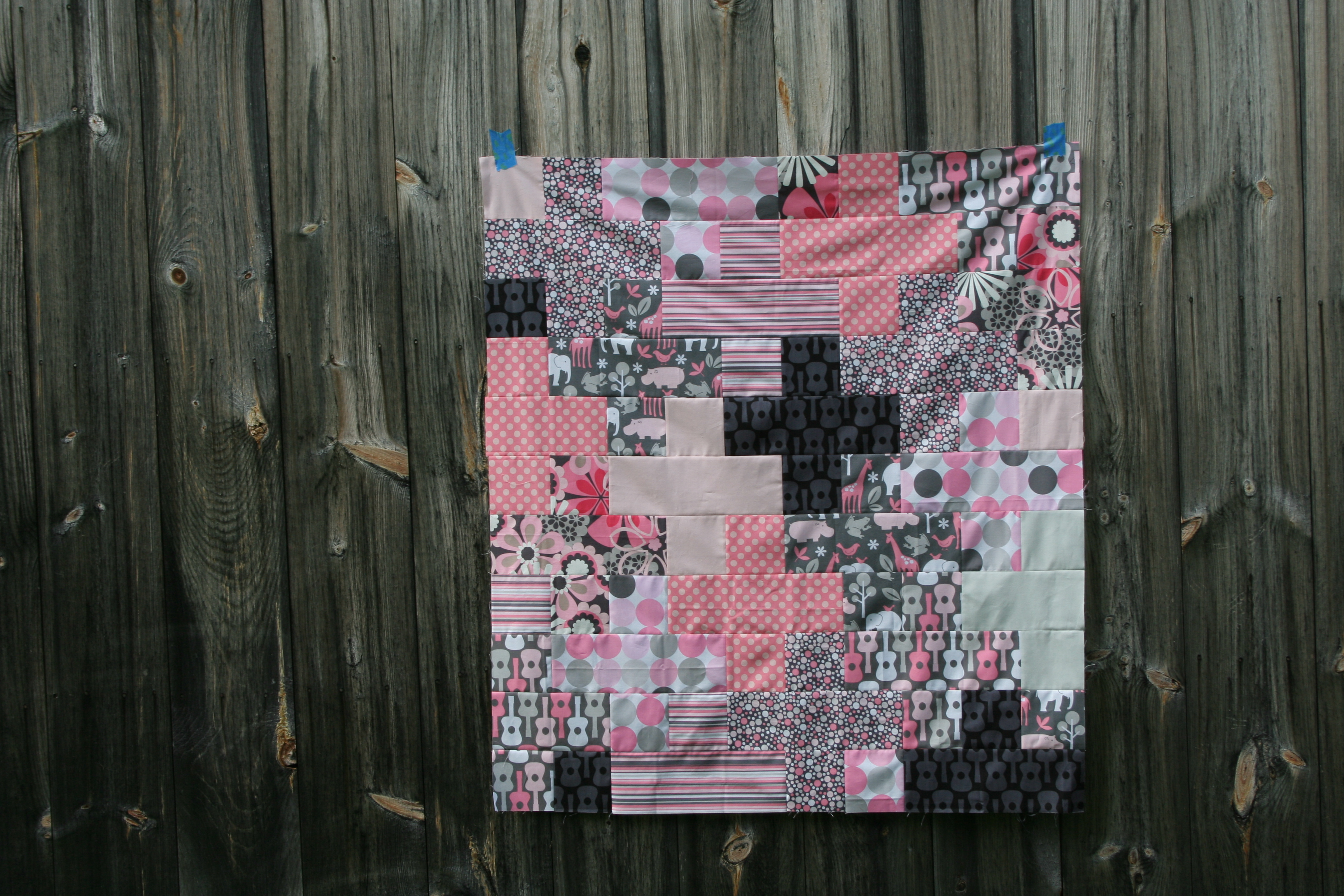
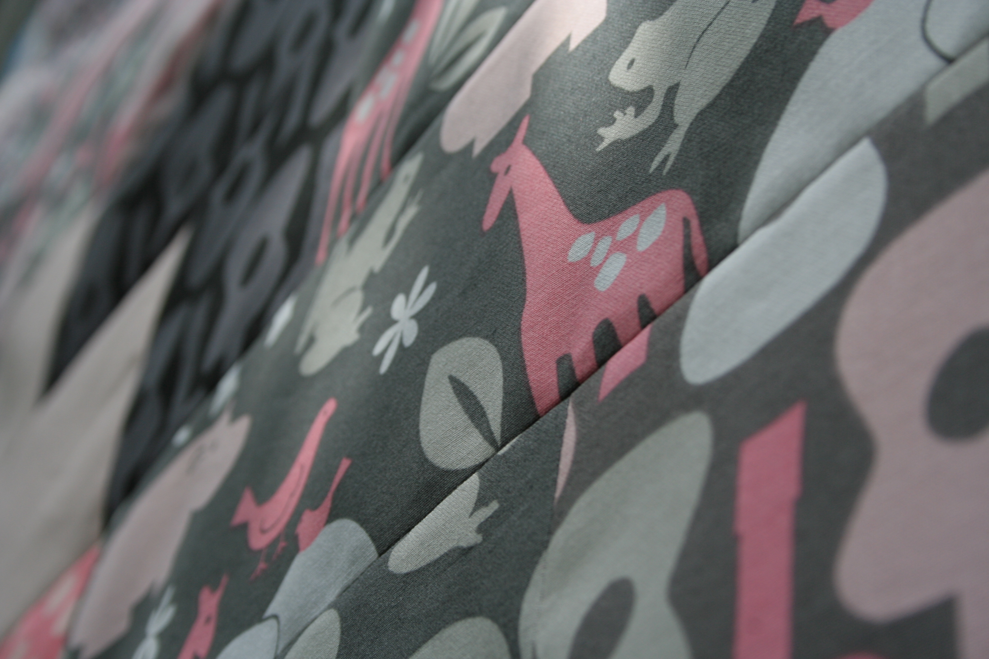
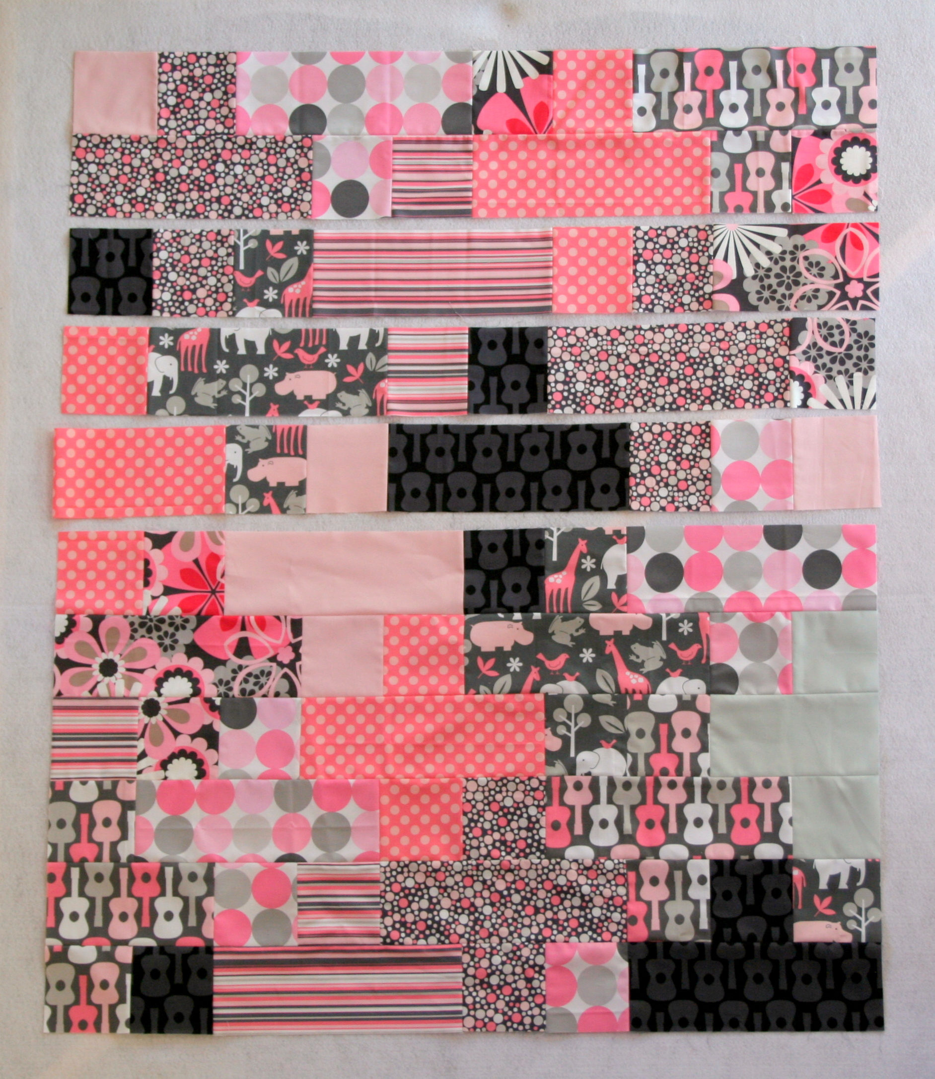
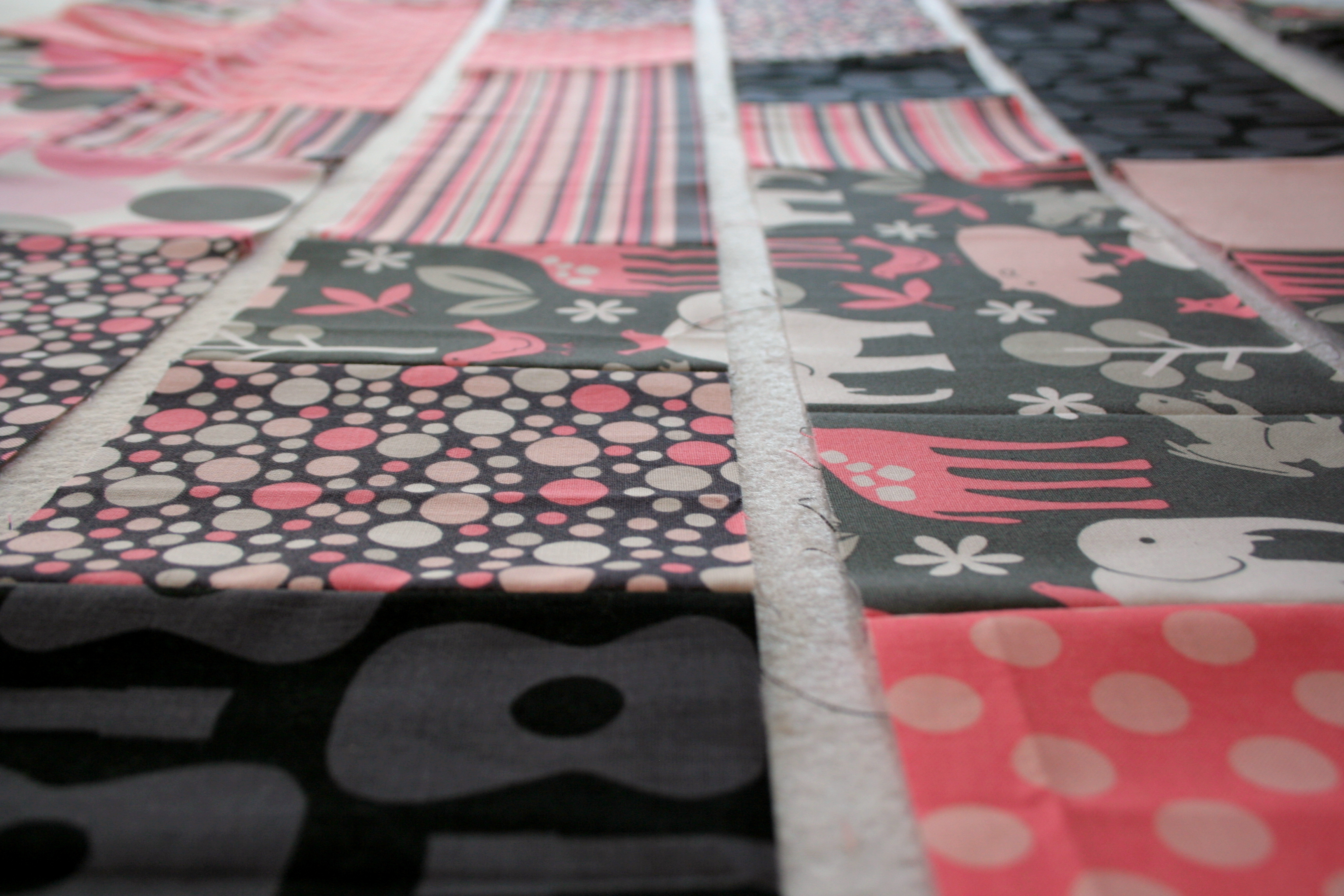
It’s been a productive sewing week, and with another chunk of uninterrupted sewing time today, I was able to complete the Pink & Grey Baby Plus Quilt I’ve been wanting to finish! I definitely will incorporate more solids into the mix the next time I make a plus quilt, but I am very happy with how this quilt turned out.
My adventures photographing the quilt top were a reminder as to why I really need to buy some washi tape! Blue painters tape does the trick, but doesn’t really add to the aesthetic. Blue bits aside, here are some photographs of my finished flimsy:
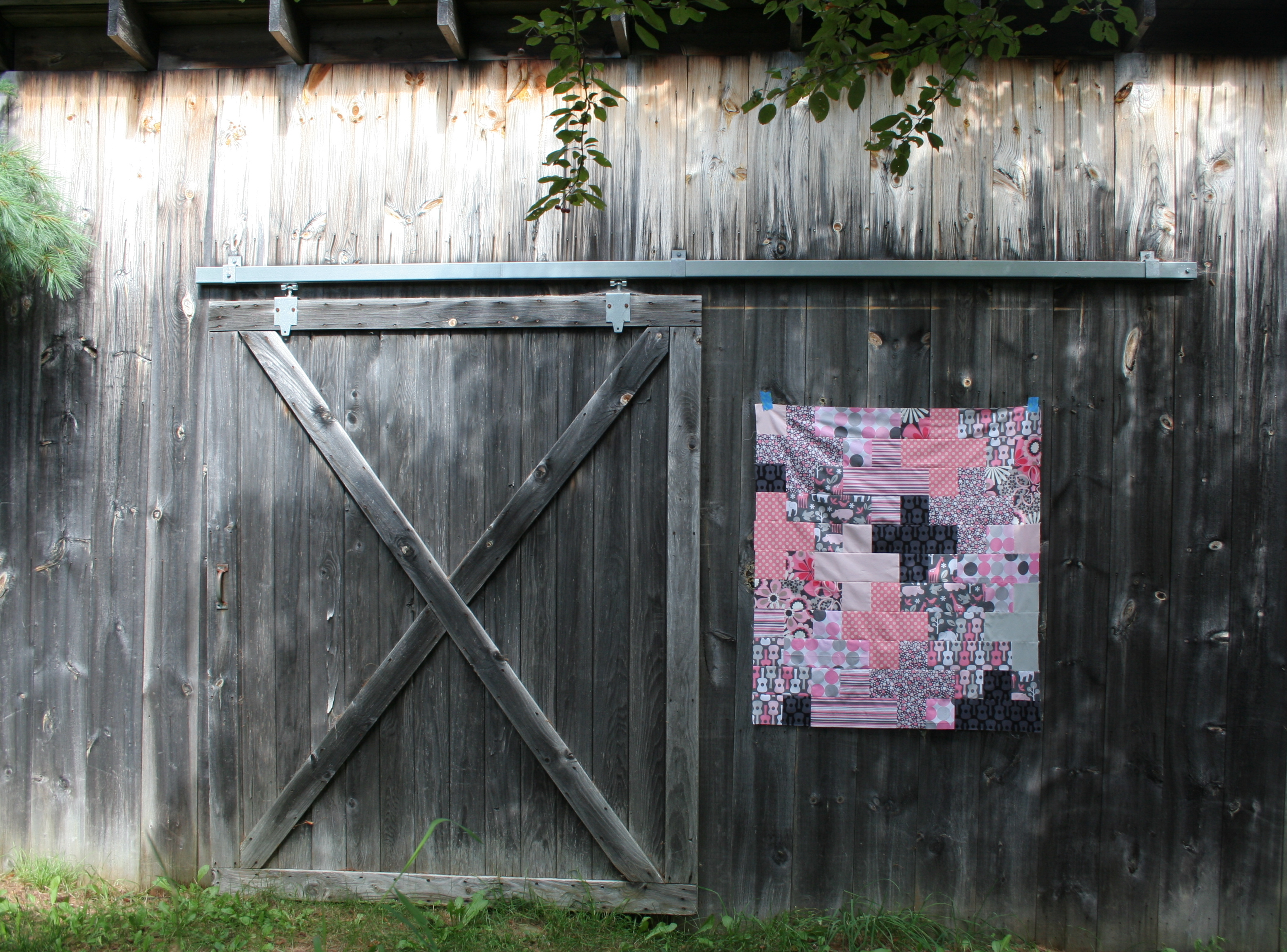
I was inspired by Michelle Bartholomew’s quilt photography, especially for her Barn Door Quilt, for this photo shoot locale. My quilt is hanging on the side of our shed, which is not exactly a barn, but the “X” door complements the plus quilt so well, the math geek in me just couldn’t resist. I think the grey in the shed also brings out the grey in the quilt. It was a match that was just waiting to happen.
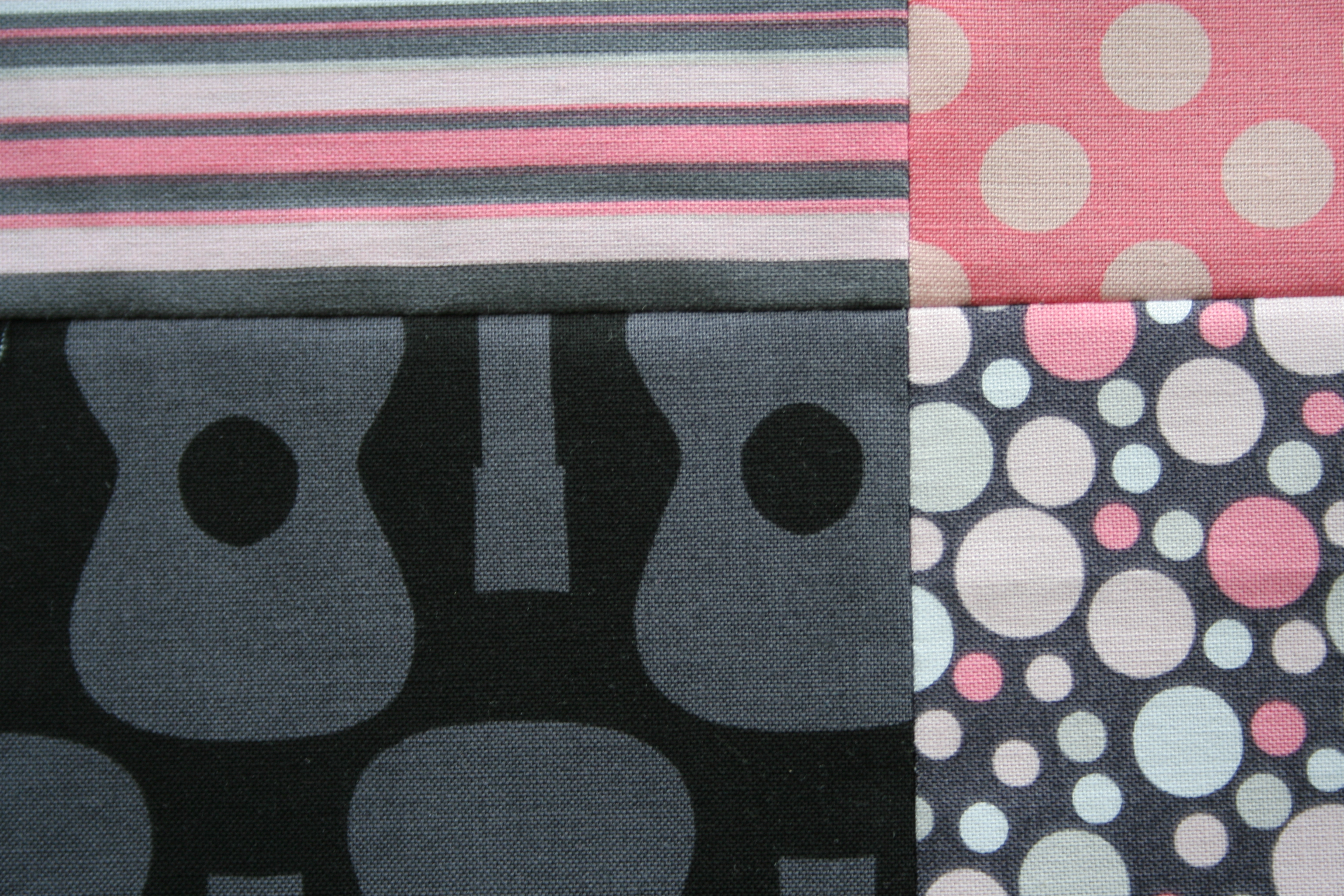
I love when seams match perfectly!
Now that the quilt top is complete, it’s all set to go to Stephanie & Michelle in Austin for some longarm quilting. Once Stephanie is finished working her magic, this quilt will be posted for sale in our Late Night Baby Etsy shop. It will be my first contribution, so I’m excited to finally get it finished.
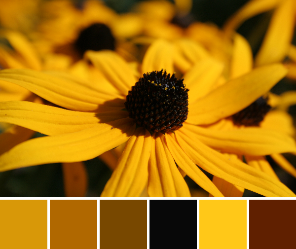
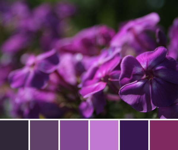
This week’s color inspiration brings us back to the garden and the late summer blooms that abound. There always seems to be something flowering in our garden, and even with the harvest of fruits and veggies swelling, now is no exception. Color palettes are created using Play Crafts’ Palette Builder 2.1 and my own photographs, taken today.
Corresponding Kona cottons from left to right: Sunny, Yarrow, Gold, Black, Corn Yellow, Paprika
I don’t think I’ll ever tire of these beauties. Bright golden yellow black-eyed susans are scattered throughout our garden and fields and seem to flower for much of the summer. While I can’t see myself making a quilt that’s entirely yellow, it’s an awfully cheerful color palette.
Corresponding Kona cottons from left to right:
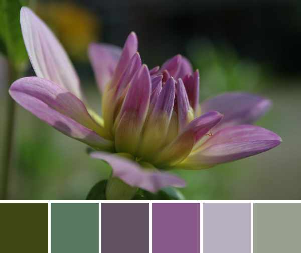
Charcoal, Purple, Magenta, Violet, Dark Violet, Cerise
This palette features my favorite seasonal colors: radiant orchid and magenta. I love the range of purples in this palette and can definitely see it making its way into a quilt of the future!
Corresponding Kona cottons from left to right:
Palm, Laurel, Coal, Crocus, Iron, Raffia
This year I’m thrilled that I got my dahlias into the ground in time for flowers. The gorgeous blooms have been brightening our kitchen table for the past week or so, and they just keep coming. These colors are stunning together, but my favorite part about this photo is the inch worm explorer; do you see him?
Quiltspiration 365
For those of you who are looking for quilty inspiration for every day of the year, I’ve teamed up with a group of quilting bloggers to provide exactly that. Search for tag #quiltspiration365 on Twitter, Instagram, and Facebook to see new inspiration each day, or visit these Quiltspiration bloggers:
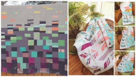
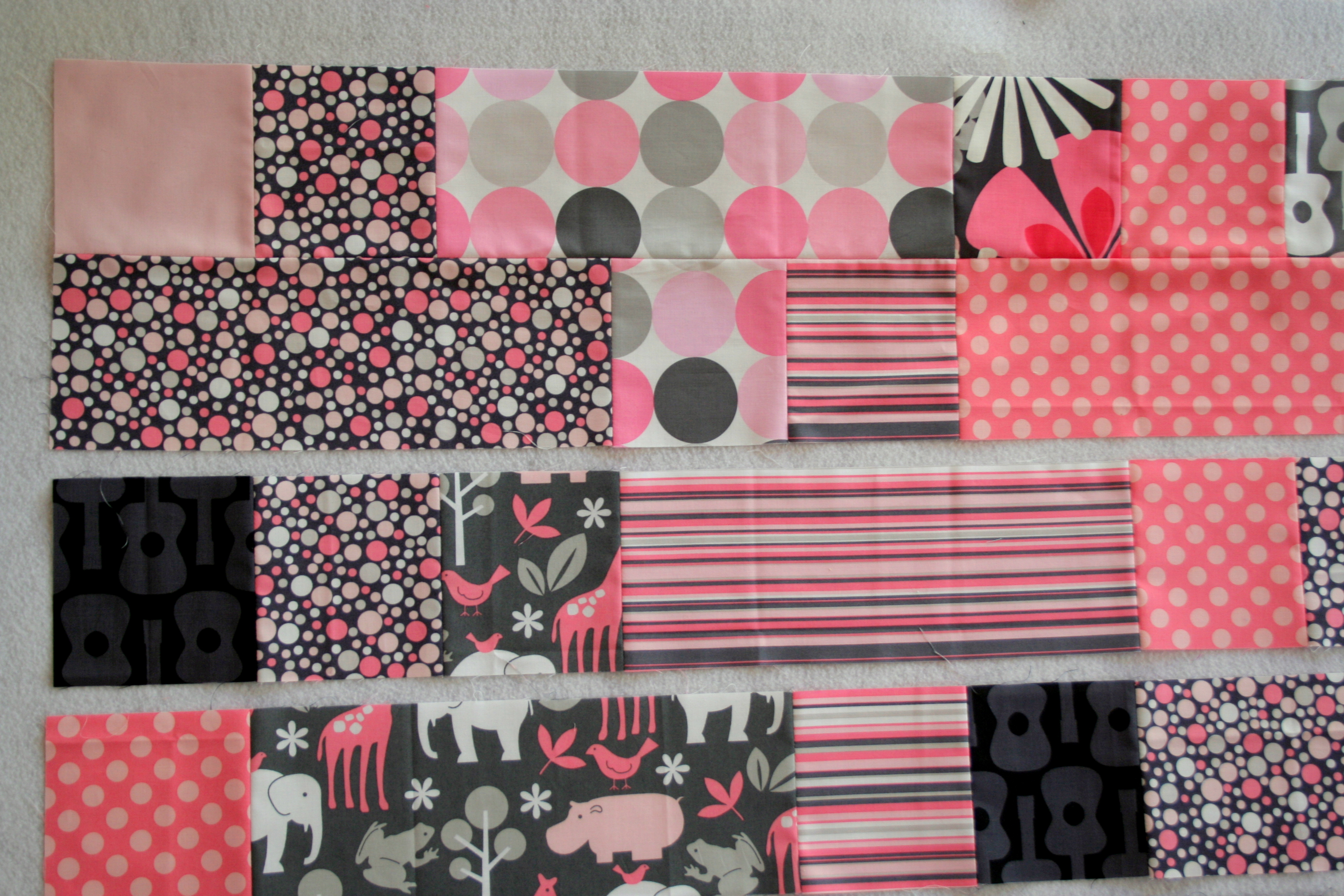
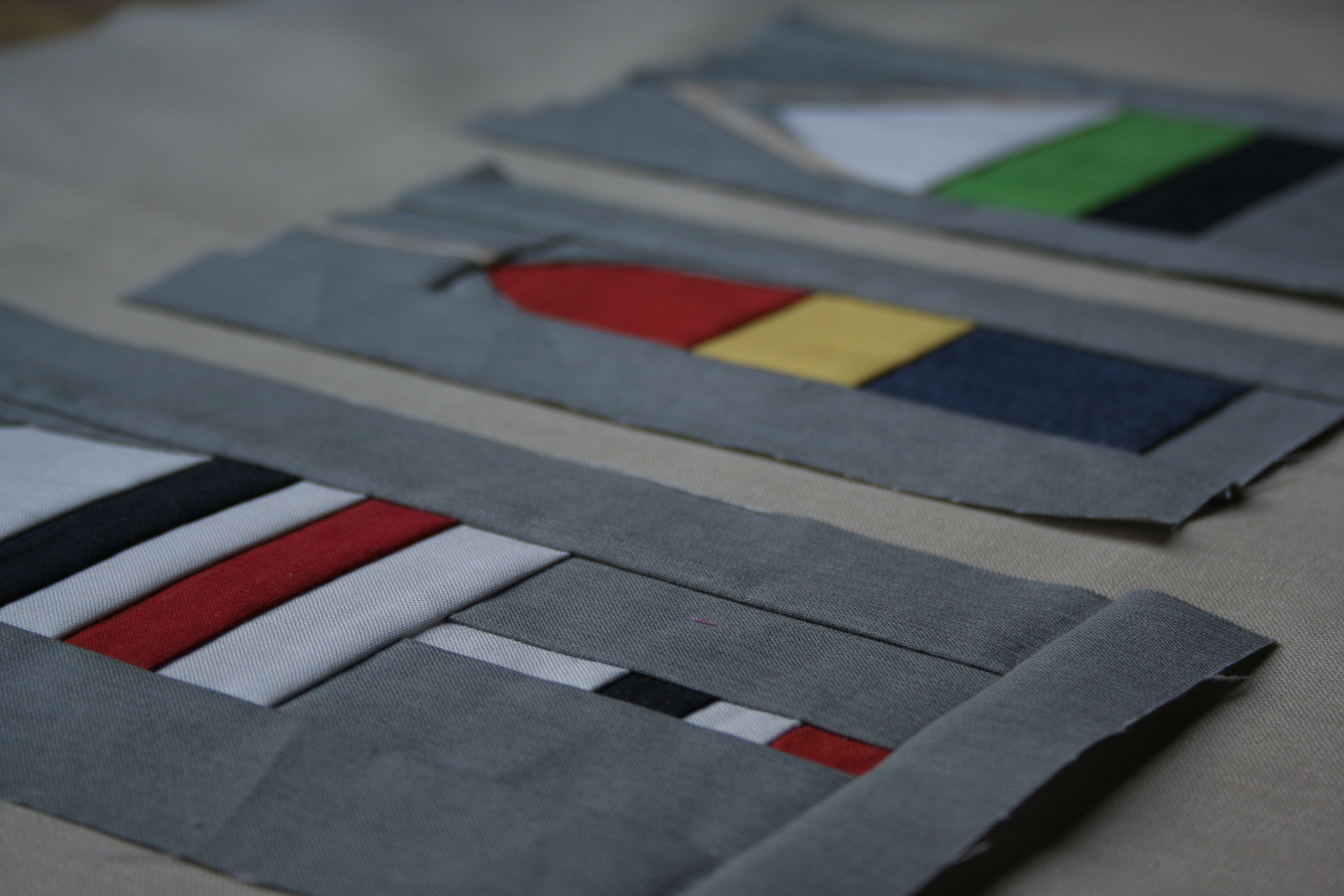
This week I’m focusing on finishing my pink & grey baby plus quilt, made with an assortment of Michael Miller It’s a Girl Thing pink & grey prints. I’m so very close to completing the top, with only four more long strips to sew together.
This is my first quilt to be listed for sale in our Late Night Baby Etsy shop, which is primarily run by Michelle & Stephanie, my Late Night Quilter soul sisters. I bought a Michael Miller pink & grey fat quarter bundle over a year ago, since I am totally in love with the color combination. I love grey in general and am typically not a huge pink fan, but together it works so well. When Stephanie, Michelle, and I started talking about opening an Etsy shop in which to sell baby quilts and other sewn items, I was immediately excited to finally make a quilt from this bundle. I added a tiny splash of Moda solids, and if I were to make this quilt again, I think I would add more solids, but overall I’m very happy with how this quilt is turning out.
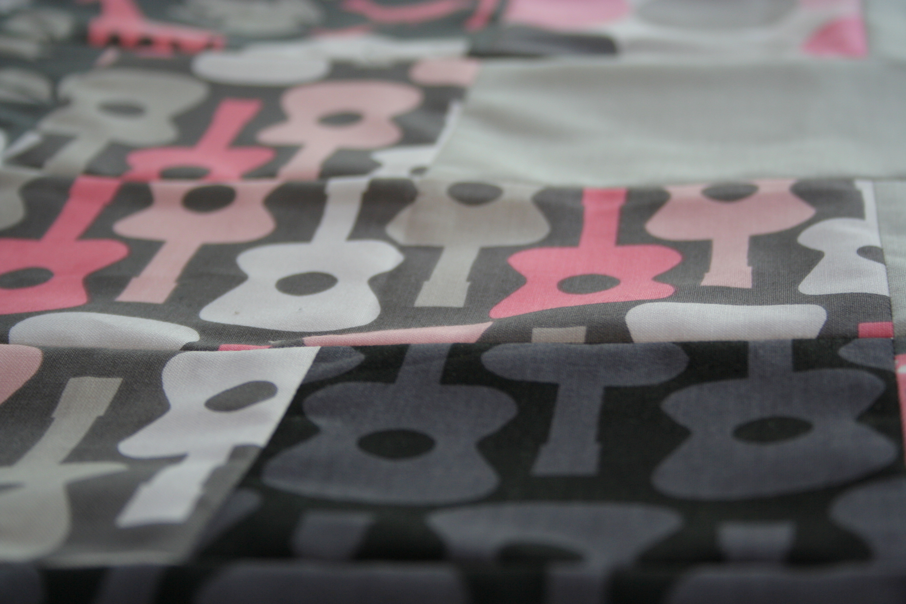
I love the guitar prints!
I’m doubly excited because once this top is finished, I will be sending it to Stephanie for longarm quilting.
In case you haven’t heard, Stephanie and Michelle recently joined forces at Late Night Quilter to kick off their longarm quilting and pattern design business. They also released a new, free pattern as part of their kick-off, so go check it out, especially if you love triangles. Visit their post to see some closer details of Stephanie’s awesome quilting. I love the shadow triangles the most, I think, but the movement created by the quilting is awesome and unexpected. I’m definitely excited to send my quilt top off to Stephanie so that she can work her magic. They are offering free batting to all customers in the month of September, too, so if you have some tops you’ve been sitting on, now might be a great chance to get them quilted!
Do you send your quilts to a longarmer, or do you quilt them yourself? So far I’ve quilted all of mine, but I’m silly excited to have my first longarm experience. I’m trying to decide how I want Stephanie to quilt this Plus Baby Quilt. Their design gallery has some great options. What design would you choose? I think I’m leaning toward Retro Revolution…
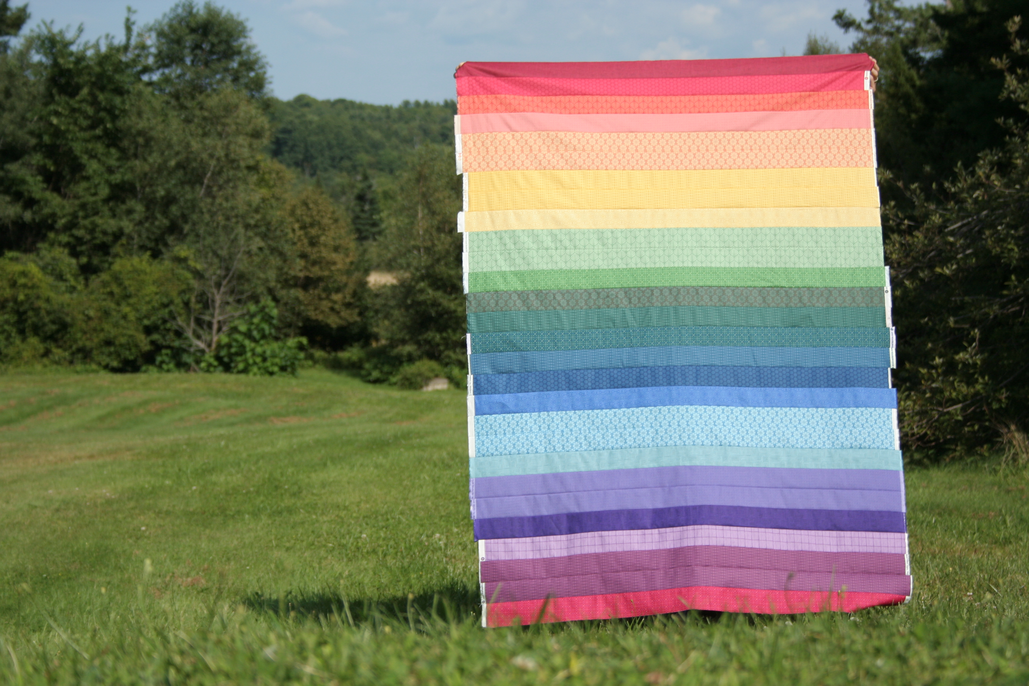
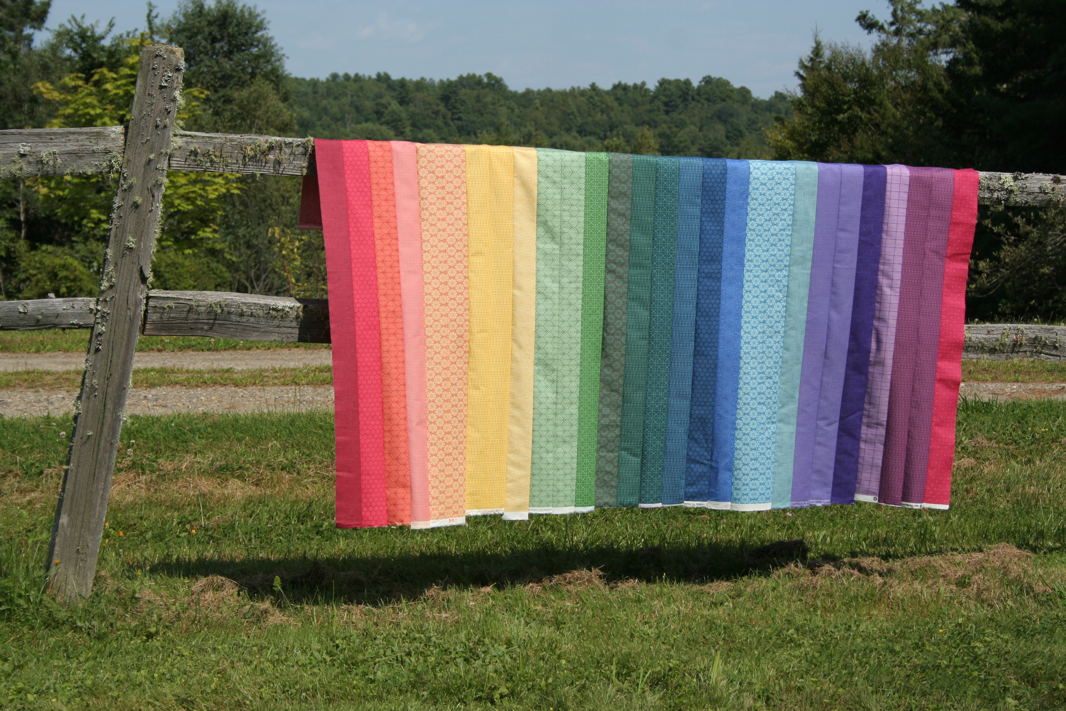
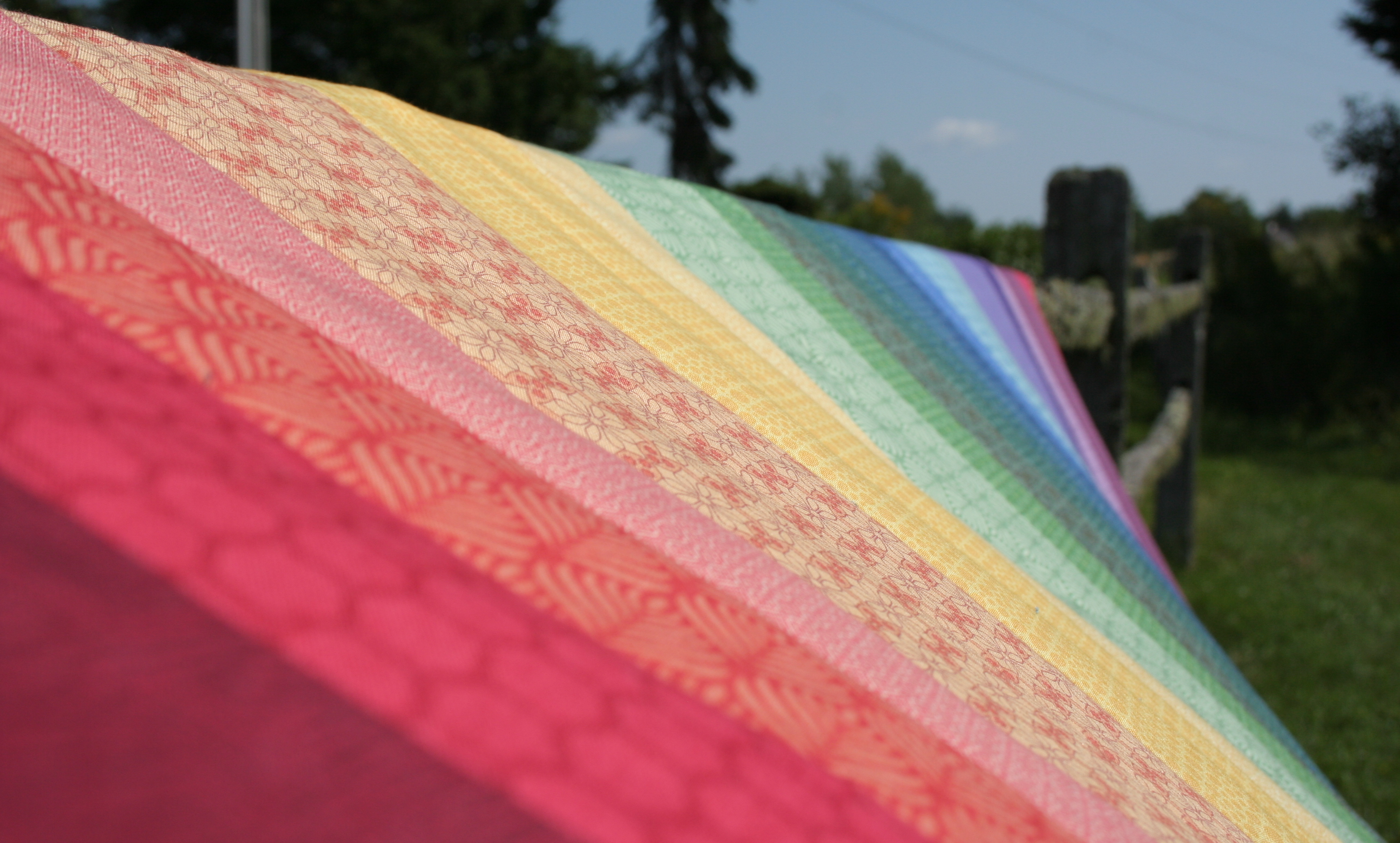
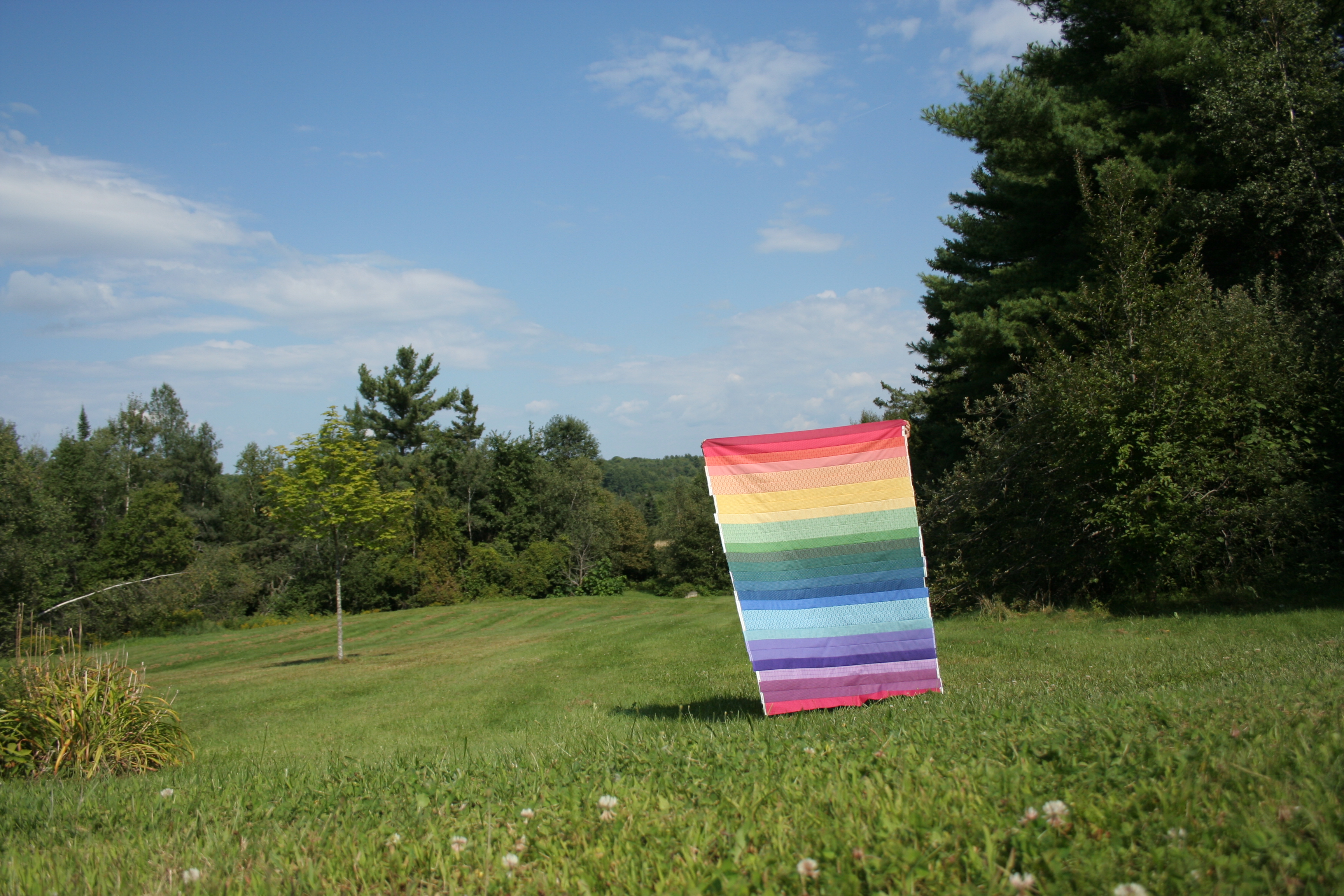
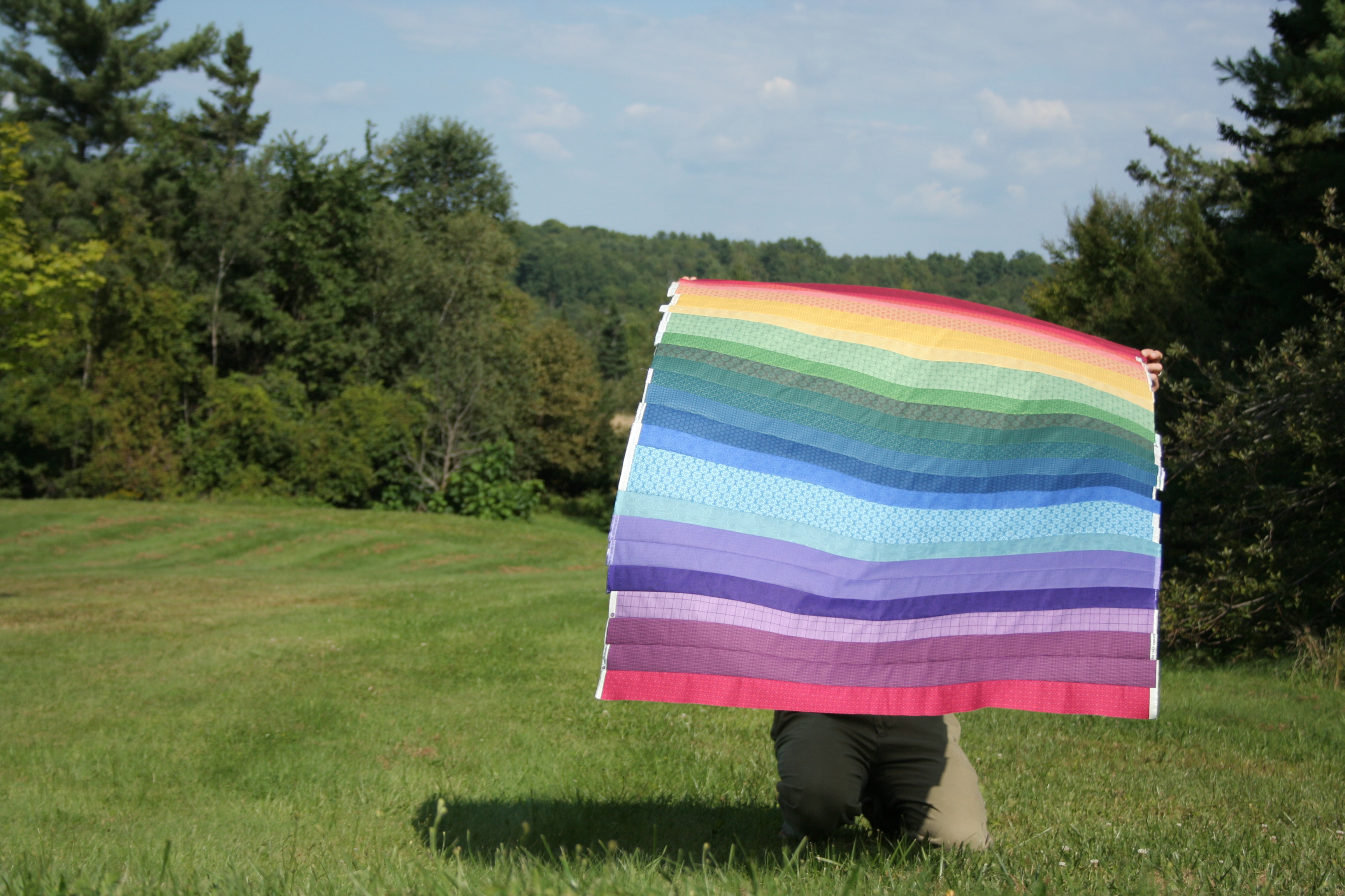
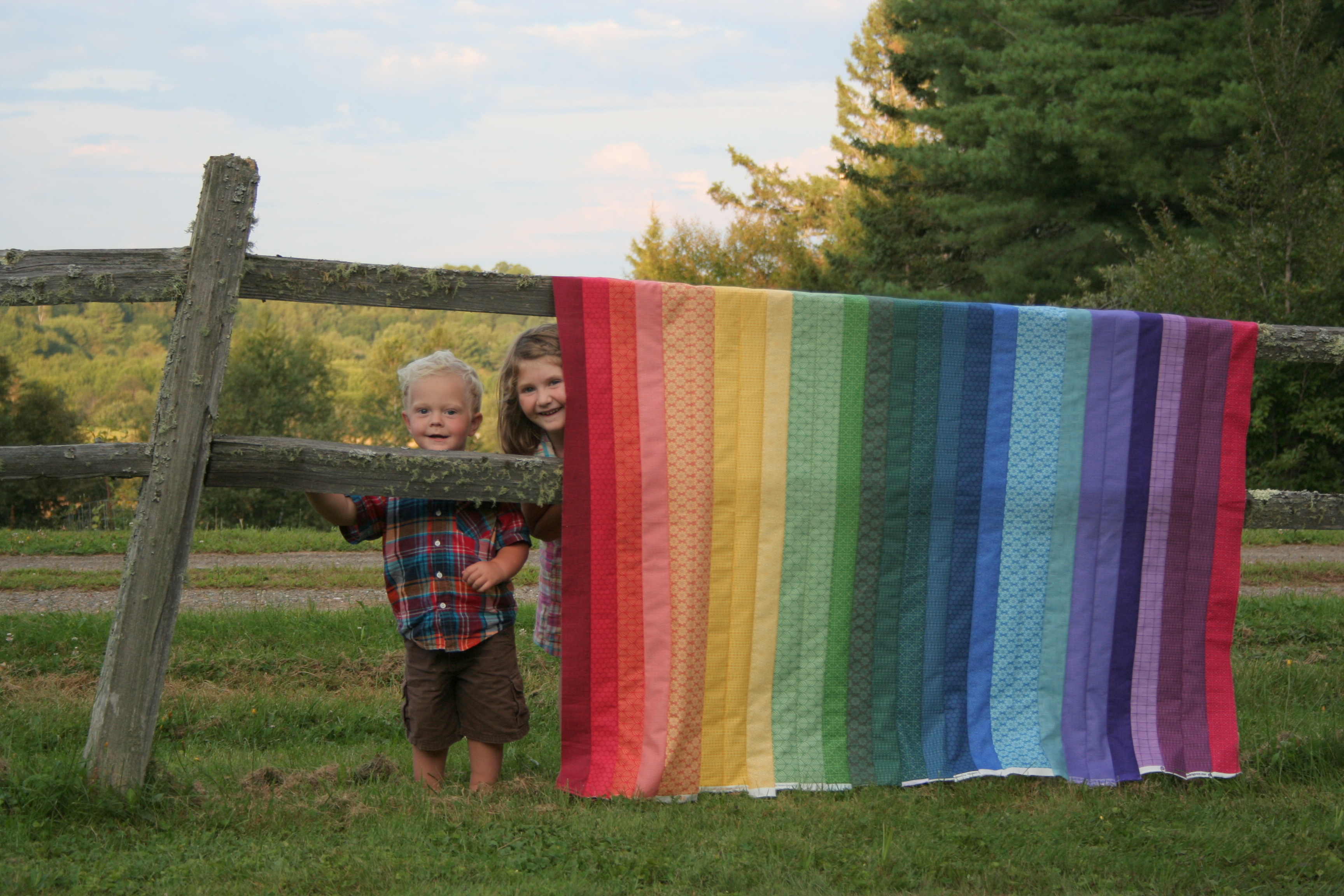
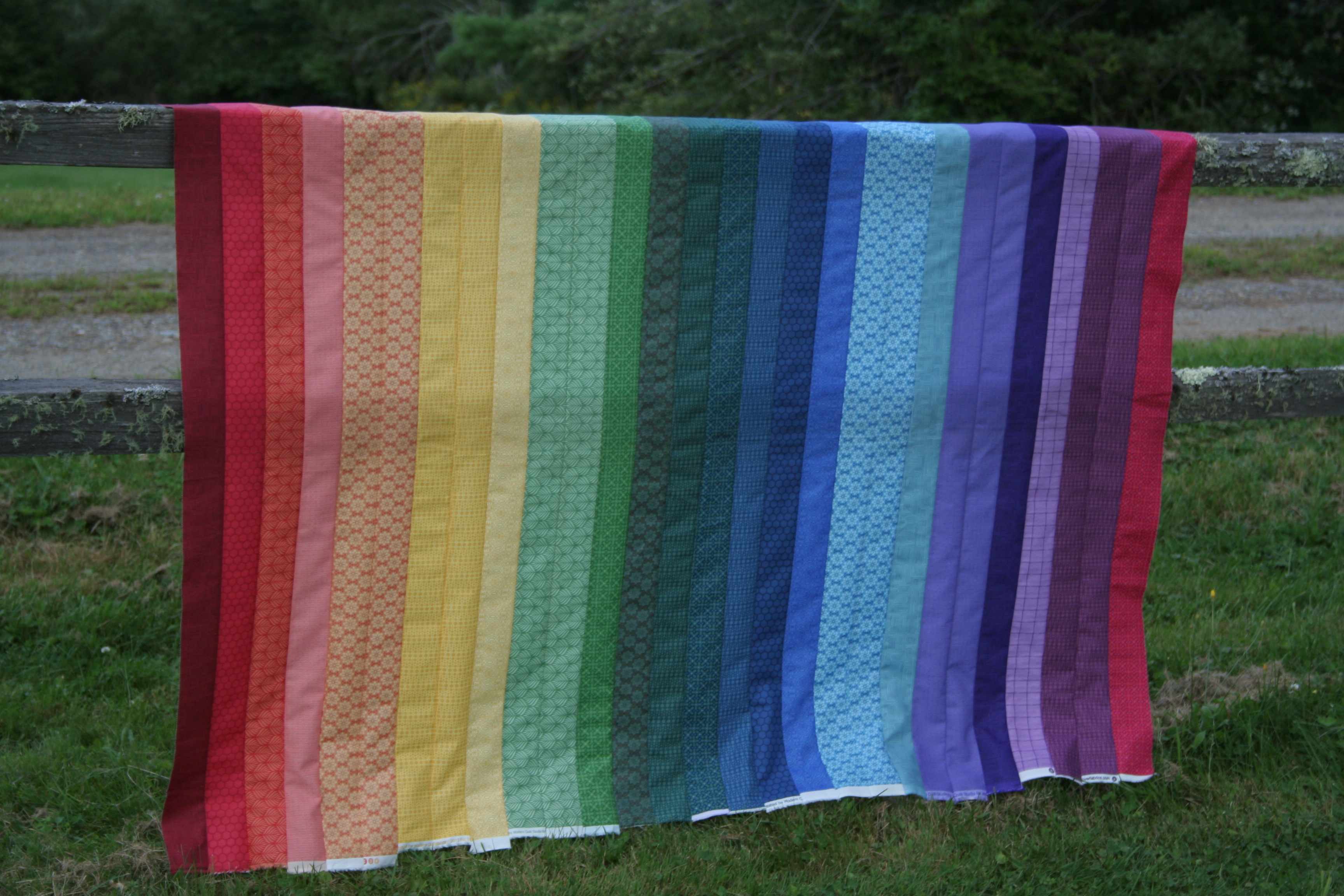
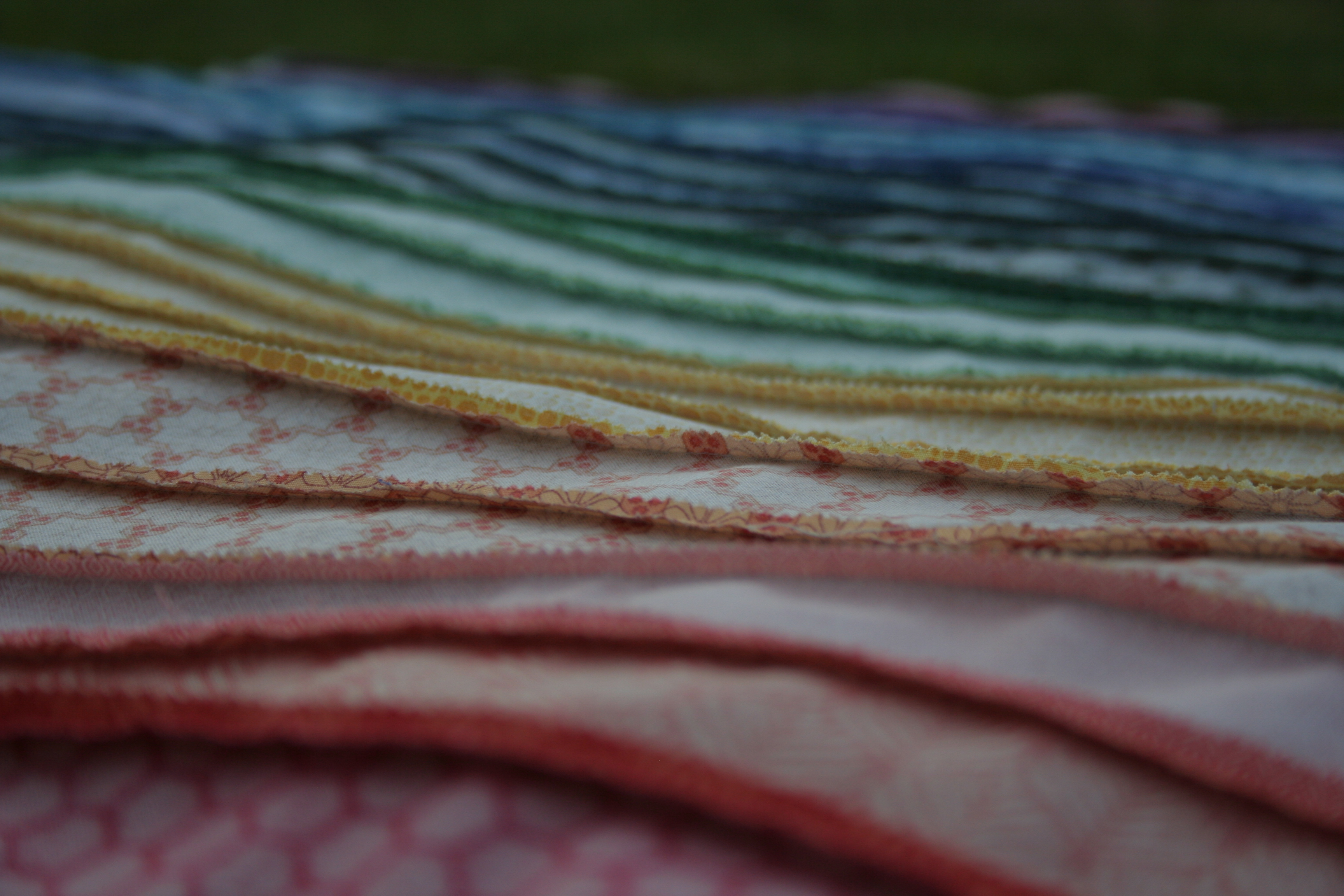
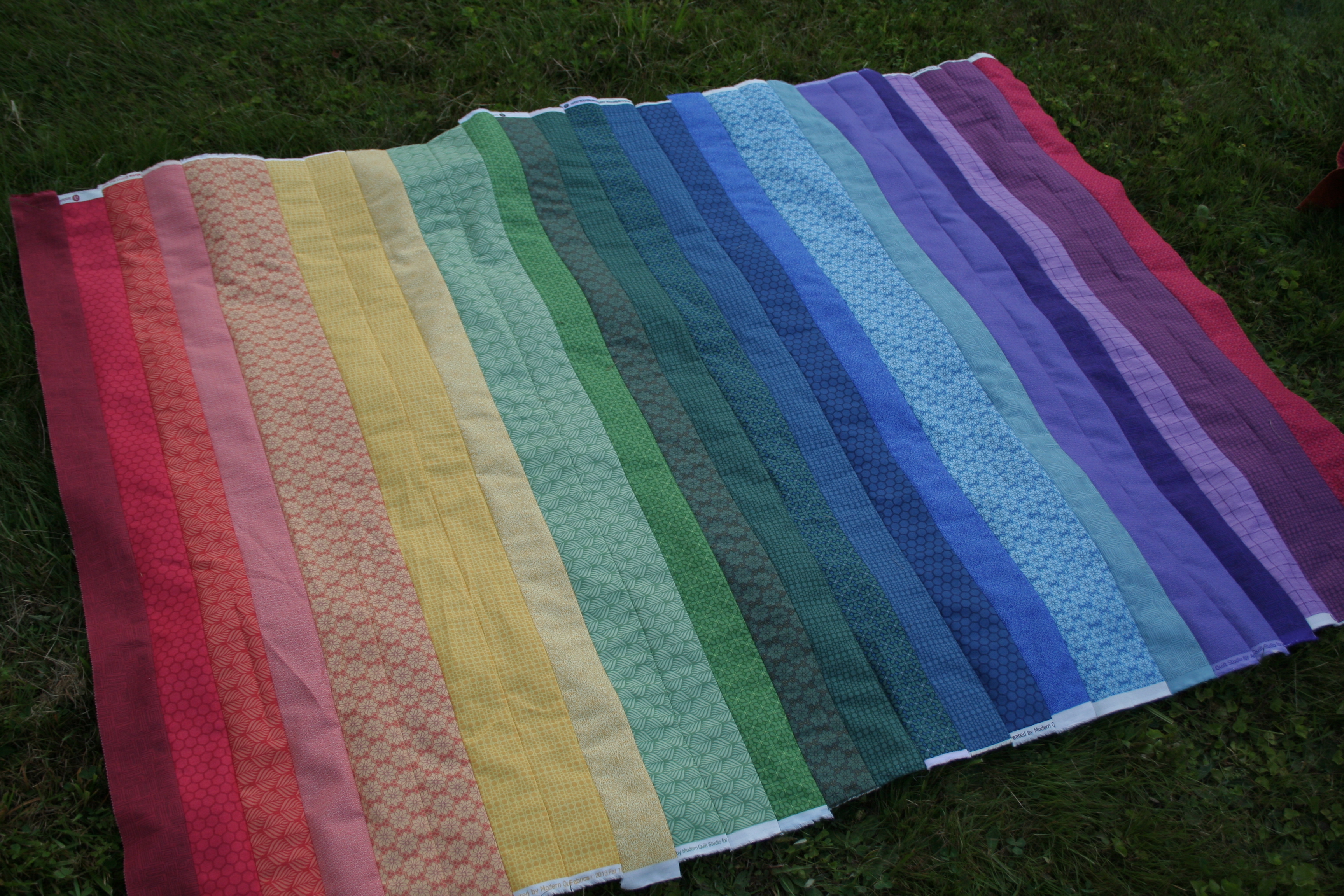
Maddie’s rainbow jellyroll quilt top is finally complete! It only took me a bit over three hours to sew together, but with a fairly large summer sewing hiatus in the middle. I decided to focus on completing this quilt over a month ago, and sewed the first jellyroll strips into pairs. This past weekend I was graced with a rare chunk of uninterrupted sewing time, during which I finished sewing all of the strips together. This quilt is made entirely of strips from an Andover Fabrics Color Collection Jellyroll. Easy peasy! Go ahead and get a cup of tea or coffee (and a snack) because here comes a deluge of rainbow photographs!
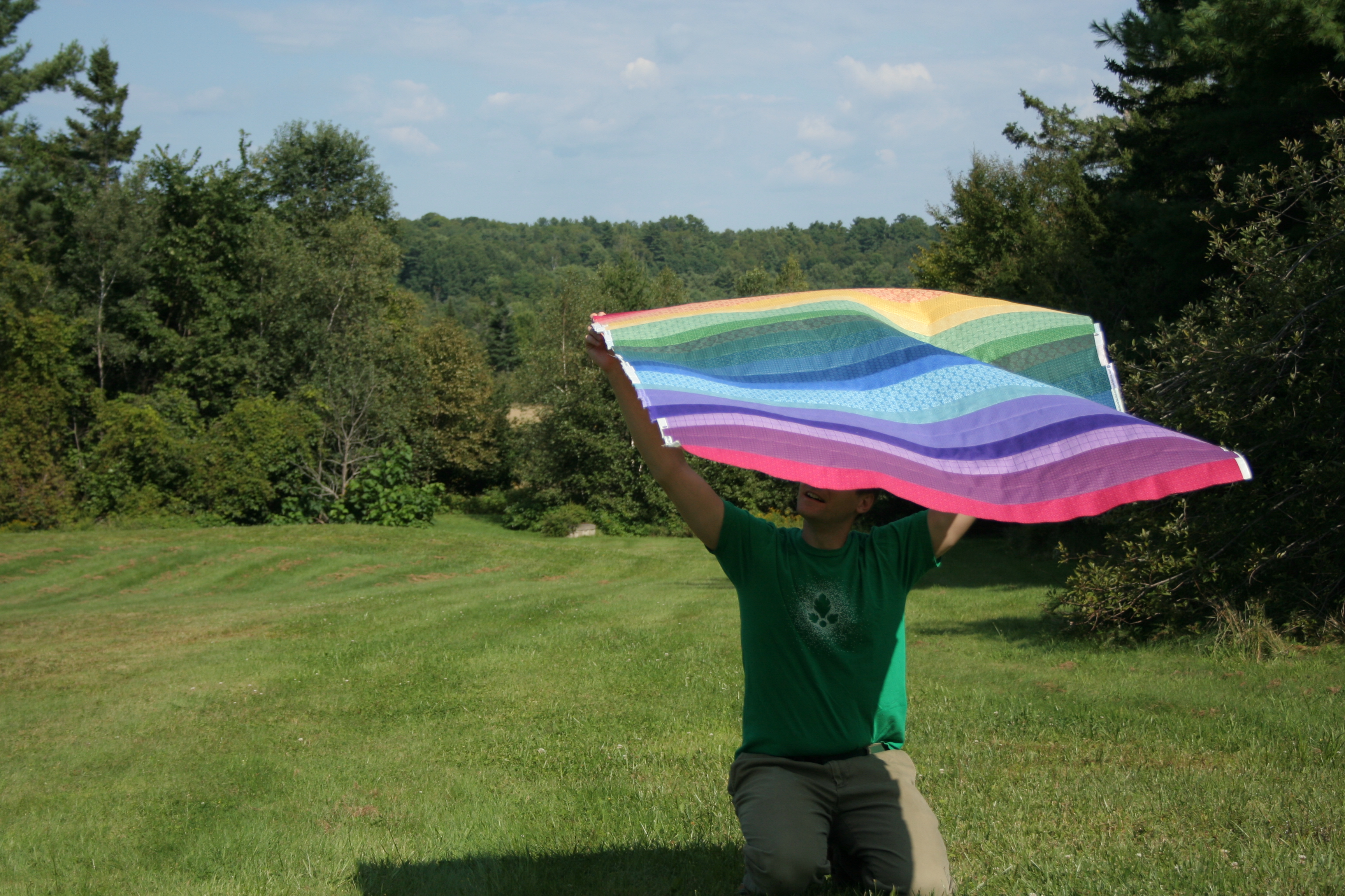
I was so excited to finally finish something, I immediately dragged my husband outside for a photo shoot upon completing this top. It was a bright sunny day with a decently brisk breeze, but I just couldn’t wait. Here’s Maddie’s gorgeous rainbow on a sunny, bright blue sky day:
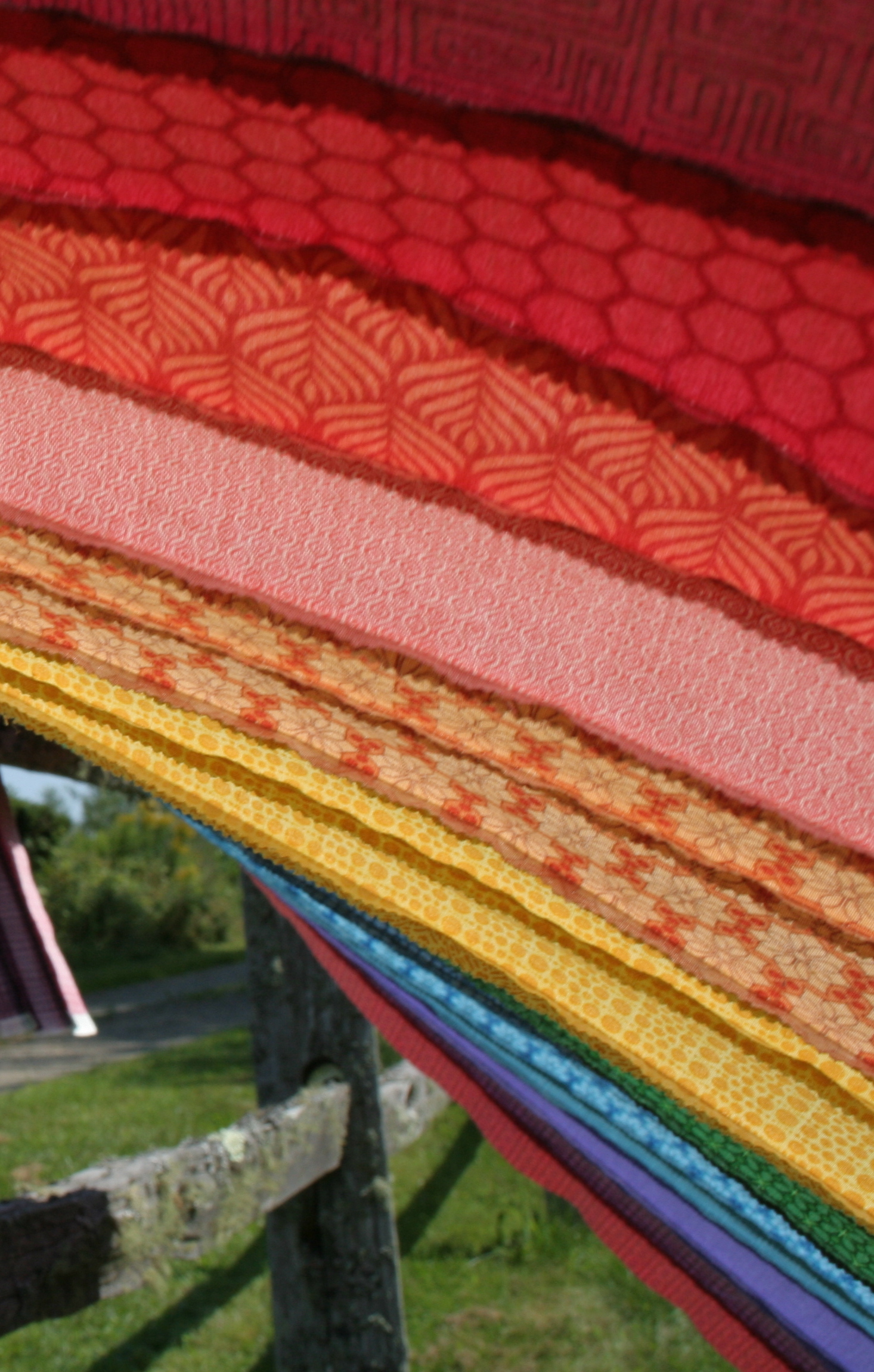
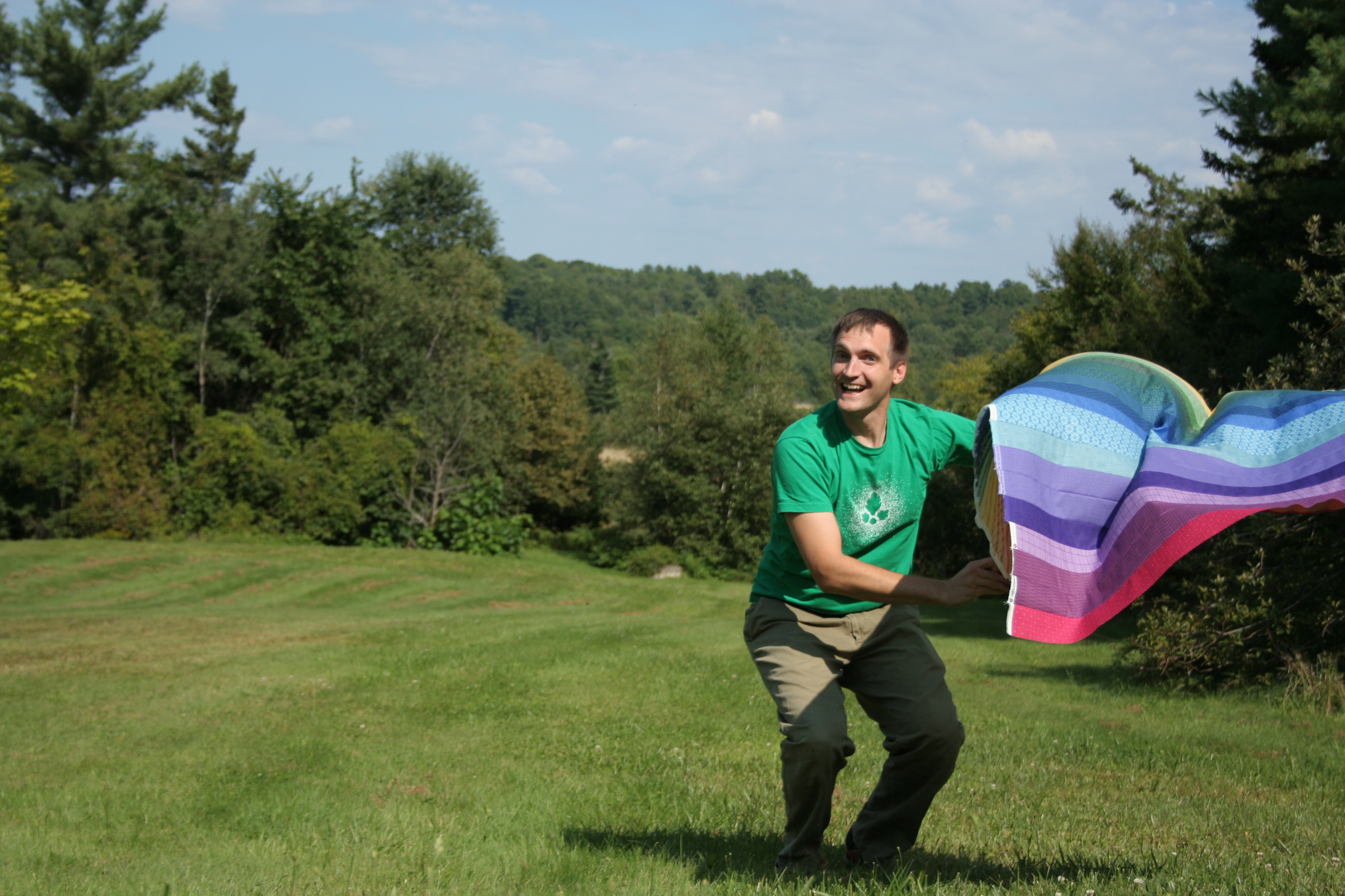
Blowing in the breeze.Sun shining through to the back as the quilt turns momentarily into a kite. I love the look of the back of a freshly pieced quilt, especially with the illumination of the sun!Quilt top-turned-kite in its resting place: crumpled on the ground next to the fence.Rainbow from afar.
My husband Garrett was quite patient as I dragged him around the yard, trying to find a spot where the lighting was decent and the photos were not too washed out from the bright sun. The wind didn’t always agree with our plan, but it made for some fun outtakes:
You would jump up and pretend you’re a bull fighter, too, right?
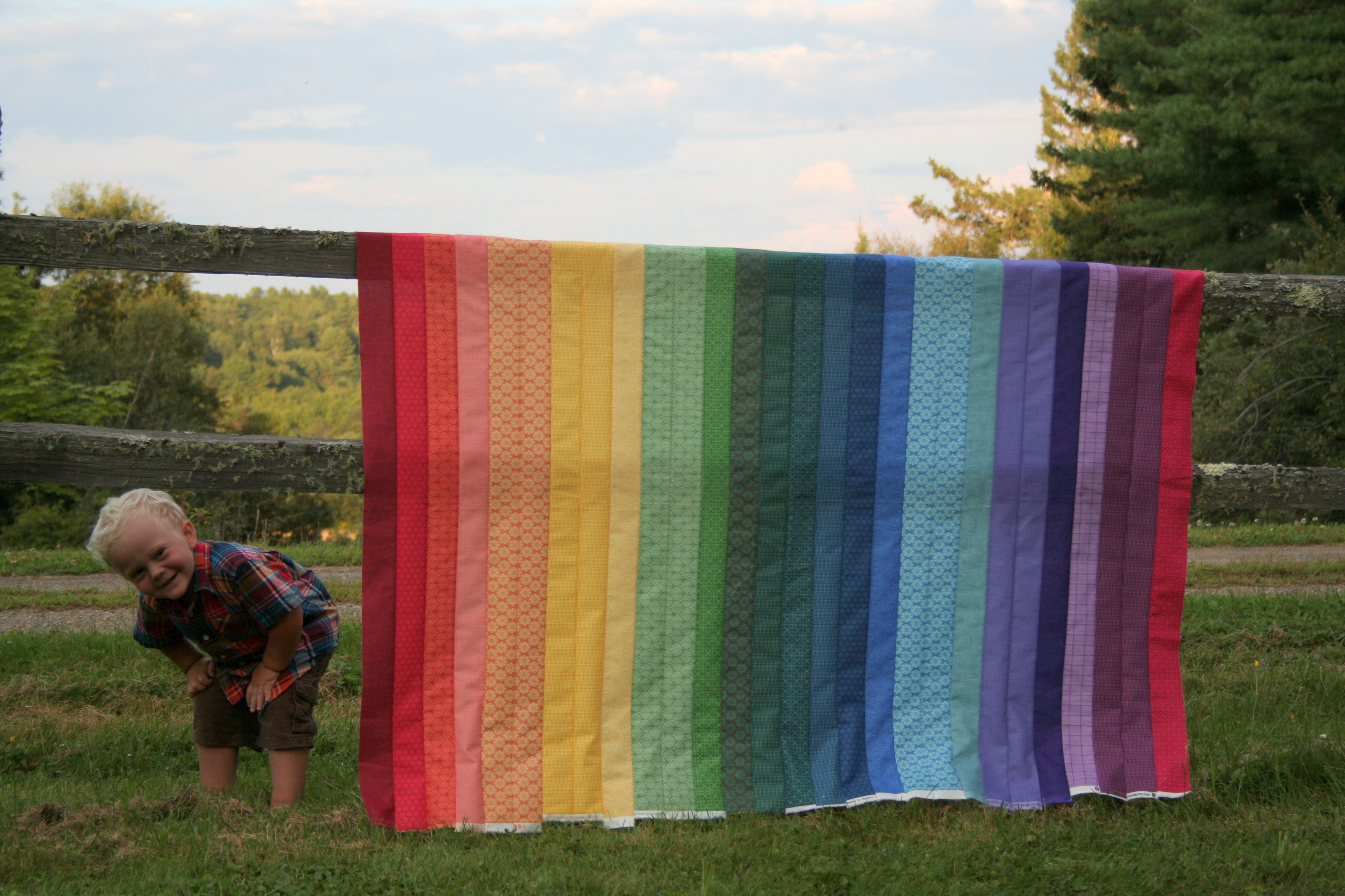
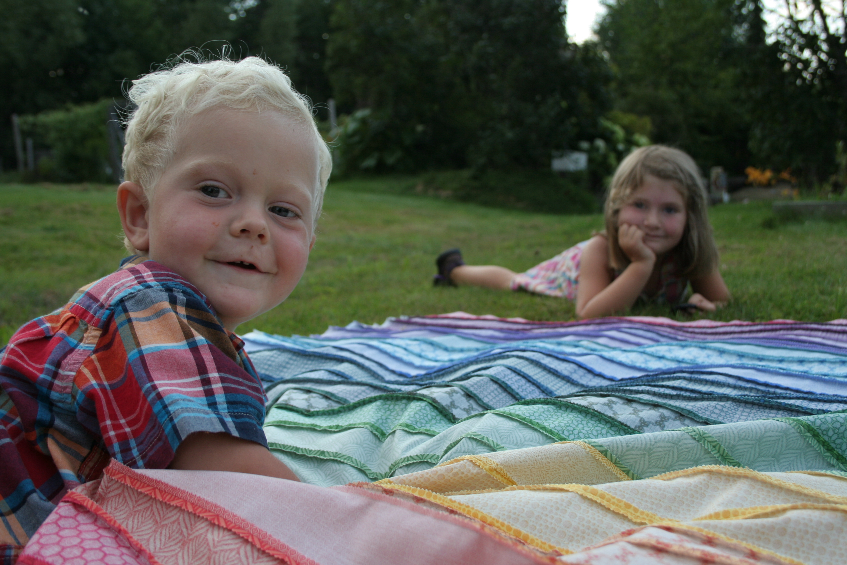
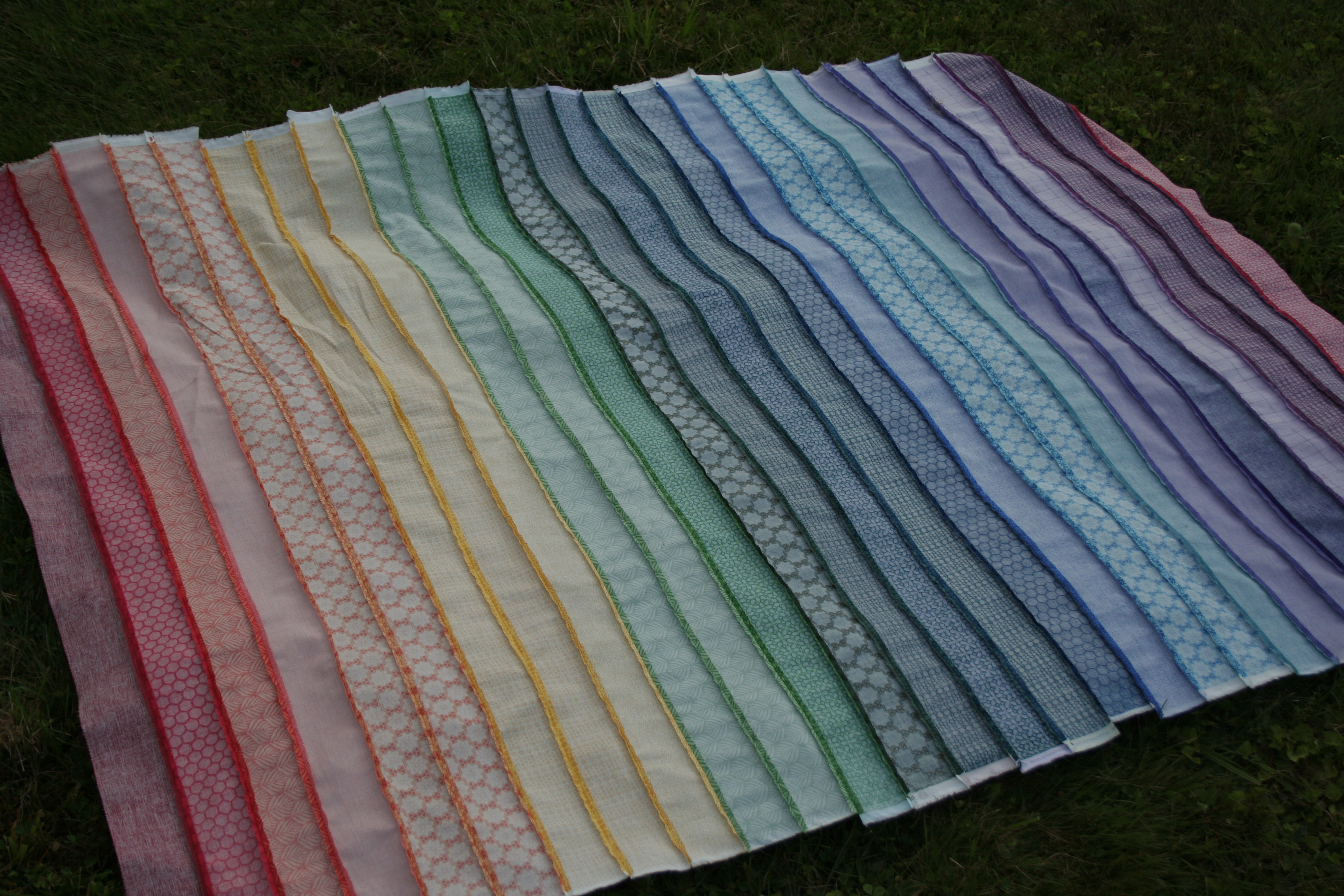
As evening began to set, I decided to go out and try a shady photo shoot, since in the past I’ve captured better color richness in shaded photos. With my kiddos back at home after an adventurous day with Grammy & Great Aunt Ellen, they of course wanted to help:
The colors definitely are richer in the shady photos, although I miss the crispness of the sunny photos. With this photo shoot, I think I prefer the sun for the full-quilt photos, and the shade for the close-ups. What do you think?
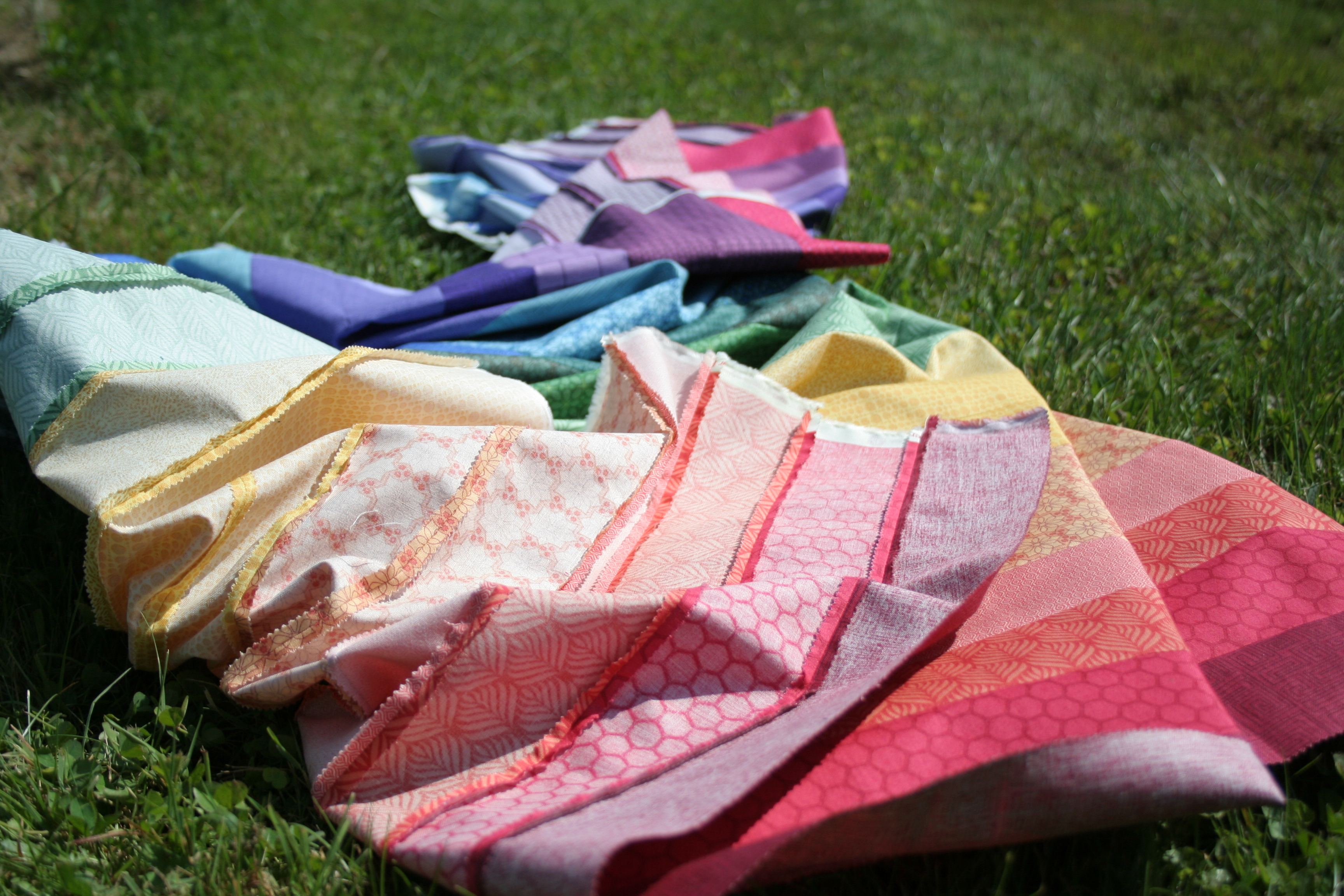
I love the look of the back of a freshly pieced quilt, even with kids flopped on it.Rainbow jellyroll quilt top front.Rainbow jellyroll quilt top back.
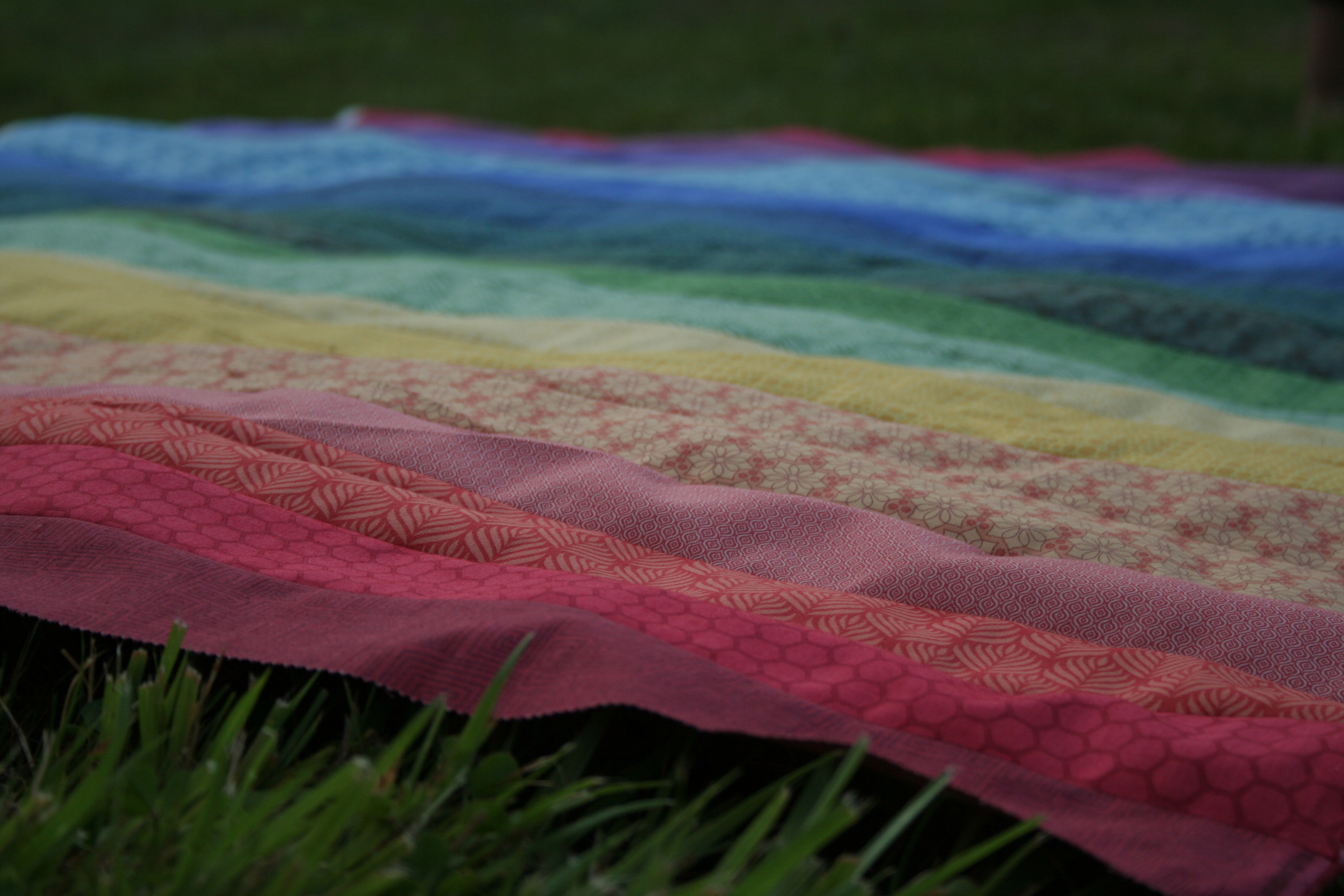
So pretty! I am quite pleased with how this came out, even if it’s a bit off-kilter on the edges. I plan to quilt it and then square it up after it’s all quilted. For those of you who have quilted rainbow quilts before, do you have any tips? I think I am going to try to match general colors of thread, and do simple straight line quilting along each strip. I guess that means I will need to buy some more Aurifil since I don’t have a full rainbow spectrum of thread (darn. wink wink).
I need your help!
My biggest question is with the bobbin: I only have two bobbins for my machine, and thus far I have quilted only in grey. When switching colors often in your quilting, do you just wind a bobbin a small amount, and hope to get lucky with how much you will need? I don’t want to waste a bunch of thread, but once I am finished quilting in a certain color, I will need to unwind the rest of the thread from the bobbin to make room for the next color. Any tips are greatly appreciated!
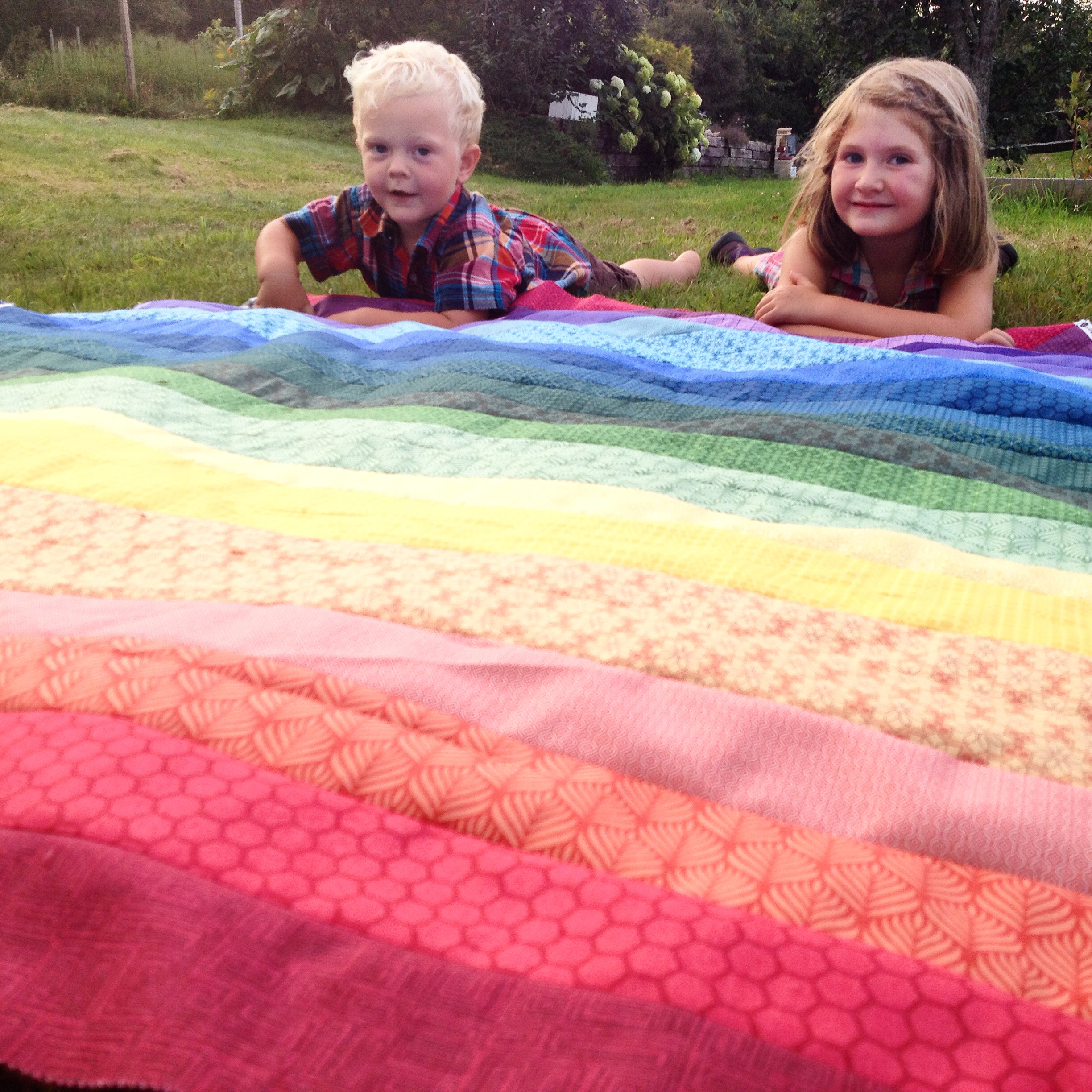
I’ll leave you with one last cute picture of my helpful kids, posted on Instagram last weekend (follow me @nightquilter).
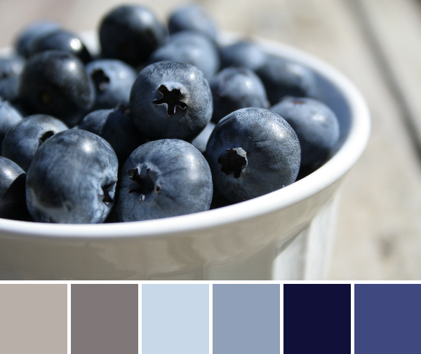
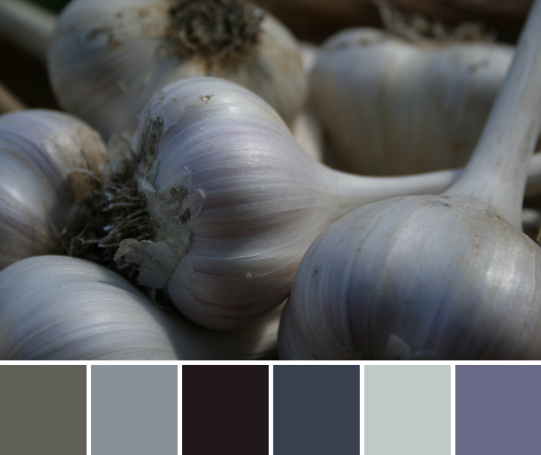
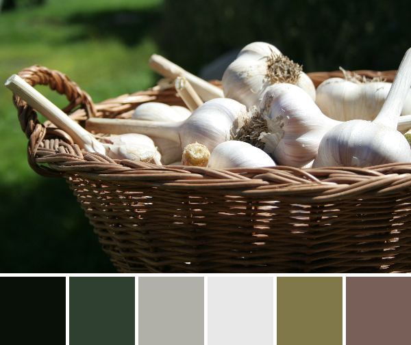
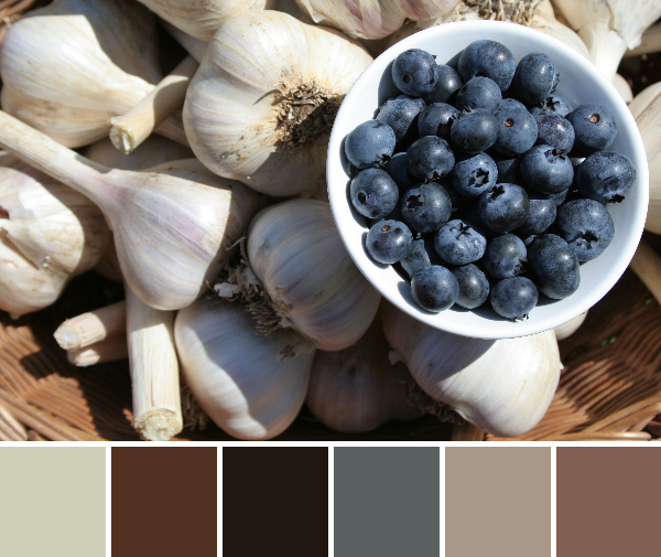
As summer drags to its end, harvest time picks up speed. We’ve been picking veggies galore from our garden over the past weeks, and preserving as much and as fast as we can. Our garlic and blueberries have done especially well this year, and are slowly filling our pantry and freezer. We’ve made a batch of salsa from garden tomatoes, peppers, onions, garlic, and cilantro, and I’m hoping to make pickles soon since our pickling cucumbers are multiplying quickly. Green beans and kale have been (or will be soon, in the case of kale) blanched and frozen, and we’ve eaten garden broccoli a few times already. I love this time of year.
This week your color inspiration comes from some of my garden harvest photos made into color palettes with Play Crafts’ Palette Builder 2.1. May you be inspired to quilt, create, and grow healthy goodness in your own backyards!
Corresponding Kona cottons from left to right:
Ash, Steel, Baby Blue, Dresden Blue, Regal, Regatta
I love this palette, but I’m already a huge fan of blue. The grays paired with the range of beautiful blues makes this a palette that is sure to be seen in a project of mine someday in the future.
Corresponding Kona cottons from left to right:
Mushroom, Steel, Black, Charcoal, Shadow, Slate
Corresponding Kona cottons from left to right:
Black, Evergreen, Ash, Silver, Ivy, Mushroom
Corresponding Kona cottons from left to right:
Parchment, Mocha, Espresso, Coal, Stone, Taupe
Earthy palettes galore today. Kona earthy neutrals have really been prominent in my garden photos, and I love it! I’m all about a bright rainbow quilt any day, but there is something sophisticated and soothing about an earth-tone quilt with just a tad of natural color.
Have you made an earth-toned quilt? Do they make you as happy as brightly colored quilts?
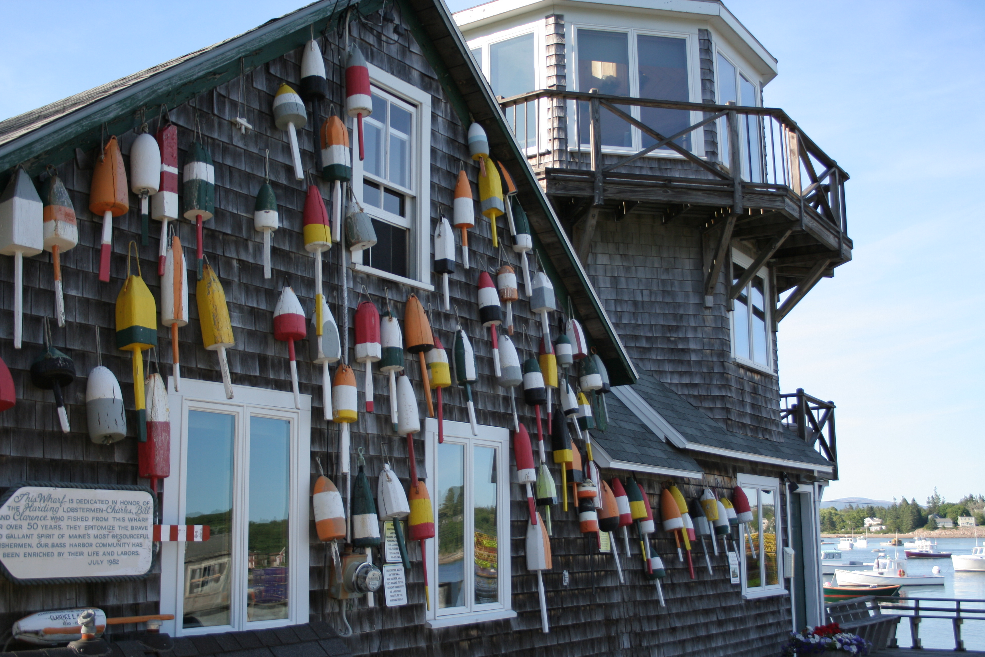
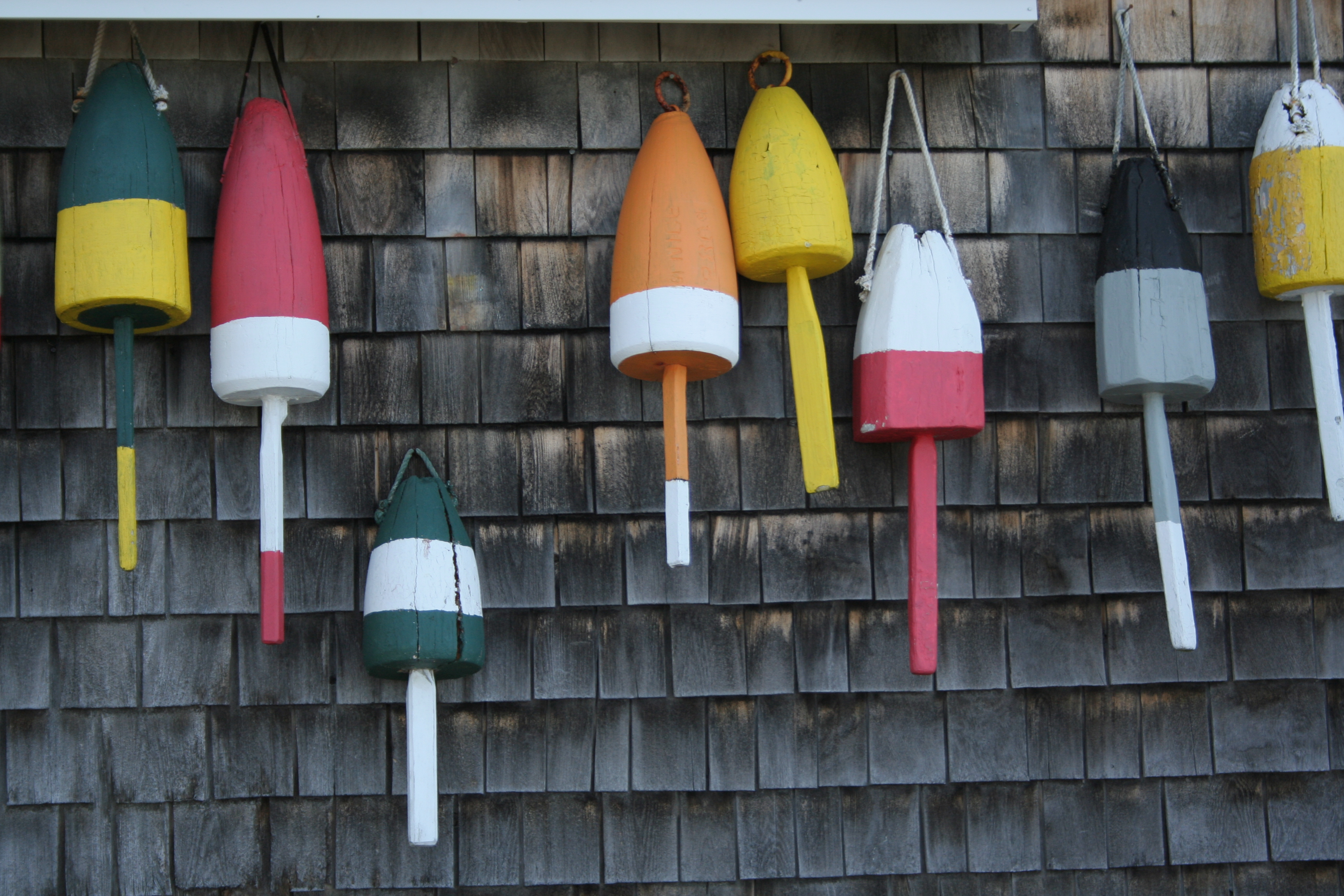
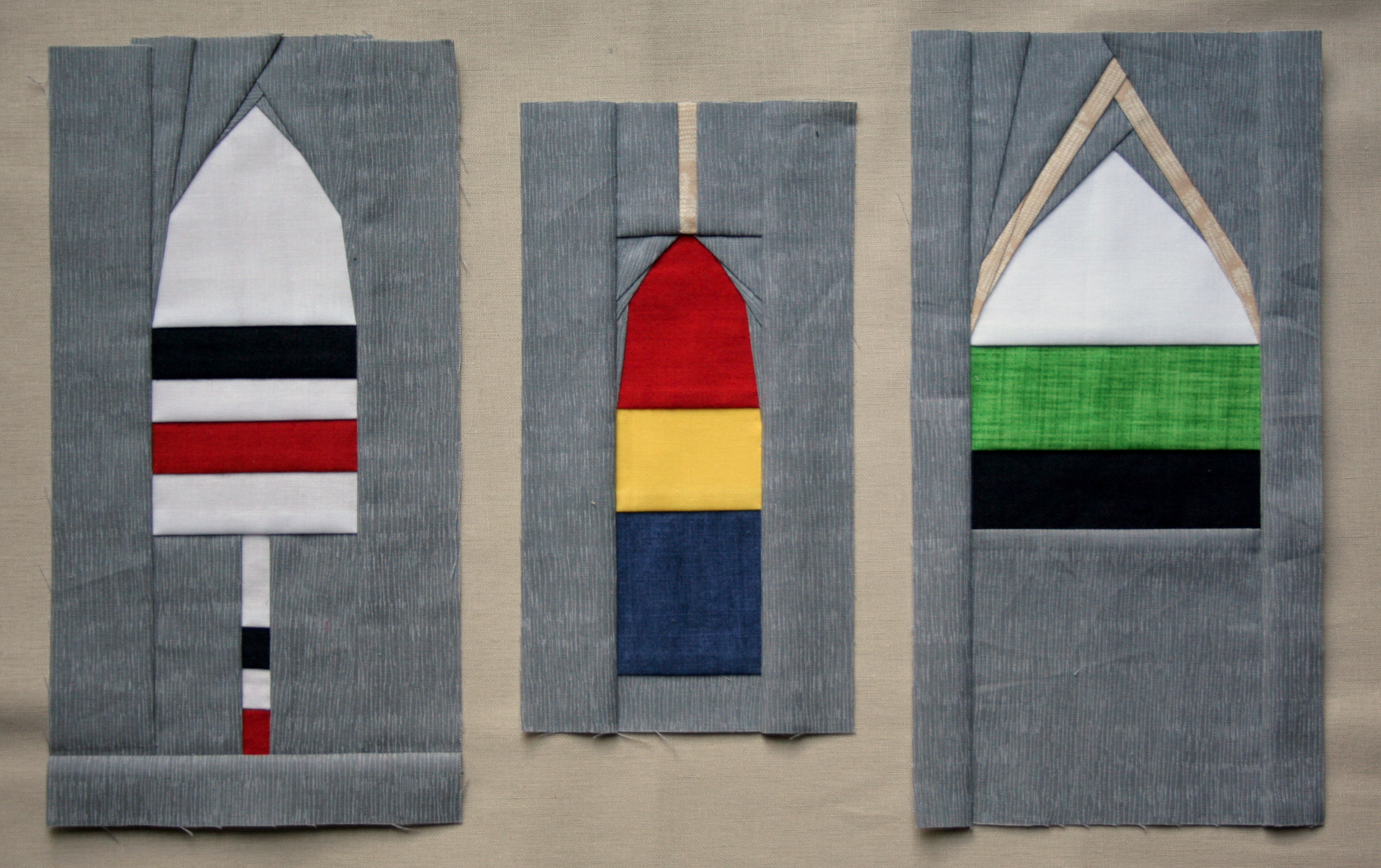
On the coast of Maine, lobster buoys freckle the harbors and are often seen hanging on the sides of buildings, sheds, boat houses, and even near mailboxes further inland. Many of my patterns are inspired by the Maine coast, and my latest works in progress are certainly not exceptions. I’ve finally completed and posted all three of my buoy foundation paper piecing patterns in my Craftsy store.
Lobster buoys come in all shapes and sizes, and definitely many different colors. I tried to create patterns for at least the three most commonly seen shapes, and I am happy with how they turned out.
The patterns are super simple and extremely versatile. While testing these patterns, I accidentally sewed the 4″x8″ of the middle buoy, instead of the intended 5″x10″ version. I’m not quite sure what I will do with the little buoy yet, but the larger ones will be made into a pillow once I make a 5″x10″ of that pesky middle one.
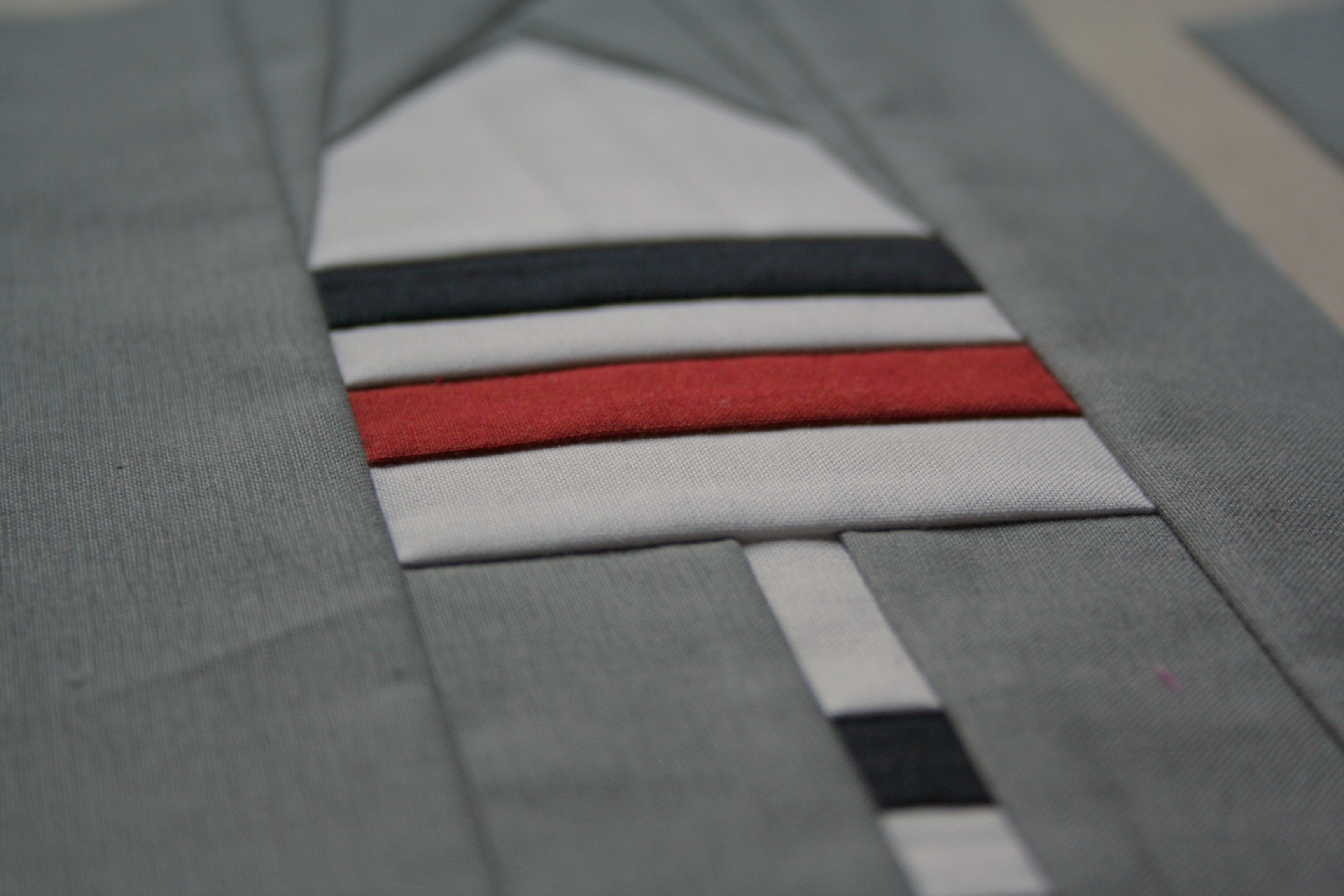
I love the detail and precision of foundation paper piecing. There’s something about the exactness of seams and the ability to create anything with fabric that makes me happy.
Buoy 1 foundation paper piecing pattern detail.
Since I still need to remake a larger version of the Buoy 2 pattern and stitch these all together, I’m linking up with Freshly Pieced’s Work in Progress Wednesday. Stay tuned to see the completed pillow, and stop by my shop if you have an inkling of making some nautical lobster buoy creations!
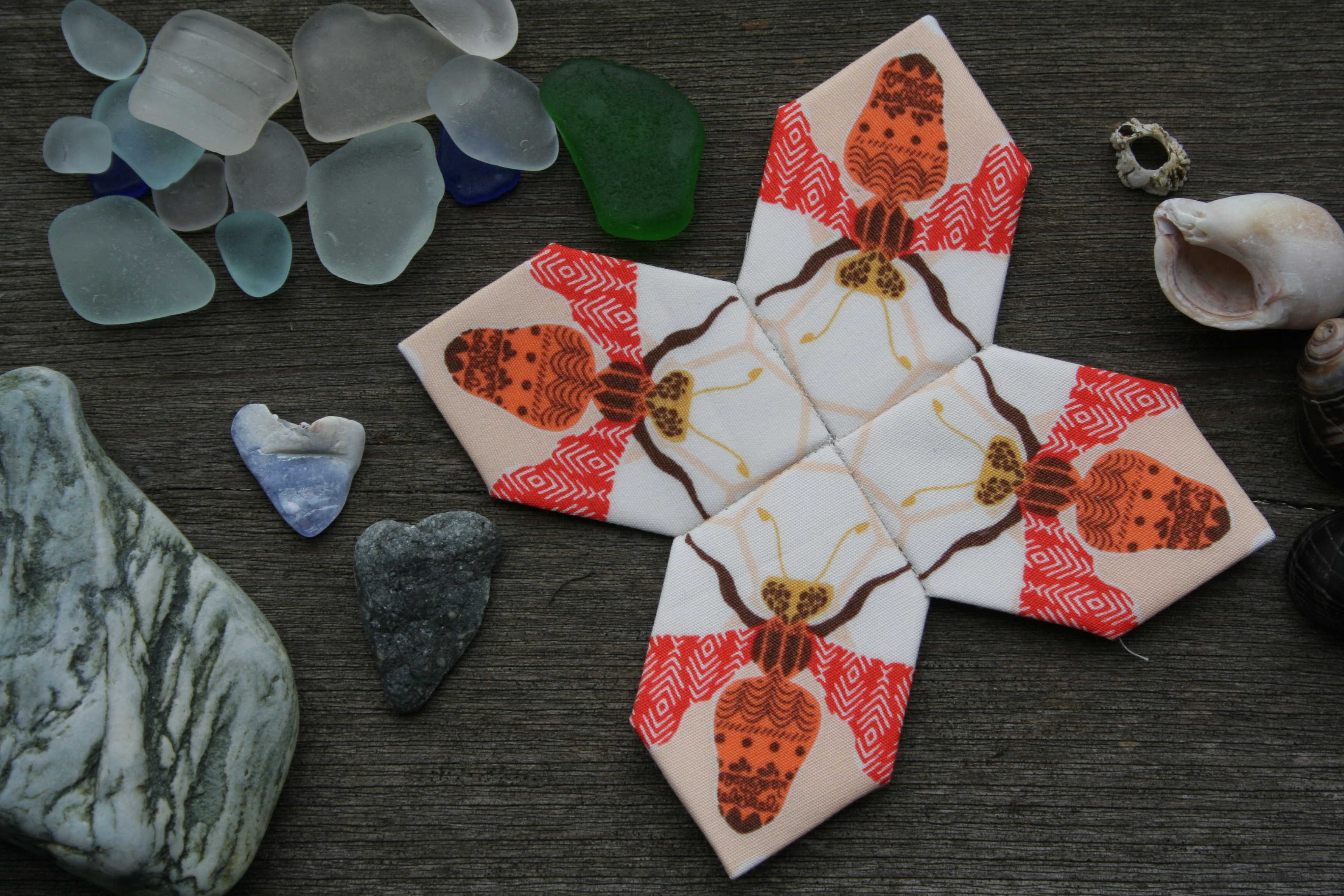
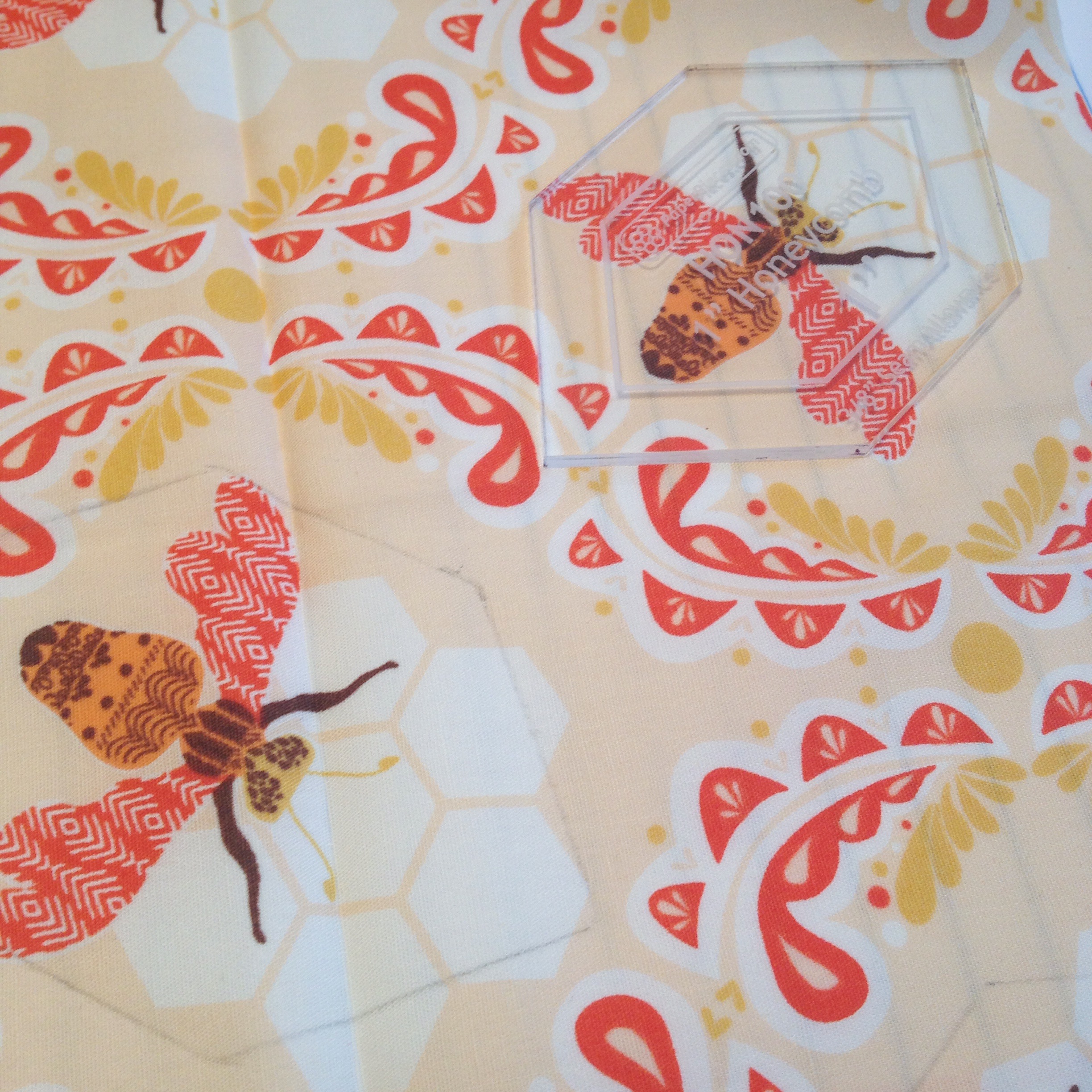
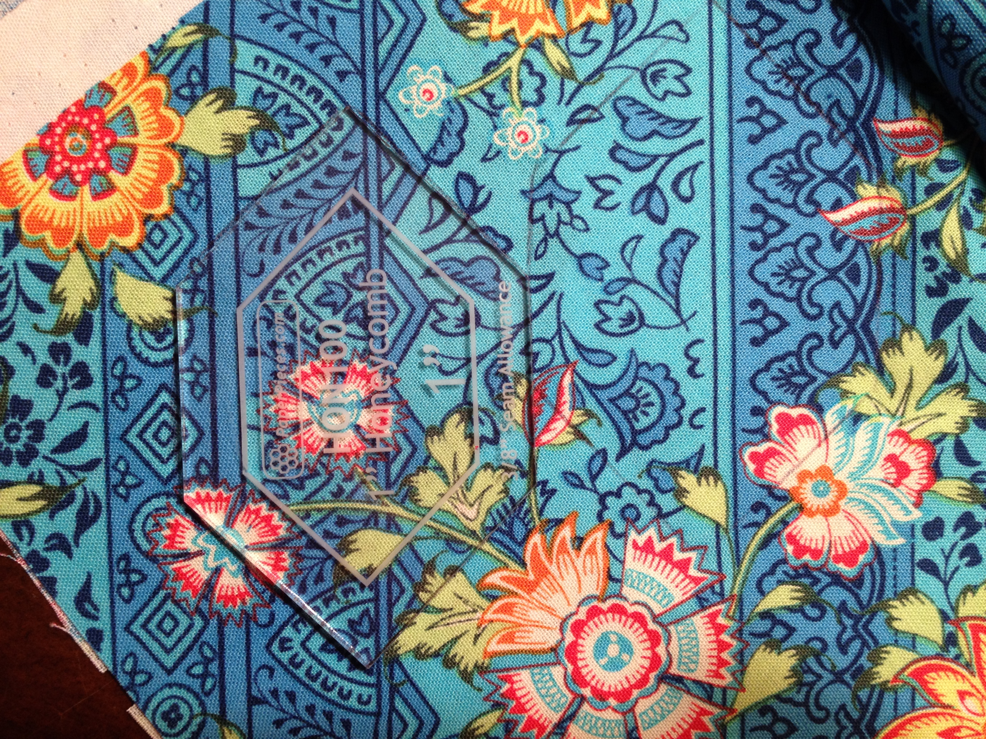
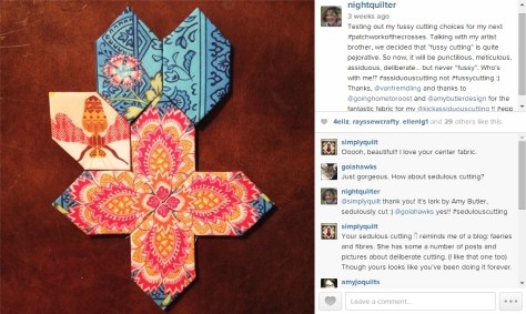
Sometimes there’s a saying that is so commonly used that you don’t even think twice about it. Last month, while on vacation with my family, my brother Steven commented on how cool my specifically planned cutting looked in my English paper piecing project. I told him how in the quilting world it’s called “fussy cutting”, and how much fun I was having with this, my first foray into it. He looked at me with an almost offended air, repeating with disdain, “fussy cutting”?!
Fussy cutting in practice for my Lucy Boston Patchwork of the Crosses center.
Steven is an artist who lives in San Francisco among many other artists of various trades. Perhaps this is why he was so taken aback by the terminology paired with quilters’ practice of selectively cutting a fabric based upon a particular element or design. He reasoned, “You wouldn’t call Michelangelo a “fussy” painter. You might call him meticulous, or careful, but never fussy.” He has a point.
It’s true; the definition of the word fussy holds a decidedly negative air. “Petty details”? “…a fussy, cluttered look.” Losing the thread of the story because of the fussy writing. None of these definitions or examples are very flattering. Personally, I think that fussy cutting in quilting is a skill and style that deserves a more complimentary, positive name. Then again, it’s just a word, right?
This conversation got me thinking: who coined the term “fussy cutting” and when did it start getting popular? I wonder if it was a saying created by the quilters, or by those seeing the completed work. A bit of googling uncovered the fact that the first evidence of selectively cutting motifs from fabric was the development of Broderie Perse in England in the 1700’s (from answers.com, so take it for what it is). The article goes on to explain that “…this technique was used by women of wealth, who had the leisure time to devote to this style of applique. Their goal was to make a “best” quilt that would be shown off to friends or used on special occasions.” In other words, it was women of wealth who could afford the time and fabric to select only very specific features to make a “best” quilt, leaving the fussy cut refuse to waste or other small, non-functional projects. Was the term “fussing cutting” created by those of lesser social status out of semi-contempt of those who could afford such fabric waste and leisure?
In searching more, in an interview with Eleanor Burns conducted in 1999, she casually mentions that she and her sister may have coined the term “fussy cutting”. Here’s an excerpt of the interview:
Brenda Horton (BH): Now you called your sister the fussy one but you “fussy cut” sometimes on your patterns, is that where you got the term?
Eleanor Burns (EB): Yes, she told me “fussy cut.” What’s really interesting, we may have coined the word “fussy-cut” but now it’s a standard in the industry. And that’s really fun to see something you started as just common terminology.
MF: Explain to us what “fussy-cut” is.
EB: Fussy-cut means you would have a large floral design with a lot of flowers. You might just specially cut out one flower and use that one flower repeat throughout your quilt, so it’s just specially cut out of the fabric to use in a certain piece. It puts together a really pretty design– fussy.
It doesn’t sound very disparaging, although between sisters, perhaps there is a bit of a teasing tone? What do you think?
Assiduous cutting with Amy Butler’s Lark fabric.
For me, I can no longer say “fussy cutting” without thinking of my conversation with my brother. Here’s my IG post from the night of the conversation:
I wrote: Testing out my fussy cutting choices for my next #patchworkofthecrosses. Talking with my artist brother, we decided that “fussy cutting” is quite pejorative. So now, it will be punctilious, meticulous, assiduous, deliberate… but never “fussy”. Who’s with me!? #assiduouscutting not #fussycutting 🙂 Thanks, @vanfremdling and thanks to@goinghometoroost and @amybutlerdesign for the fantastic fabric for my @kickassiduouscutting !! #epp
I’m sure that “fussy cutting” will still be part of my quilting lingo, since when in Rome! However, I will also be using “assiduous cutting”, “meticulous cutting”, and “punctilious cutting” interchangeably. Personally, I lean toward “assiduous cutting” since then I can say I’m doing some “kick-ass-iduous cutting” tonight!
What do you think? Do you think “fussy cutting” has a derogatory inclination? If you are a quilt historian and have any more information regarding the origination of the term “fussy cutting”, I’d love to know!
Until then, have fun with your punctilious, meticulous, assiduous, deliberate, and okay… sometimes fussy… cutting. I know I will!
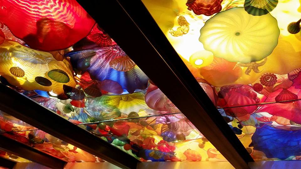
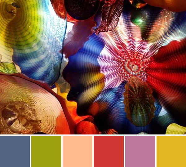
Sometimes you see a burst of color so amazing, you just can’t let it go. That happened to me yesterday, when my cousin Kayley posted these amazing photos of glass sculptures created by Dale Chihuly, seen at Chihuly Garden and Glass in Seattle, Washington. Kayley is visiting our aunt in Seattle, and her photos are just amazing! They are taken with her camera phone, but the back-lit glass sculptures look so vibrant that I feel like I could reach out and touch them. Most of the photos are detail shots taken of a suspended 1,400-piece, 100-foot-long sculpture.
Part of Dale Chihuly’s suspended 1,400-piece, 100-foot-long sculpture in the Chihuly Garden and Glass in Seattle, Washington.
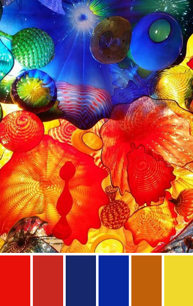
I think you will agree that these photos just begged to be turned into quilt-inspiration color palettes!
These beautiful palettes are created with Play Crafts’ Palette Builder 2.1 and photographs taken by my talented cousin Kayley Gallagher.
Corresponding Kona cottons from left to right: Tangerine, Lipstick, Ocean, Royal, Cedar, Citrus
I absolutely love this color palette! Consisting almost entirely of primary colors, it is bright and cheerful. I think it would make a great kids’ quilt.
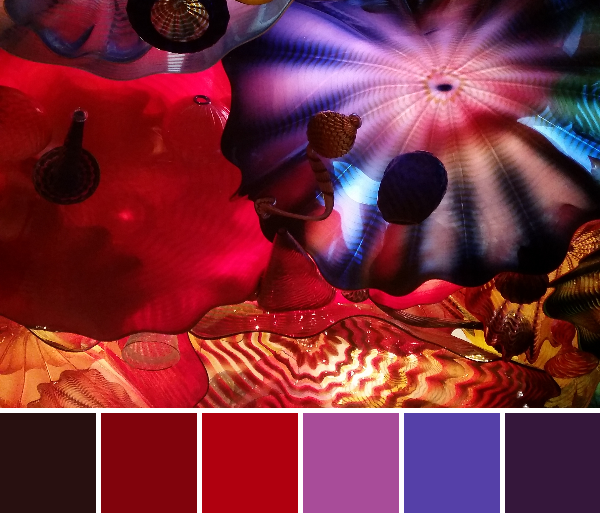
Corresponding Kona cottons from left to right: Mahogany, Poppy, Lipstick, Plum, Surf, Hibiscus
This palette makes me think of the purple hat ladies. Purple hat ladies make me think of fun-loving, bold and beautiful women who do what they want without concerning themselves with what others may think. Can you tell that I hope to join their ranks someday? What fun! Passionate reds and purples, with a bit of rich mahogany make this another vibrant palette.
Corresponding Kona cottons from left to right: Black, Sable, Cappuccino, Shadow, Parsley, Honey
This palette isn’t colorful, but sometimes we need to focus on neutrals. This earthy palette has a good balance of neutrals and achromatic colors and would make a lovely subtle quilt or foundation for a quilt with a splash of additional color (maybe a bright Leprechaun green to pull from that subtle kona Parsley?) Plus, what an amazing glass squid sculpture!
Corresponding Kona cottons from left to right:
Slate, Lime, Wheat, Lipstick, Rose, Corn Yellow
I’ll leave you with one more rainbow color palette to cap off this week. This photo features all the colors of the rainbow, which is well represented in the resulting palette. I don’t know about you, but I’m on a definite rainbow gradient quilting kick lately. You can’t go wrong with rainbow!
Special thanks to Kayley this week for letting me use her photographs to help inspire more colorful creative works of art. Enjoy!
This week you will get another glimpse into the colorful world of the Maine coast. Meanwhile, I’m driving all day long with my husband and two small children, off toward Ohio for our next family vacation! You get the better end of the deal, I think, but I hope to have some new fun photographs for next week’s color inspiration.
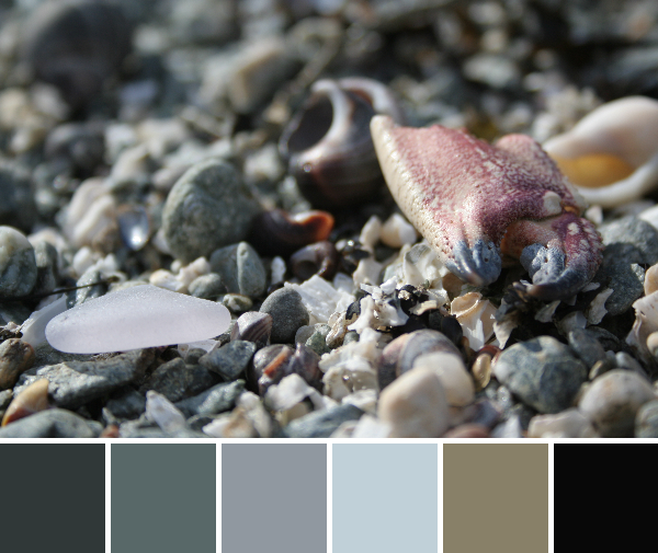
Corresponding Kona cottons from left to right: Charcoal, Steel, Pewter, Dusty Blue, Sweet Pea, Black
I love to get a really close look at the stones and shells at the beach. What from above looks like a bunch of rocks, when inspected from an inch or two away, is an entire world of complex beauty. Tiny bits of shell, stone, sea glass, and even pieces of sea creatures create a gorgeously intricate scene.
Corresponding Kona cottons from left to right: Steel, Fog, Wasabi, Yarrow, Sunflower, Raffia
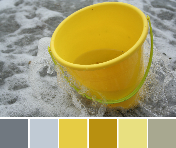
Vacationing with children, there are sure to be little splashes of color in the form of buckets, shovels, and other beach toys. I couldn’t resist a photo of this bright yellow bucket in the surf, and I love the color palette that resulted. Yellow and gray are GREAT together!
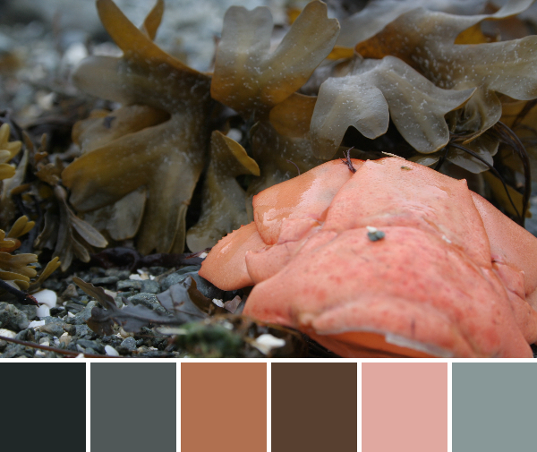
Corresponding Kona cottons from left to right: Pepper, Coal, Spice, Earth, Primrose, Shale
A lobster tail washed up onto the beach, providing the perfect finale for the Maine coast color palettes. After all, Maine and lobster are synonymous according to some people. I have really loved the heavy presence of gray in many of these coastal color palettes, and I love how well gray plays with the pops of color that emerge in other details.
I hope these color palettes inspire you, and I would love to see any quilts that you create using these palettes!
This year I was honored to be a part of the New Quilt Blogger Blog Hop organized by Beth at Plum & June. Through this blog hop, I got to know so many awesome quilters, helped jump start a couple of awesome friendships, and learned a ton about quilting and blogging in general. If you missed it, my introductory post is here: Let’s Get Acquainted! It includes everything you ever wanted to know about me, and then some.
As of last week, the final round of new quilt bloggers have posted their introductory posts, so the hop is officially complete! For those of you who haven’t had a chance to hop around to all of the awesome new quilt bloggers in the group, here’s your chance. Compiled by Yvonne at Quilting Jetgirl, here is a complete list of all of the new quilt bloggers and their introductory blog posts in no particular order. Yes, there were a TON of us… pace yourself! There is no better way to get to know some new, follow-worthy bloggers. Enjoy, and tell them Kitty @ Night Quilter sent you!

 Now that the quilt top is complete, it’s all set to go to Stephanie & Michelle in Austin for some longarm quilting. Once Stephanie is finished working her magic, this quilt will be posted for sale in our Late Night Baby Etsy shop. It will be my first contribution, so I’m excited to finally get it finished.
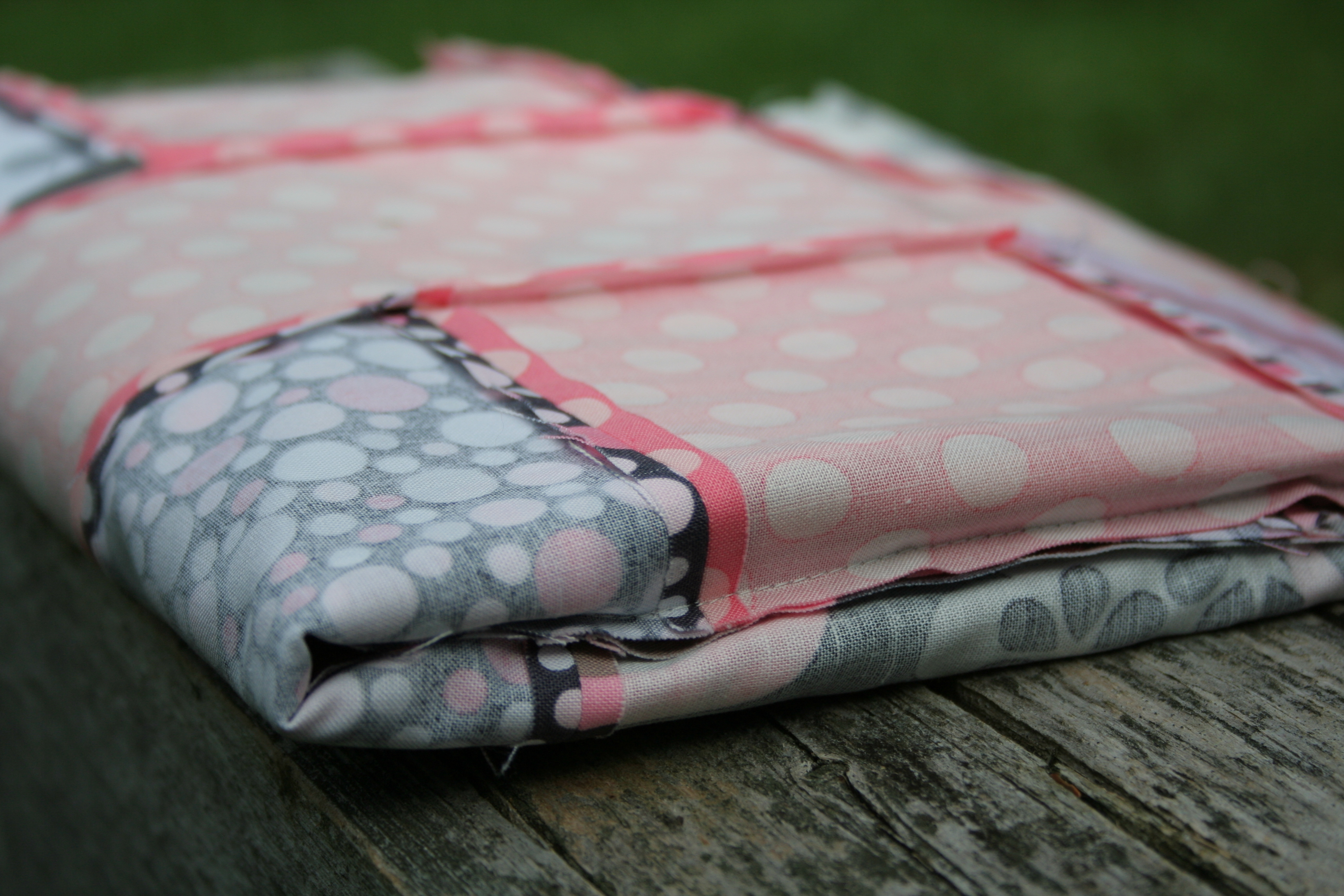


 This year I was honored to be a part of the New Quilt Blogger Blog Hop organized by