
Many makers have a signature style, a color palette they visit again and again, or perhaps an aesthetic that just makes their heart sing and their makes shine. We all know how much I love a rainbow, but recently I’ve felt the need to dive into other color combinations and experiment elsewhere. I’ve tried color combinations that have felt way out of my comfort zone, played with more monochromatic palettes, and have experimented with predetermined colors (paired with improv, no less!). While I do love the makes I’ve created through these experiments, I’ve realized that I truly love a rainbow gradient, but more specifically, I’m drawn strongly to tertiary colors.
 As a refresher, the tertiary colors are the ones that fall between the primary and secondary colors, namely: Vermillion (red-orange), Amber (orange-yellow), Chartreuse (yellow-green, or lime), Teal (green-blue), Violet (blue-purple), and Magenta (purple-red). Thank you, Wikipedia for the great graphic! Even when a project isn’t a full rainbow spectrum, if it consists of tertiary colors it still makes my heart sing. Primaries? Not so much. Secondaries? Meh. Tertiaries? Oh, yesssss! All the colors? Even better!
I’ve decided that once a few last non-rainbow projects are completed, I am going to let go of my hesitancy to creating rainbow-everything. I will embrace my rainbow-loving self and create a rainbow-filled world! I have some really fun projects on the horizon and I can’t wait to share them with you! Do you have a specific color combination that makes your heart sing and your eyes turn into hearts? Tell me about it in the comments and enter to win a great bundle of some of MY favorites!
Giveaway Time!
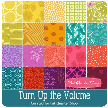 Today’s giveaway is generously sponsored by the Fat Quarter Shop. When it was time to select the giveaway bundle for the month, this lovely Turn Up the Volume bundle curated by Rebecca Mae Designs caught my eye. Can you tell why? Tertiary colors!! It’s jam packed with vibrant, stash building tertiary colors. Now you have a chance to build your tertiary color stash in a big way (20 fat quarters-big… that’s 5 yards of fabric!).
To enter the giveaway today, let me know what colors you find yourself using again and again. Leave a comment and make sure I’m able to get ahold of you if you win. If you’re a follower of Night Quilter, leave a second comment telling me how you follow for a second entry. Tell me how you follow Fat Quarter Shop (facebook, twitter, Instagram, their blog Jolly Jabber, etc.) for a third entry.
This giveaway is open to US and international participants. The giveaway will be open until Tuesday 5/10 at 8pm EST when I’ll select the winner randomly with random.org. Good luck! This giveaway is now closed. Congratulations to Delaine!!
Thanks again to the Fat Quarter Shop! Blog sponsors help me to keep this blog going by helping cover the costs of hosting, photography equipment, supplies, and of course time. Sweet, precious time. Many many thanks to all who support me!

I, too, love the tertiary colors although I didn’t identify them by that name. Just completed a color gravity quilt for a grandson who is marrying. It is a bit modern for my preference, but I love how it turned out. Queen size—my biggest quilt yet!
LikeLike
I follow you via email. Thanks for including me.
LikeLike
I am a rainbow girl myself–love them all! 🙂
LikeLike
I follow you via email.
LikeLike
I follow FatQuarter Shop via Facebook
LikeLike
I follow Fat Quarter Shop via email and Facebook. My favorite online fabric store!
LikeLike
I tend to use a lot of yellow and grey. Grey is my go to background color.
LikeLike
I follow you on instagram, bloglovin, and via email. 😉
LikeLike
I follow Fat Quarter Shop on Facebook. 🙂
LikeLike
I’m always making something in the purple family
LikeLike
Wow, realize that I too, prefer tertiary colors. Thanks for the graphic.
[email protected]
LikeLike
I follow via email.
LikeLike
Hi
I love deep colours and I follow you on Instagram and I follow fat quarter shop
LikeLike
I love the Tertiary colors too. I haven’t thought about it much before. But looking at my stash I have tons of dark teals, especially with rich browns. A lot of golden yellows and deep oranges too. One thing about looking at my stash though is I know for sure I like bright, rich colors. You will not find any pale pastels in my fabric piles. 🙂
LikeLike
I find myself using lots of lime green (chartreuse) and purples in my sewing projects. Not sure I’d call them my signature colors just yet though!
LikeLike
I just recently started following Fat Quarter Shop on Facebook and following the blog as well.
LikeLike
I follow your blog on Bloglovin!
LikeLike
I love blue and my stash is full of it! Blue makes me happy, and I am happy when my project has blue in it.
LikeLike
I follow Fat Quarter Shop on IG, Bloglovin, and Facebook!
LikeLike
I get the FQS’s email newsletter, “The Jolly Jabber” in my email inbox!
LikeLike
Right now I find myself using a lot of browns. But I change all the time on what is my primary color.
LikeLike
I follow you on Bloglovin, and I receive your newsletters
LikeLike
I follow Fat Quarter Shop on Instagram, Facebook, Bloglovin, and I receive their newsletter
LikeLike
HAPPY TO FOLLOW YOU VIA BLOG LOVIN; !
LikeLike
HAPPY TO FOLLOW FQS VIA GMAIL!
LikeLike
HI, seems like I use a lot of red, dots, stripes, geometrics etc.Thanks for sharing a sweet giveaway!
LikeLike
Change is a constant, especially as we age. Need more light now, so my greyed down county pallette has switched to clear and bright. Love the colors you are talking about! Thanks for a chance to win your favs!
LikeLike
Like you, I love all rainbows…but in most of my projects I find I always include some purple shades or blues..,
LikeLike
I gravitate to pinks…and I’ve gotta watch that cuz it can get a little overwhelming really fast 😉
LikeLike
I love purple and teal….I keep vibrating towards them!! Thanks for the chance! churcaeatauburndotedu
LikeLike
I follow you on IG and thru Blogger.com
LikeLike
I tend to use a lot of green. Or green paired with something (green, yellow, orange together or green + purple). I love the idea of doing something using all the tertiary colors, though!
LikeLike
I am drawn towards a full rainbow, but turquoise seems to be the color I try to work into everything.
LikeLike
And I follow you via Feedly.
LikeLike
I follow you via email
LikeLike
I follow you on Instagram
LikeLike
I follow you on bloglovin and instagram and my money follows FQS right out of the wallet!! (and on Facebook) churcaeatauburndotedu
LikeLike
And I follow FQS’ blog via Feedly, and I follow them on Facebook as well.
LikeLike
And I follow FQS by email and through Facebook.
LikeLike
I follow Fat Quarter Shop via their blog.
LikeLike
I make most of my quilts in cool colors, blue-green-purple. But I could use this fat quarter bundle, definitely!
LikeLike
I follow you on Bloglovin.
LikeLike
I love all the colors these days. I a rainbow girl. This is such a great bundle. Thank you for the chance to add it to my shelf!
LikeLike
I love purple, magenta, pink and orange. I also go for teal and aqua a lot. I gravitate towards jewel tones and dark backgrounds. And of course rainbow.
LikeLike
I follow you on IG
LikeLike
I follow Night Quilter via Instagram.
LikeLike
I follow Fat Quarter Shop on IG too
LikeLike
I follow FQS on Instagram also.
LikeLike
Green and purple I can’t get enough of! I collect a lot of Aqua and orange but for some reason don’t start many quilts in this color scheme. Thanks for the giveaway!
LikeLike
I follow you and fat quarter shop on IG. Thanks!
LikeLike