
Many makers have a signature style, a color palette they visit again and again, or perhaps an aesthetic that just makes their heart sing and their makes shine. We all know how much I love a rainbow, but recently I’ve felt the need to dive into other color combinations and experiment elsewhere. I’ve tried color combinations that have felt way out of my comfort zone, played with more monochromatic palettes, and have experimented with predetermined colors (paired with improv, no less!). While I do love the makes I’ve created through these experiments, I’ve realized that I truly love a rainbow gradient, but more specifically, I’m drawn strongly to tertiary colors.
 As a refresher, the tertiary colors are the ones that fall between the primary and secondary colors, namely: Vermillion (red-orange), Amber (orange-yellow), Chartreuse (yellow-green, or lime), Teal (green-blue), Violet (blue-purple), and Magenta (purple-red). Thank you, Wikipedia for the great graphic! Even when a project isn’t a full rainbow spectrum, if it consists of tertiary colors it still makes my heart sing. Primaries? Not so much. Secondaries? Meh. Tertiaries? Oh, yesssss! All the colors? Even better!
I’ve decided that once a few last non-rainbow projects are completed, I am going to let go of my hesitancy to creating rainbow-everything. I will embrace my rainbow-loving self and create a rainbow-filled world! I have some really fun projects on the horizon and I can’t wait to share them with you! Do you have a specific color combination that makes your heart sing and your eyes turn into hearts? Tell me about it in the comments and enter to win a great bundle of some of MY favorites!
Giveaway Time!
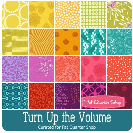 Today’s giveaway is generously sponsored by the Fat Quarter Shop. When it was time to select the giveaway bundle for the month, this lovely Turn Up the Volume bundle curated by Rebecca Mae Designs caught my eye. Can you tell why? Tertiary colors!! It’s jam packed with vibrant, stash building tertiary colors. Now you have a chance to build your tertiary color stash in a big way (20 fat quarters-big… that’s 5 yards of fabric!).
To enter the giveaway today, let me know what colors you find yourself using again and again. Leave a comment and make sure I’m able to get ahold of you if you win. If you’re a follower of Night Quilter, leave a second comment telling me how you follow for a second entry. Tell me how you follow Fat Quarter Shop (facebook, twitter, Instagram, their blog Jolly Jabber, etc.) for a third entry.
This giveaway is open to US and international participants. The giveaway will be open until Tuesday 5/10 at 8pm EST when I’ll select the winner randomly with random.org. Good luck! This giveaway is now closed. Congratulations to Delaine!!
Thanks again to the Fat Quarter Shop! Blog sponsors help me to keep this blog going by helping cover the costs of hosting, photography equipment, supplies, and of course time. Sweet, precious time. Many many thanks to all who support me!

I’m with you, love the rainbow. So hard to find the Tertiary colors. Thank you for finding a bundle of them. Orange/Yellow and purple have always been my favorites. [email protected]
LikeLike
Following you on bloglovin’.
LikeLike
Follow The Fat Quarter Shop by blog, newsletter and youtube.
LikeLike
Yellow is a big favorite for me. Thanks for the opportunity. [email protected]
LikeLike
I seem to use a lot of blue. But I like all colors. Thanks for the giveaway.
LikeLike
I go back to turquoise and different shades of reds, leaning toward pink over and over when I am drawn to fabrics. I too like the tertiary colors but I did not know what they were called.
LikeLike
I follow you by email.
LikeLike
I get the Fat Quarter Shop newsletter and follow blog and on Instagram.
LikeLike
i use bright solids and a lot of white
LikeLike
I follow you by email. [email protected]
LikeLike
I use bright colors. Don’t really have a favorite as long as it is bright.
LikeLike
I seem to be drawn to the blue range.
LikeLike
I follow the FQS via FB, email, and IG.
LikeLike
I love rainbows as well, but since I mostly create for swaps, I make things in the colors of what the other person likes, like my last swap she liked brown, uck, my least favorite color, but I still made her something with brown in it.
LikeLike
I follow you on IG 😉
LikeLike
And I follow FQS through e-mail and etc.
LikeLike
Teal and chartreuse get me every single time! Thanks for the giveaway, Kitty!
LikeLike
I follow you on Instagram!
LikeLike
I like/follow FQS on FB!
LikeLike
I’ve just made my first (small) rainbow project in 8 solid colours, so primary, secondary and tertiary present. But usually I tend to go for deep, intense, secondary and tertiary colours with a good contrast between them. Turn up the volume would be right up my street!
LikeLike
Follow you through Bloglovin and IG
LikeLike
Following Fat Quarter Shop on IG too!
LikeLike
I am still finding my favorites, but I tend to want yellow in everything. The trick is finding the right yellow- I prefer nice buttery yellows. This bundle is amazing!
LikeLike
I always look for Blues & greens…watery & sky shades LOOOOVE bright colors too..
LikeLike
I follow you thru Email & Bloglovin.. Thank you for chance to win your Give-a-way too! 😀
LikeLike
Already a Follower of FQS thru Email, Jolly Jabber, & You Tube 🙂
LikeLike
I am drawn to those warm colors. Love coral/orange and red/purple.
LikeLike
I am so into Tertiaries! See my recents @rowermom3 on Instagram. I follow you on Instagram and fat quarter shop
Lovin this combo you chose!
LikeLike
I love the rainbow colors but am usually working in earth tones.
LikeLike
I follow you through email.
LikeLike
I follow FQS blog by email.
LikeLike
I love tertiary colors! I use lots of vibrant colors (and adore rainbow configurations!), but if I had to choose, I would say that I use lots of bright pink and orange paired with navy and/or white.
LikeLike
I follow you on Bloglovin
LikeLike
I follow the Fat Quarter Shop on Instagram
LikeLike
I love the tertiary colors too ~ just didn’t realize the name until you pointed out some of those colors (graphic was great). I follow you on Bloglovin. I follow the Fat Quarter shop by blog, newsletter and youtube. Thanks for the giveaway
LikeLike
Kitty – you have inspired me to go to my inner rainbow. But also I love the colour lime green – especially with navy blue. It is such a gorgeous bright fun colour.
LikeLike
red, red, red !!!
LikeLike
Thanks, Kitty! Great giveaway 🙂 I, too am a rainbow girl, but especially drawn to bright fuschia and rich, saturated agua. This may be genetic as my mom was a pastel pink and blue gall
LikeLike
I follow you on e-mail and love to see you in my inbox. Your’s is always the first e-mail I open!
LikeLike
I follow Fat Quarter Shop via Jolly Jabber. My guilty pleasure at lunch is to check their flash sale and then click on what’s new. I saw your giveaway bundle today and fell in love. Thanks again for this great opportunity!
LikeLike
I have to have grey. Grey paired with anything makes my heart sing 🙂
LikeLike
Follow on bloglovin
LikeLike
Chartreuse, periwinkle, amber and grays,turquoise and pinks or orange
LikeLike
I love a pretty teal colour
LikeLike
I almost always use teal in my projects
LikeLike
I follow you on bloglovin
LikeLike
I follow you on instagram and by email
LikeLike
I follow the fat quarter shop by Facebook, bloglovin and the jolly jabber
LikeLike
I follow the FQS on instagram and by email
LikeLike
I love the combination of Vermilion, Amber and Teal ❤ The bundle looks gorgeous (both the patterns and tertiary colors)!
[email protected]
LikeLike